Designing website forms - a complete guide
Form design best practices
The best forms are a place of valuable information exchange that lead to informed purchases, sign-ups, patient intake and check-ins, and customer feedback. Conversational in tone, they are intuitive, engaging, and personalized to each customer’s journey. Yet there is nothing simple about the form building process and choosing the right design features can feel overwhelming.
Should the form be short or long? Collect email at the start or towards the end? Clean and direct or animated and fun? Pop-ups? Dropdowns? What do you need to engage and educate the right leads so you convert and retain? And what’s just a distraction?
In this article we provide a comprehensive guide to plan and create effective forms. Keep in mind that a healthy cycle of experimentation with each design choice will help you optimize your form.
We’ll look at great design choices made by Apostrophe, Asics, Curology, Future, Hers, Innerwell, Jetty, Nourish, Nutrafol and Stitch Fix.
Many of the strategies we’ll discuss will be particularly relevant to the healthcare, finance, SaaS, and ecommerce industries. You can explore some of the best form designs around the web and in your industry for inspiration here.
Contents:
Understanding the target audience
Forms vary greatly between industries so start by considering your industry and target customers. How might your form be different depending on your industry? For example, healthcare businesses must use HIPAA compliant forms where protected health information (PHI) is being captured. Finance-related forms might need to run credit checks must use secure forms to meet certain industry standards. Ecommerce forms may present different subscription plans for potential customers to choose from.
Think about the style elements that would best fit your customers. Are you going for a professional and clean look and feel or do you think a more colorful style with gifs are going to help you resonate better with your audience?
Also consider mobile-friendly design. Approximately 50% of internet traffic is on mobile phones and tablets. Forms should be responsive and easy to use on mobile devices, especially if you expect a large percent of your traffic to come from mobile devices. Form elements should be appropriately sized and touch-friendly for smaller screens. Any effects that require a mouse should be adapted for a touch-screen interface.
For example, Apostrophe’s responsive design feels intentional and thoughtful. They arrange the same components appropriately for desktop and mobile screens, creating a cohesive experience for users switching between devices.
Planning and designing your form
Build in-house or with a form builder?
Perhaps the first question that comes up is should the form be built in-house or with a form builder. While building in-house can seem more cost-efficient, many teams quickly find that forms are more complex than they expected and end up draining their engineering resources. There are many form builders out there and they offer solutions that can save your team valuable hours and money. Learn more about the challenges and inefficiencies of building your own form.
“I (once) spent an entire Saturday handwriting out the mappings of a form and then spent hours going through JSONLint to figure out where my error was. That’s such a painful process and a poor use of a PM’s time.” - Molly McGrath, Head of Product at Allara (source).
However, not all form builders are built the same. It’s important to look for a builder that gives you the coding flexibility and design customization to create a seamless, professional form that sets your company apart. See why Formsort is an excellent Jotform alternative.
Formsort forms are easy enough for non-technical team members to build while offering custom engineering features in our advanced options. Why is this great? You can publish quickly and optimize over time. You can learn more about the factors to consider before deciding whether to build in-house or with a form builder.
Developing the form and essential questions
Once you’ve decided on the platform you’re going to build your form on, it might be tempting to jump right in and start building. However, drafting your questions first and creating a flowchart that reflects the question order and any branching in the form will save you a lot of time down the road.

Decide which questions will be required and which will be optional–you can set the appropriate validations for them later when you’re building in the studio. Required fields ensure you’re getting enough information to be able to deliver your products and services correctly. On the flip side, if you keep non-essential questions optional, responders who are extra cautious about their privacy are more likely to complete the form.
Once you’ve planned out the form, you’re ready to build.
Enhancing form functionality and user experience
Selecting appropriate form elements and components
Form components are the building blocks of online forms. These components are essential for capturing data accurately and efficiently. This section explores some popular form components and how they help create engaging and user-friendly forms.
By understanding and utilizing the right form components, you can create intuitive forms that facilitate seamless user interaction and accurate data collection. Here are some design elements you can use in your form:
- Text input is one of the most common question types in forms. It’s a single-line element that’s used to obtain names and other basic data. Other input types include emails, passwords, and dates, which have specific required validations.
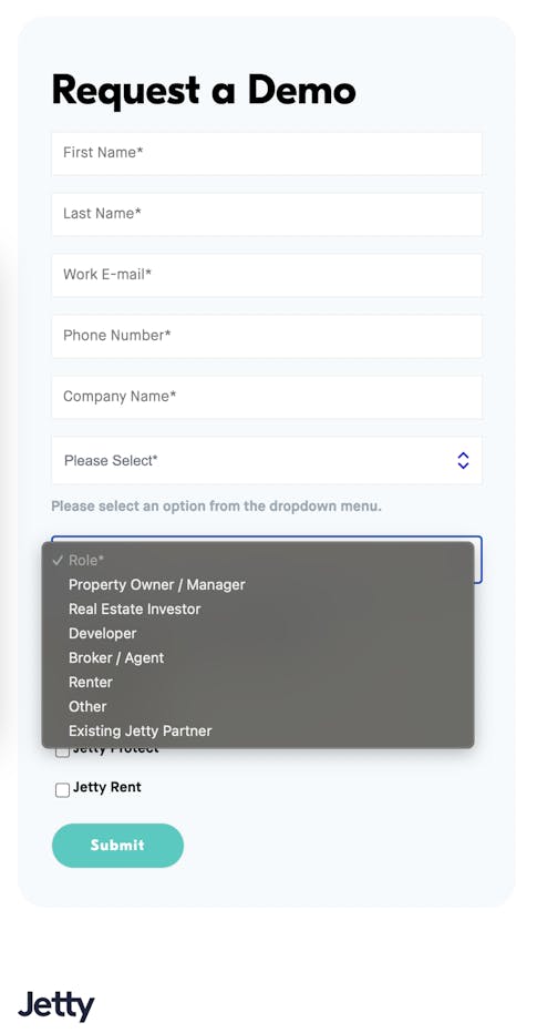
- Select question is any element that presents a question and offers a set of answer options for the responder to choose from. It’s easy for users to click an answer. It produces structured data that’s easy for companies to validate and interpret. Dropdowns, which are dynamic menus that appear below their titles when they are selected, are a type of select question. “Select one” and “select many” question types, which can use buttons or sliders, also belong in this category.
- Boolean refers to yes/no questions. Their answers are stored as true or false.
- Comparison cards are commonly used to compare complex offerings such as plans or packages. An image, text, title, and button can all be included in a comparison card.
- File upload is an element that accepts image, video, and document files into the form. IDs, medical documents, and resumes are common files that are requested.
- Interstitials are informational steps in forms, used to separate sections, provide context, or build trust through messaging.
- Tooltips are supplemental text labels that appear when a user hovers over, focuses on, or clicks on an element. They provide information that can help users answer form questions.
- Other elements you might find useful include address, confirmation question, date, grid, image map, number, payment, phone, signature, video, loading indicators, user consent, sidebars, and progress bars.
Best practices for form design
When creating a form, focusing on creating user-friendly and intuitive experiences can help increase your form conversions. A friendly conversational tone, asking only relevant questions, and displaying just one question (or a few related questions) per page are key. On the backend, securely processing data and handling errors are essential.
By following the guidelines and best practices outlined in this section, you can design user-friendly, efficient, and optimized forms for data collection.
Here are some key considerations and best practices for form design:
- Keep it simple
- Logical order
- Accessible text
- Placeholders
- Input validation and error handling
- Prominent call-to-action (CTA) buttons
- Visual feedback
- Personalization
- Returning responders
Keep it simple
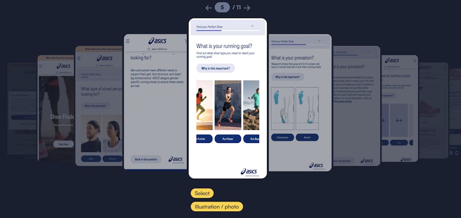
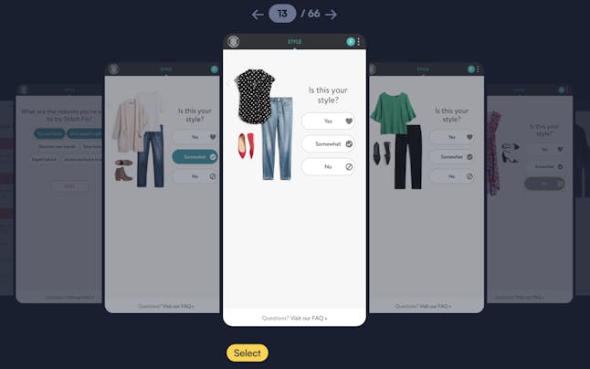
Don't overwhelm users with unnecessary questions or information. Design one question per page and experiment to determine the best ways to phrase questions, add supplementary information, and include images. The Asics product recommendation form asks just 4 questions.
While shorter forms generally have a higher completion rate than longer ones, responders will complete longer forms if their value is apparent. For example, highly personalized products and services like Stitch Fix’s wardrobe subscriptions require longer forms so they can effectively curate the right product recommendations.
Logical order
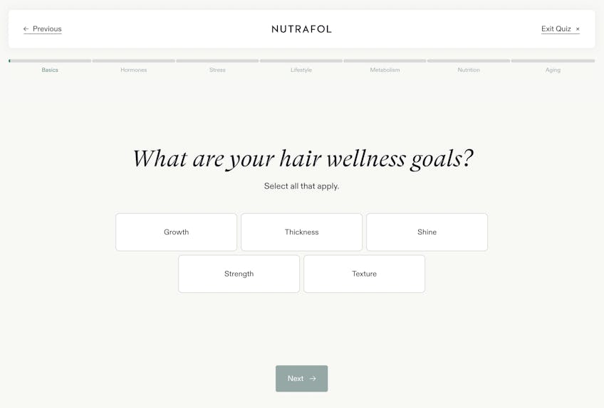
Consider starting with simpler, multiple-choice questions and placing questions that require users to type their answers into text fields later in the form. Organize related form fields into groups to make them easier for users to answer. Some groupings include demographic questions, medical history, style preferences, and budget. Some companies place account creation at the start, others at the middle or end. Checkout should be at the end. You can determine the best order of groups and questions for your form through form split testing.
Nutrafol’s quiz is divided into sections by topic, starting with an introductory section called “Basics” and moving into the data categories that affect product recommendations.
Accessible text
When it comes to forms, style should never trump accessibility because the end goal is to have successful form submissions. Customize your UI appropriately for your target responder. Make sure that your design theme accounts for readability. Will your responders need larger, bolder text? High-contrast colors? Translations into other languages? Each form field should have a clear, descriptive label. Removing UI barriers is an important part of form design.
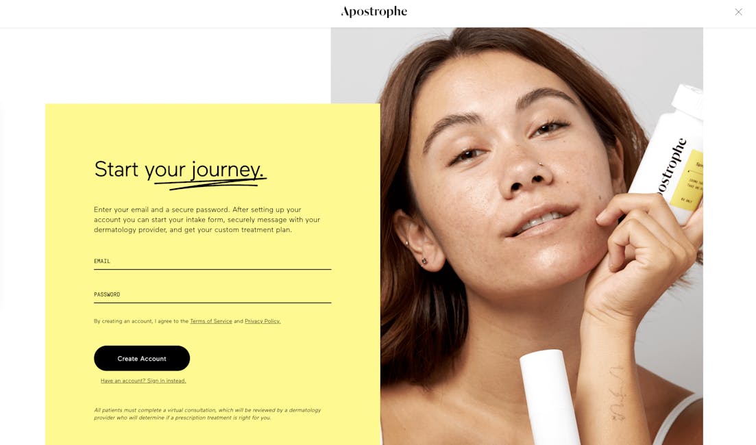
Future’s form uses a monochromatic black and gray palette with a green accent. The fonts are simple and clear, making them easy to read. Curology uses visuals with text to help communicate their terminology.
Placeholders
When relevant, add placeholder text inside form fields to help responders understand the type and format of the data you're looking for. Pre-empt the need for error messages and avoid responder frustration with this helpful text. Placeholders are gray by default and go right into the field so they’re subtle and don’t require extra screen real-estate.
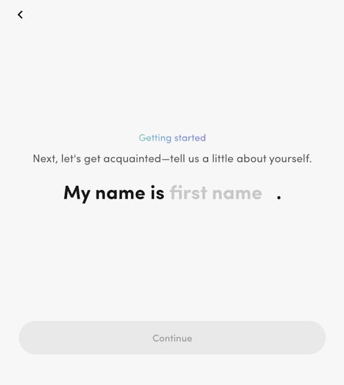
The placeholders used by Hers make are really intuitive. The text “first name” is a placeholder. A question isn’t needed since the sentence stem and placeholder are enough to indicate what type of data is being requested.
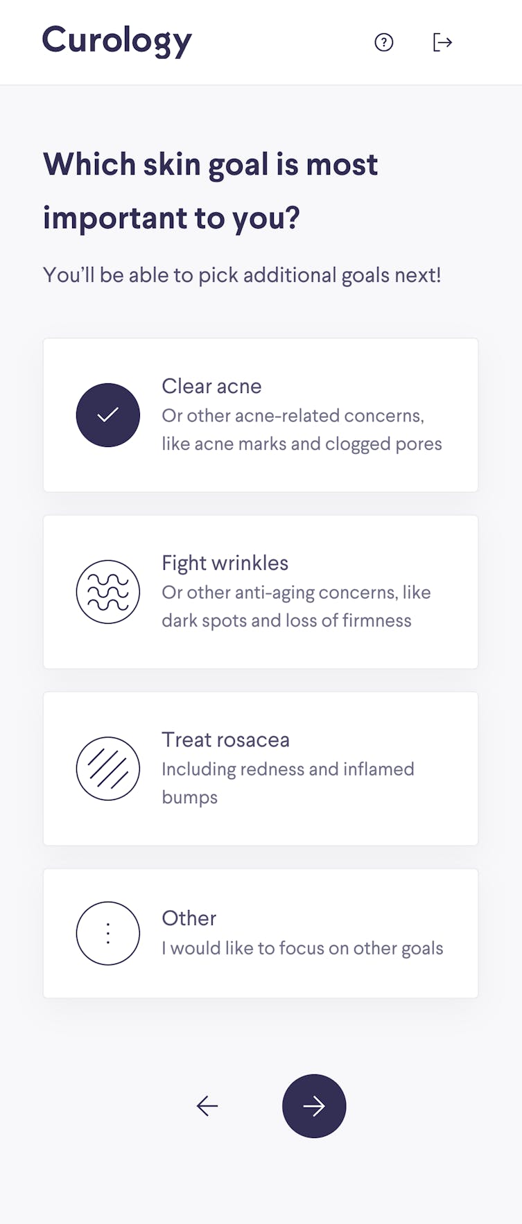
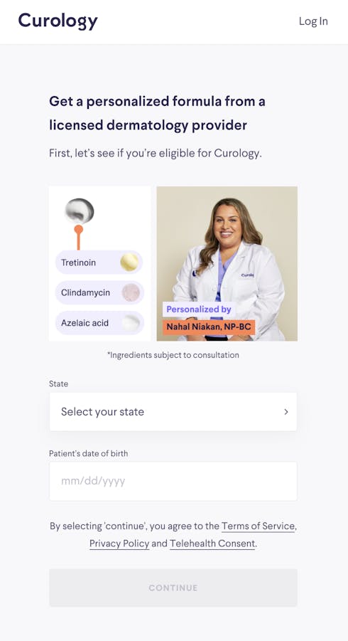
The two fields on this Curology page are clearly labeled and include helpful placeholders. The label and arrow in the first field indicate that a state must be selected from a dropdown list. The second field shows the correct format for entering the responder’s date of birth.
Input validation and error handling
While clickable buttons are the easiest way to get valid data input because it’s structured data, sometimes answers have to be entered manually. Implement real-time validation as responders fill out the form, indicating any errors made is crucial. Responders will be able to correct mistakes instantly, reducing frustration and manually checking errors. Formsort’s custom validation gives you full control over the kind of data you accept in each form field.
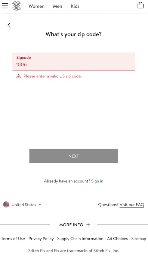
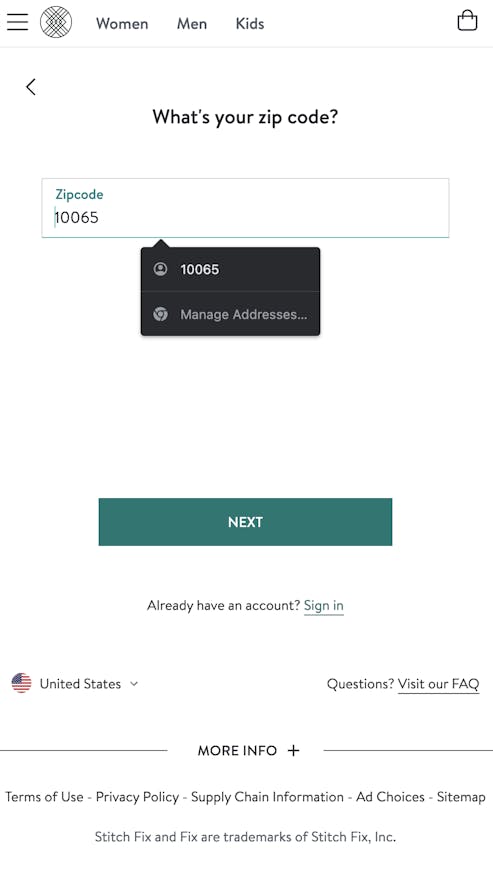
The Stitch Fix zip code field has a real-time validator that is even color-supported. The red field text, error message, and highlight color indicate an error has occurred. The next button is also disabled. When a valid zip code is entered, the text turns black, highlighting reverts to gray, the error message disappears, and the next button turns green.
Error handling is important throughout the form. Forms should have error reporting and solution strategies at the site of each error so that a user doesn’t get to the end of their form only to find out they can’t submit it due to an error that occurred on a previous page. To ensure successful submission, display clear and specific error messages at the appropriate locations. Explain the issue and suggest possible solutions to help responders resolve the problem.
Prominent call-to-action (CTA) buttons
CTA buttons guide users from the homepage to the form. That’s why these buttons should be large and placed in a prominent location on the page. Users should be able to find the button easily and want to click on it. The button text might read “Start Now,” or something more customized like “Find your Coach.”
The CTAs within and at the end of the form are also important. Provide clear and descriptive action buttons to help users complete the form. Ensure that the primary call-to-action ("Submit" or "Next") is easily identifiable.
Visual feedback
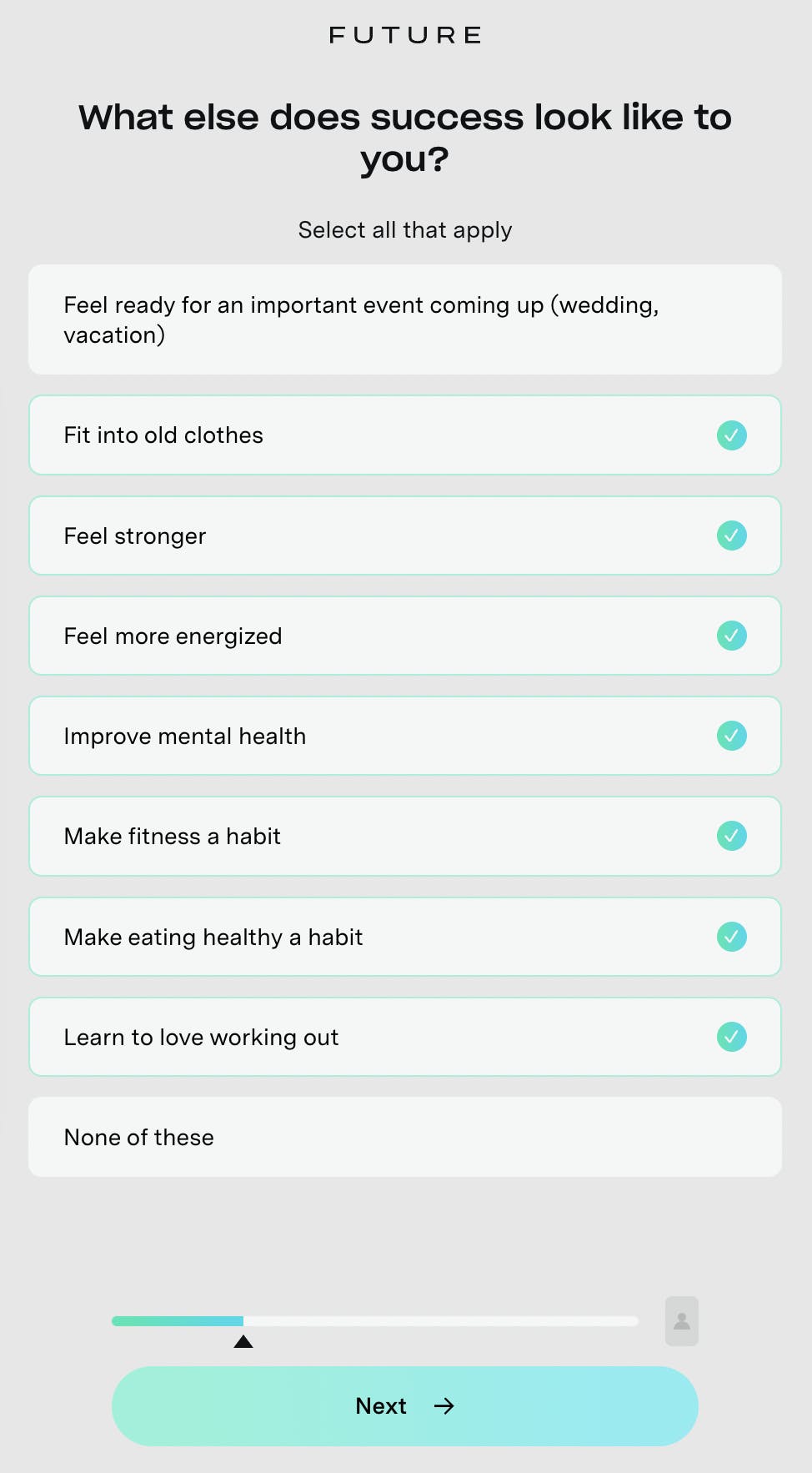
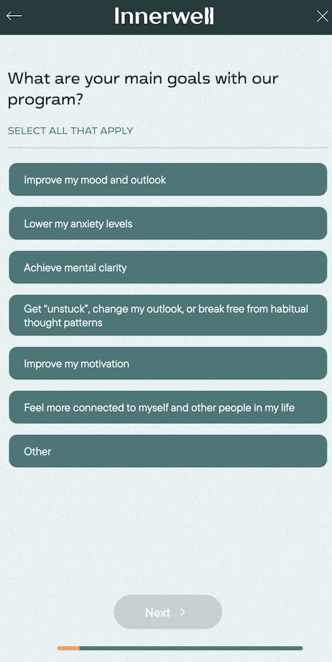
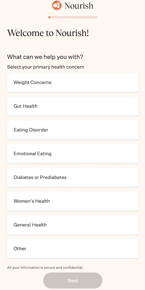
Provide users with visual feedback on their progress by using color changes, checkmarks, and progress indicators. Another type of visual feedback, the progress bar, is an industry standard and an easy way to let responders know how close they are to completing the form. Bars can be placed at the top of the page like on the Nourish intake form or at the bottom of the page like the one on Innerwell’s form.
Confetti is a type of animated visual feedback that tells responders they’ve reached a significant point in the form, such as qualification, account creation, or purchase. The Curology signup form displays confetti upon qualification. This encourages the responder to continue on to account creation and the rest of the form.
Personalization
Whether you customize greetings by including responder names by dynamically populating them from a previous form field, display quiz scores and product recommendations, or adapt the actual form pathway based on responses, using conditional routing logic is a powerful way to engage with responders and personalize their form experience. Branching logic can shorten the form completion process by routing to question sets that apply to responders as based on their previous answers.
Stitch Fix offers petite options to customers on the shorter end of the scale.
Conditional logic can significantly impact your back end as well, by routing leads to the appropriate team, for example. Koalafi, a Formsort customer, used branching logic to increase their sales funnel efficiency. Their new form automatically directs responses to the business-to-customer (B2C) or business-to-business (B2B) sales based on answers.
“When we came upon Formsort to create branching logic trees, customized form experience for every segment we’re trying to go after, it eliminated the noise and helped us focus on the right areas. It’s been an absolute game changer for us. From day one, we had a lot more quality leads and were able to provide customers and businesses with a simple, transparent experience." - Josh Carter, Senior Marketing Manager, Demand Generation & Marketing Operations at Koalafi.
Returning responders
Ensure responders can come back and finish incomplete forms. When you obtain contact information early in the form and save input data at each step, you can reach out to partial form responders and encourage them to complete the form. Studies show that almost 20% of these responders will come back and complete the form if they are sent the link (source). Learn how Koalafi recovers lost leads this way.
Applying consistent branding and visual identity
In a competitive market, branding is essential for growing your business. From landing page to checkout, customers must experience professionalism and sophistication that instills confidence in your product and your brand. Enhance your form’s visual appeal and create a seamless user experience by customizing your form’s colors, fonts, logo integration, and language. Nothing should feel out of place. When Allara chose to use Formsort’s customizable mental health assessment templates, they knew these forms should be on-brand extensions. Since the onboarding form is Allara's first interaction with prospective patients, its design needs to match the rest of the website. With Formsort, Allara was able to meet both its logic and customization needs (source).
Advanced features and integrations
Storing your data
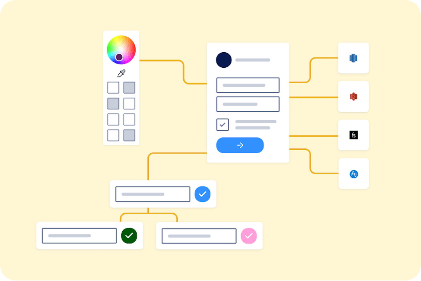
Form builders aren’t and shouldn’t be databases. They should not be the source of truth when it comes to your data–you are the owner of your data so your form responses should be stored securely in your own database or a reliable data store. Form builders collect and send this data to the right places. That’s why they should have an array of available integrations to expedite the processes mentioned above. Formsort offers integrations with several platforms to store data, including:
- Zapier
- Google Cloud Storage
- BigQuery
- PostgreSQL
- Redshift
- Webhooks
- Salesforce
- S3
- RudderStack
- Google Sheets
Empowering power users
When certain scenarios require you to go beyond the limitations of standard form builders, you need a form builder that allows your developers to add custom functionality Manage your team’s workflow more efficiently with Admin API. Perform math on numbers or dates with calculated variables. Calibrate what you display and how you route responders with advanced conditional logic. Use custom validation to enhance your security and data input.
Testing, tracking, and optimization
You can gain valuable insights into user behavior and make data-driven decisions by integrating analytics and reporting into your form design. With analytics tools integrated into your forms, you can track metrics such as form completion rates, drop-off points, and user demographics. You can use this data to optimize the performance of your forms, identify areas for improvement, and improve user experience.
Analytics and reporting are essential for gaining valuable insights from user behavior, optimizing form performance, and making informed decisions. Some platforms that can support your analytics are:
- Amplitude
- Google Analytics
- Google Tag Manager
- Segment
- FullStory
In addition, WebWorkers ensures your code executes safely and Sentry notifies you in real-time when there’s a problem completing your form.
Rome wasn’t built in a day and neither are great forms. Forms that convert require experimentation and go through many iterations that are successively fine-tuned before they are highly effective. You can learn about how Mindbloom uses a robust experimentation protocol to test and optimise their forms. Safely test new versions of your form before a full launch with Formsort’s form testing framework.
Conclusion and key takeaways
Building an engaging, seamless, intuitive online form that educates, converts, and helps establish a long-term relationship with leads is no small feat. Add on consent regulations, compliance laws, data storage and processing, analytics, and the myriad necessary integrations that entail today’s online sales funnel. It’s no wonder so many well-meaning companies face pitfalls when they attempt to build in-house. On the other hand, when you work with a form builder, you don’t want to sacrifice your branding for the sake of utility.
Power your next form with Formsort and take advantage of our easy-build, brand-customization, advanced logic, and integrations with top workflow applications. You can also request a free audit of your existing form and get expert advice on how to optimize it.