Optimizing checkout form design
How to convert leads and fight checkout abandonment
Checkout is often the last step in a flow but receives the most amount of attention given its impact on the bottom line. Small changes to checkout form design can lead to significant revenue improvements: one major e-commerce company saw its annual revenues increase by $300 million after removing the account creation step in its checkout flow.
Optimizing checkout improves the buyer experience and helps reduce checkout abandonment. Below we share tips for optimizing checkout page design inspired by some top e-commerce brands: Curology, Curex, Function of Beauty, Hubble, Mango, Rent the Runway, and Warby Parker.
What is checkout abandonment?
Checkout abandonment refers to a customer dropping off in the payment process after beginning checkout. It’s a significant challenge for online businesses: on average, ~70% of customers abandon at some point in the checkout process.
Why do customers abandon during checkout? Common reasons include:
- Unexpected fees: According to a Barilliance study, unexpected shipping costs are the #1 reason customers abandon carts.
- Forced account creation: According to the same Barilliance study, forced registration is the #2 reason for significant drop-off.
- Long or complex checkout process: If customers feel they need to enter unnecessary information or through hoops to check out, they will probably leave the flow.
- Payment or shipping issues: If a business doesn’t offer a customer’s preferred payment method or shipping options, they probably won’t complete the purchase.
Guest checkout vs. account creation
Forcing users to create an account can decrease checkout conversion rates by 35% (source). Our previous e-commerce checkout example shows just how expensive of an opportunity cost this can be: up to $300 million in annual revenue.
Guest checkout is great for quick, one-time purchases. It optimizes conversion rates by making it as easy as possible to complete a purchase. That being said, there are still valid reasons for offering account creation in the checkout process:
- Long-term customer retention and engagement: Account creation enables repeat sales. Since all of the customer’s payment and shipping information is stored in a database, future checkouts are easier. This also opens up the opportunity to create loyalty programs tied to a customer’s order history.
- Easier order modification and return process: By saving order history, businesses can make it easier for customers to change orders, initiate exchanges and returns.
The decision to go the guest vs. account checkout route depends on your business goals: are you optimizing for one-time purchases or repeat / subscription purchases? We recommend offering both options so that customers can decide for themselves. We’ve shared a few examples of different approaches below.
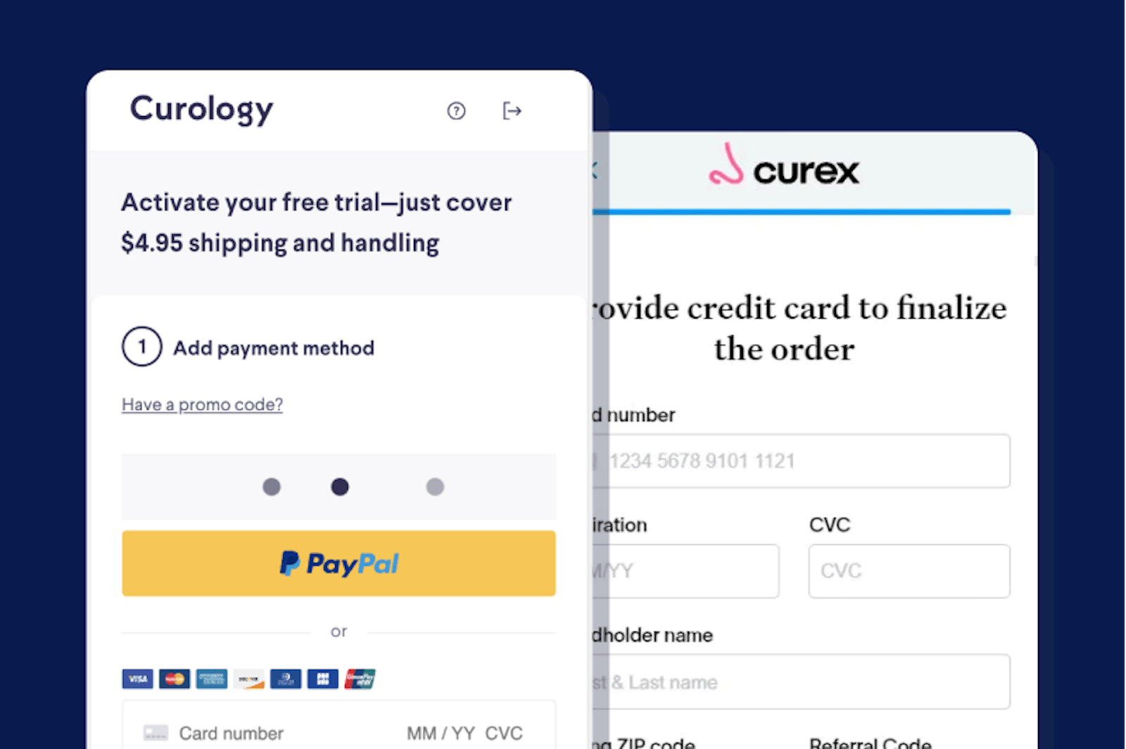
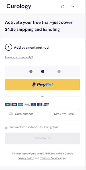
Curology lets customers check out as a guest for their first-time trial.
Rent the Runway and Warby Parker require account creation. This makes sense given their business model and the type of relationship they have with customers. Both companies attract passive shoppers who browse over a period of time and save multiple items before finalizing their purchases. Account creation lets their customers save these products in one convenient, secure place.
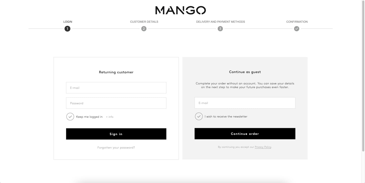
Mango offers both options, which is our recommended approach. This allows customers to choose their checkout preference.
Mobile-friendliness
Almost 80% of smartphone users have made a purchase online using their mobile device in the last 6 months. With the shift towards mobile shopping, e-commerce companies need to make sure their checkout experience is responsive to mobile devices.
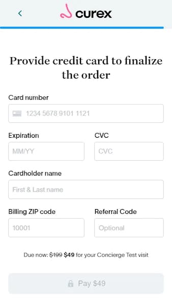
Great mobile checkout pages have minimalist, accessible designs that make the best use of the smaller screen real estate. We like Curex’s mobile checkout design for a few reasons:
- It has clearly outlined input fields that are organized logically
- It reiterates the purchase price (with the promotional pricing)
- It includes a blue progress bar up top to let customers understand how far along they are in the checkout process
Formsort’s Live Preview function lets teams see what their flow would look like across multiple devices. Dimension variables let you create re-usable units that can be made responsive across viewport sizes.
Autocomplete and pre-populated fields
The average user visits multiple sites in a day: clothing, furniture, skin care, travel. Entering the same personal information over and over can be cumbersome, especially for address fields.
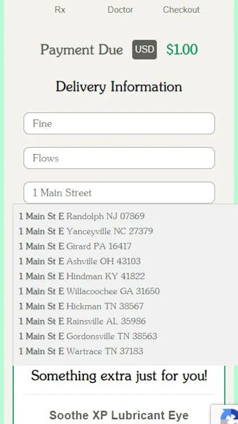
Address autocomplete accelerates this part of the checkout process by dynamically populating a customer’s address as they type it out. Hubble offers address autocomplete once a responder starts typing in the first address field (street address). Formsort’s Google Places API lets you offer address autocomplete in your forms.
Prefilling fields is another way to expedite the flow completion process. Formsort lets you pre-populate fields via two methods: URL parameters or through the body of a HTTP request.
Data validation
Don’t wait for customers to complete an entire checkout process to point out data entry errors. Instead, use form validation to surface input errors as soon as they happen.
Formsort lets you add data validation for common fields like email and phone number to make sure customers are entering accurate information and in the right format.
Security badges
Payment and shipping information is sensitive data, and customers want assurance that this information will be kept safe. Display security badges and other trust signals throughout the checkout flow to build confidence in your security measures.
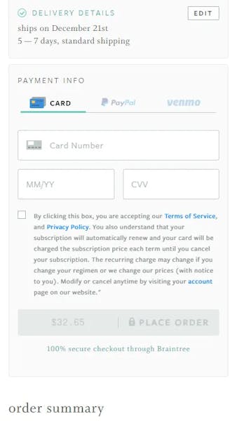
Curology and Function of Beauty both display trust signals in their checkout experience. Curology mentions their data encryption policy and features a “lock” symbol to highlight their security practices. Function of Beauty assures customers that checkout data is secure via their well-known third party payment partner, Braintree.
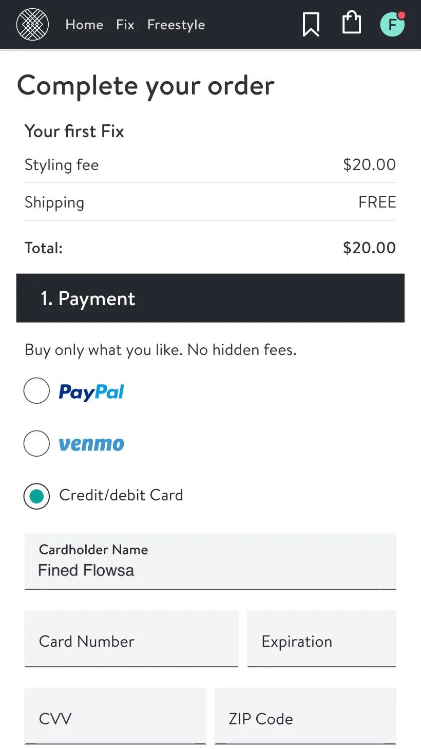
Multiple payment options and express checkout
Customers want to choose the payment method that works for them. Offer customers multiple payment methods, and feature the most popular payment methods first. Formsort’s Stripe integration lets you collect credit card information in the checkout phase of your flow.
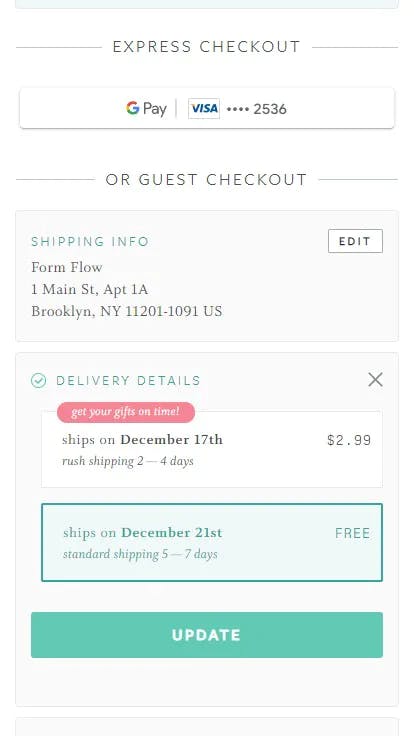
Express checkout is another way to accelerate the purchase process. By syncing with a popular wallet provider (e.g. Google Pay, Apple Pay) or a previously used credit card, express checkout processes let customers leverage previously entered payment information and complete purchase by clicking a few buttons.
Stitch Fix lets customers checkout via PayPal, Venmo or by using their credit/debit card. Function of Beauty offers express checkout via Google Pay or a previously used credit card on file.
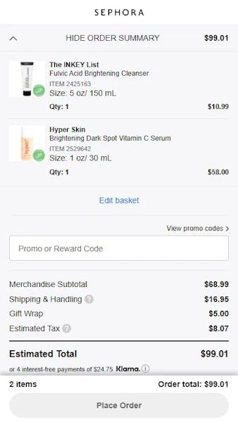
Order summary page
Order summary pages are a critical final step in the checkout process. They let customers ensure all of their personal and payment information is accurate and do a final check of the products and quantities in their cart. We like Sephora’s order summary page for its clean, straightforward layout.
Want to learn more?
Head to Fineflows for more checkout page inspiration.
Use Formsort and start building your checkout flow for free today.