Dropdown menu design: UX best practices
Sharing design tips and best practices for form dropdown menus
Form dropdown menus are one of the most commonly used UI components in forms. They’re fantastic for mobile interfaces because they take up minimal screen space. They also help automate the form experience - once a user chooses an option from the list, the field is automatically filled out for them. The answers produce structured data, keeping the form validation streamlined, and ensuring form design best practices are adhered to.
While form dropdowns are a great tool, it’s important to understand when and how to use them. In this article, we’ll describe what a form dropdown menu is and analyze some factors to consider before deciding to use form dropdown menus, as well as some design choices to think about as you build your form dropdowns.
We’ll also share some form dropdown best practice examples from Apostrophe, BetterHelp, Cove, Curlsmith, Ever/Body, Hims, HUM, Ladder, Nutrafol, Spill, and UpLift. For more inspiration, check out Fineflows, our design gallery featuring flows from around the internet.
What is a form dropdown menu or form dropdown field?
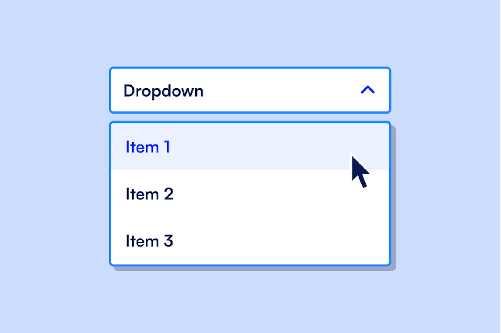
Form dropdown menus are one method of displaying multiple options for a user to select from. They’re composed of a couple of different design elements:
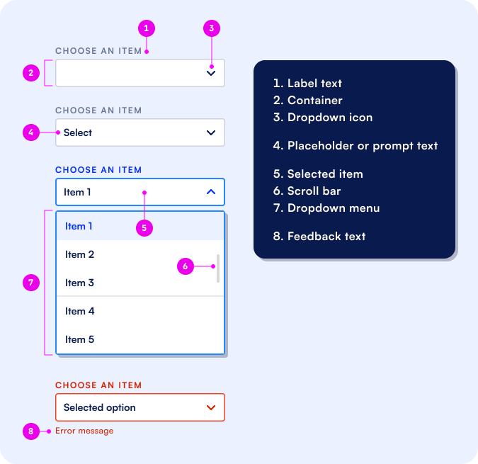
- Label text: This is the prompt for making choices in a dropdown. E.g. “Choose an item.”
- Container: This is where the user’s selected choice will appear.
- dropdown arrow: This signals to the user that the field is a dropdown and encourages them to click on the container and select from the menu.
- Placeholder text: This is another prompt letting the user know that the field is a dropdown.
- Scroll bar: This lets users know there are multiple options that they need to scroll through to see.
- Dropdown menu: This is the full set of options a responder can choose from.
- Search: Some dropdown menus allow search through a filter method.
Feedback text: Sometimes dropdown menus will include an error response if the dropdown is filled out incorrectly (for example, if a user doesn’t select an option). Formsort’s form validation feature lets you enable and customize this.
When should you use form dropdown menus vs other elements?
Here are some UX considerations when trying to determine the best type of input form field:
Jump to section:
- Use dropdowns menus for simple use cases
- Avoid dropdown menus for complex decisions
- Use dropdown menus for questions with more than 5 options
- Be careful when using form dropdowns for lists with more than 10 options
- Avoid dropdowns for commonly known values
- When should you opt for multi select dropdowns
- When should you use native dropdowns versus styled dropdowns
- How can you customize dropdown menus in Formsort
1. Use dropdowns menus for simple use cases:
Form dropdown UIs are best suited for easy selection and input - just choose an option and move on. This makes them a great fit for simple questions like picking a payment method during checkout.
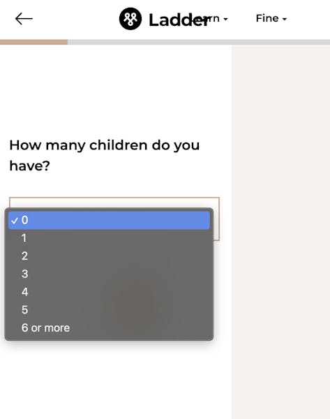
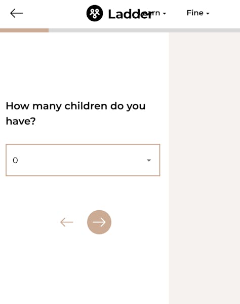
Ladder displays a 7-item dropdown list to let users select the number of children they have.
2. Avoid dropdown menus for complex decisions, like choosing a subscription plan:
- If a user has to make multiple decisions, or review multiple pieces of data to make a decision, each of these should be displayed separately. Form dropdowns aren’t appropriate for these use cases. This element has limited screen space and design flexibility, so forcing users to make multiple decisions within a dropdown can lead to an overwhelming user experience.
- In these cases, consider using a different element like a button.
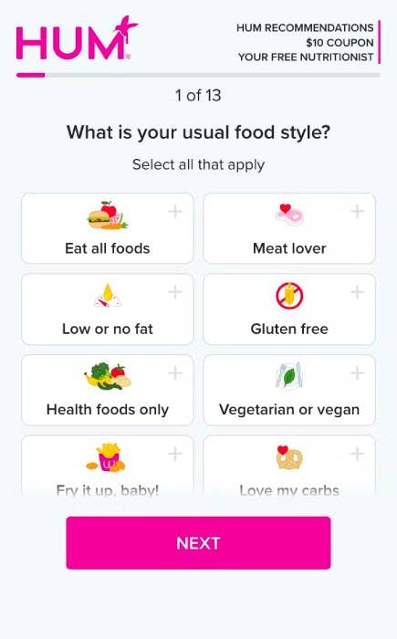
Below is an example from HUM where using buttons is a better design choice than using a dropdown menu. here using buttons for multi-select question. If more space is available, select questions with images like the one below is a great design choice.
3. Use dropdown menus for questions with more than 5 options:
- This is a general UX design rule of thumb and makes the list appear less intimidating.
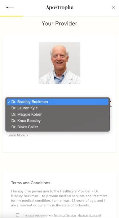
Curlsmith lets users select their geographical region from a 6-item list. Apostrophe’s list of providers has only 5 names but may include more or less within a small range at any given time, making a dropdown a good choice.
- If you have fewer than 5 options, don’t use dropdowns. Instead, show these options explicitly using a different UI component, like buttons. This is a better user experience because it reduces the number of clicks, and lets users see all available options immediately.
Cove uses radio buttons in their flow. A click anywhere within the oval component will be recognized.

4. On the flip-side, be careful when using form dropdowns for lists with more than 10 options:
- This can be information overload for users - they might lose track of all of the options as they scroll through the menu or it might just be easier and faster for them to type in the answer than to scroll. Sometimes, it might be appropriate use dynamic picklists that only show relevant options for the user.
As an example Ladder’s long list of mortgage balance can be substituted with integer input fields with some validations.

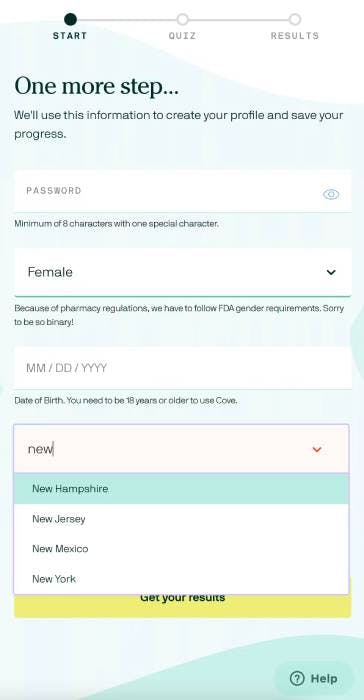
When you have a long list of items - like state or country of residence - consider using a different UI element like text input with auto-complete. If you still want to use dropdowns, pair them with auto-suggestion or auto-complete functionality. While this requires your team to develop more form validation, it makes for a faster form fill-out process and a better user experience.
For example, Cove’s state selection dropdown is easy to use because users can just type one or two letters of their state and the auto-suggestion feature shrinks the list to a much shorter one. The user can also just type out the state name.
5. Avoid dropdowns for commonly known values, like dates and age:
- Users are used to filling out this kind of information, and expect to answer these questions fairly quickly. Forcing users to complete this field using a long menu creates more work for them and can slow them down.
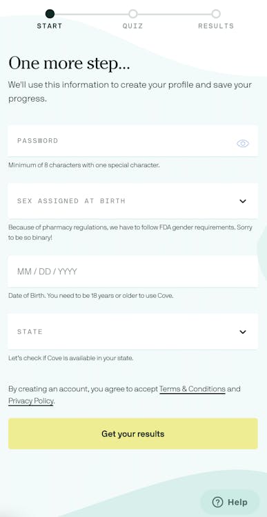
For biographical data, consider letting users type in the information in an input field. Cove’s date field works well for birth date values and other familiar dates. Notice that the placeholder text provides the acceptable format for the data.
`
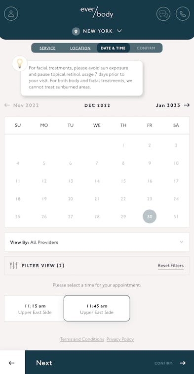
On the other hand, the date picker element is great for selecting travel dates or appointments, such as this one by Ever/Body.
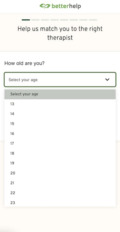
The BetterHelp age dropdown can be replaced with an integer input field with a minimum age limit validation.
6. When should you opt for multi-select dropdowns?
- Multi-select in dropdowns is an extension of checkboxes. It’s a great option when you want to let users choose multiple options, but you’re low on screen space. This often happens in mobile patient intake surveys: you want patients to select all of their symptoms, but don’t want to overwhelm the page with this question.
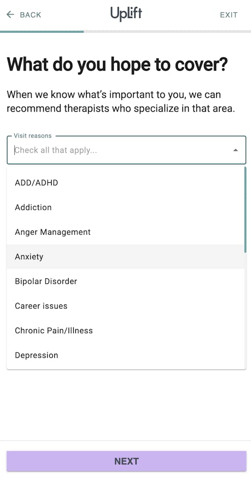
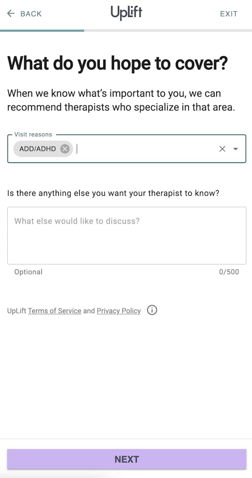
In UpLift’s multi-select dropdown, users have to click and scroll multiple times but this element choice makes sense within the limited screen space.
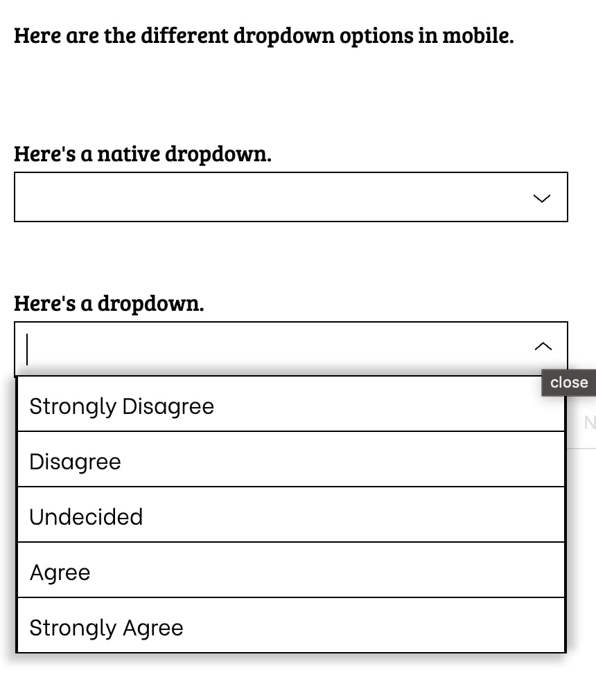
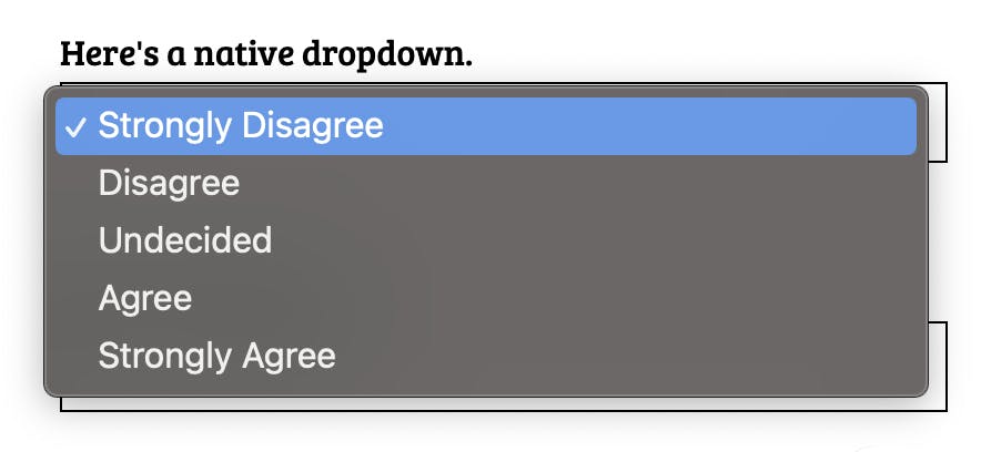
7. When should you use native dropdowns versus styled dropdowns?
- Using native dropdowns can often be a more pleasant experience for responders on mobile. A native dropdown is an element that’s part of the React Native framework. The native dropdown will inherit the UX of the operating system, which allows it to be used across different platforms. The styled dropdown will fix the choices to the top so that responders are not stuck scrolling within the scroll of the step. It is also more customizable to your overall form design.
How can you customize dropdown menus in Formsort?
Dropdown menus can be used in select questions within your Formsort flow. Dropdown menu items inherit from the input style by default, but can be overridden in the Menus section in the theme tab.
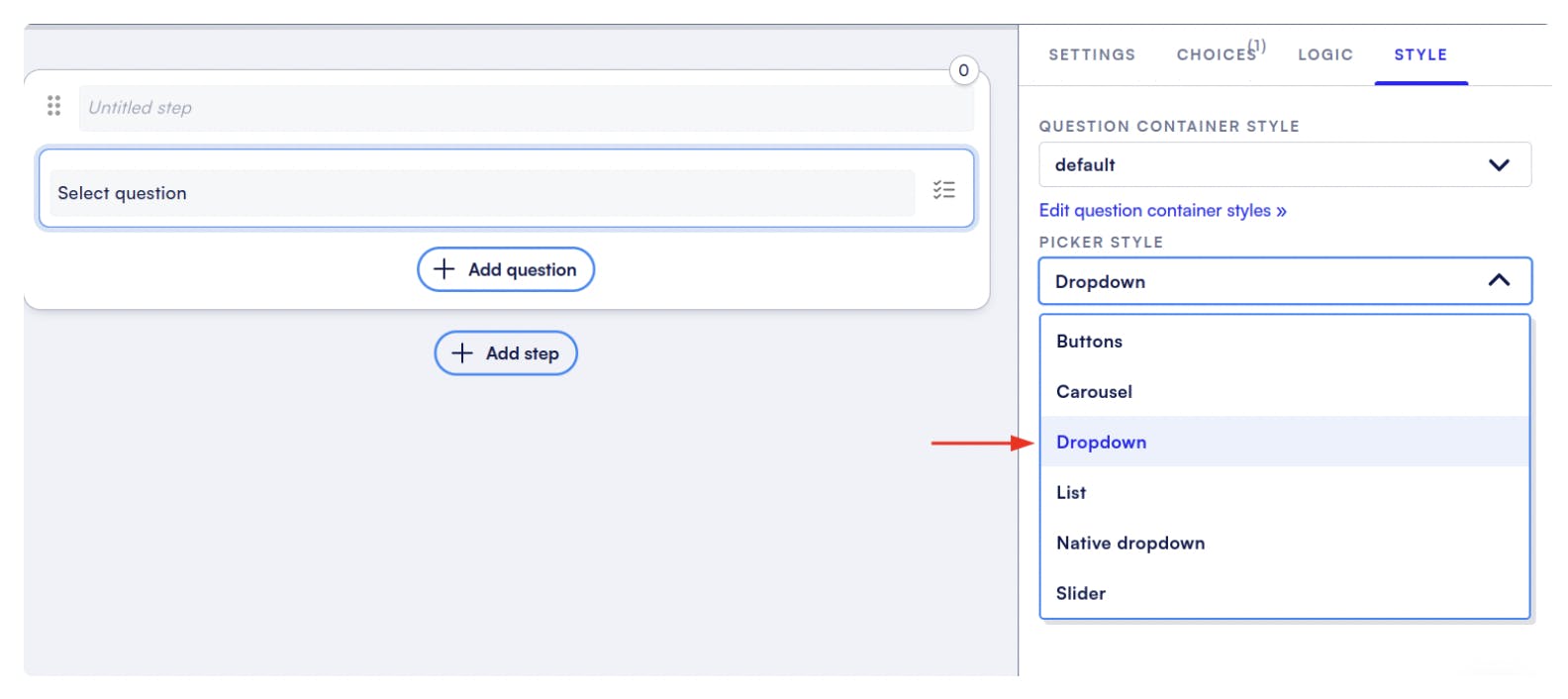
There are three key pieces to the menus: items, container, and input. Using the items tab, you can control how each of the options in the menu will look. Container tab will let you customize the box that the items are enclosed in. You can also use native dropdowns.
For more details, check out our documentation on dropdown menus.
Conclusion
Dropdowns are one of many possible select elements you can use to attain structured data from your flows. Find out more about how Formsort can help you optimize your flows or explore more flow design inspiration at Fineflows.