Designing effective tooltips

Using tooltips to clarify concepts in your flow and reduce form abandonment
If you’ve ever visited a bank or doctor’s office, there’s usually someone on-site who can help you fill out your intake form and explain any confusing terms. Tooltips perform a similar role when you’re filling out an online form.
Tooltips are discreet text boxes that pop up when a user hovers over or clicks on a help icon. They’re a great way to provide supplemental context in an unobtrusive way. However, some tooltips are designed as an afterthought, which can lead to long and clunky explanations that confuse rather than clarify users.
Read on for some tips on designing tooltips based on examples from our Fineflows design gallery: BetterHelp, Care/of, Function of Beauty, and Flyhomes.
What are tooltips?
Traditionally, “tooltips” have referred to graphical user interface (UI) elements that display text boxes when someone hovers over them. Since hovering only works on devices that have a mouse or keyboard, more and more websites have been implementing mobile-friendly “on-click” tooltips (also known as pop-up tips and popovers). This eliminates the need to create two separate UX designs and reduces the chance of errors.
Does the image below look familiar? Card verification value (CVV) is one of the most common tooltip examples on the internet.
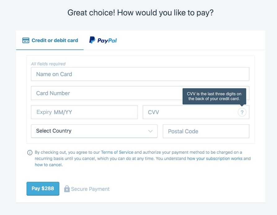
When a user hovers over the question mark symbol, a tooltip appears to explain what the CVV is. It gives new users the appropriate context to fill out the form, does not cover up other important information, and fits with the design of the page.
How to design effective tooltips
In order to effectively incorporate tooltips into your design, they need to be a part of your design process early on. Successful tooltips all encompass these three considerations:
- Clear purpose: Use tooltips to clarify a concept or explain why you’re asking for information.
- Effective timing: Identify the questions in your flow that need clarification or explanation and keep the text brief.
- Proper implementation: Use clear, concise language and noticeable but unobtrusive design.
We’ll elaborate on each of these in the next sections.
Clear purpose: why should you use tooltips?
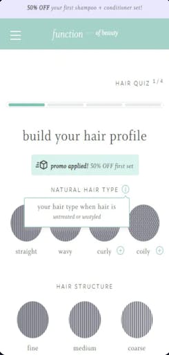
- Explain a concept: Tooltips can help explain complex concepts or terms that don't have a standard definition. Function of Beauty adds a reminder about hair types to help users select the most accurate description of their hair.
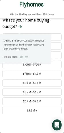
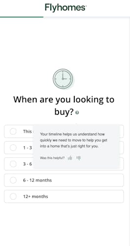
- Explain why you’re asking for information: Tooltips can also help explain why you’re asking for sensitive or personal information from users, thereby generating greater trust. This is very common in healthcare and financial services, where companies have to ask for detailed medical history or bank information during sign-up. Flyhomes uses a tooltip to explain how knowing a prospective customer’s budget for buying a home helps them serve the customer.
When should you not use tooltips?
Don’t add an extra hover or click unnecessarily - it creates more work for your responders. Skip tooltips if:
- the information is essential each time the page is accessed
- you have enough space on your screen
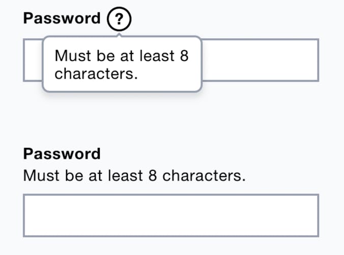
Password requirements are a great example of information that should not be hidden in a tooltip. They’re essential for account registration and are necessary each time the flow is used. Also, there’s usually enough space for them on the screen: short password requirements can be displayed as a placeholder in the password form field, as in the second example below.
Check out BetterHelp’s intake flow for another example. Since their flow is organized into single-question pages, there's plenty of space to add supplemental information. As a result, they display explanations right on the page instead of masking them under tooltips.

Proper timing: when should tooltips appear in your flow?
Figuring out where to place tooltips - the specific step of the flow and the specific location in that step - is a key question to address in the design process. Since tooltips aim to clarify your UX, appropriate context-setting is critical. A misplaced tooltip can create confusion.
The best tooltips are effective at providing:
- Contextual help: When you review your flow, identify points in your flow that might need clarifying information. A well-placed tooltip can explain why a certain question is being asked or why a particular feature appears on a page.
- Brief instructions for first-time users: Tooltips are a great way to quickly inform a first-time user about a specific question while staying out of the way of repeat users. If a user needs to enter an account number from a bill, for example, a tooltip can explain where to locate it on the bill. Keep the instructions short and direct, including only the most necessary information. This keeps the screen clutter-free and the flow moving.
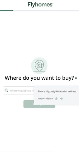
This Flyhomes tooltip provides a specific, short explanation of how to enter a location's address.
Appropriate implementation: how should tooltips appear in your flow?
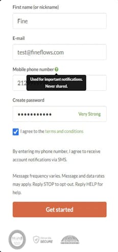
- Clear language: Remember that the tooltip’s job is to clarify. Use easy-to-understand, jargon-free wording to explain your concept or reasoning. Complicated, unclear language will do the opposite of what the tooltip is meant for. Flyhomes tooltips use clear, casual language.
- Noticeable but unobtrusive design: Tooltip icons are generally a question mark or an “i” for information and placed next to the question or prompt. The example below is obtrusive and covers up a key form field. While the explanation is valuable, it could have been more intuitive if it had been placed next to the question mark, instead of below the question mark (masking the phone number field).
Want to learn more?
Check out our Fineflows design gallery for more tooltip examples, and start building your first flow for free with Formsort.