Using sidebars in customer onboarding funnels
Tips for incorporating sidebars into your sign-up form based on Roman, Robinhood, and dbt.
Your app’s onboarding interface is valuable real estate, and designers are always experimenting with ways to make the most of this space. One common example of this is the sidebar.
Sidebars usually appear on either side of the screen in a desktop layout, and above or below other material in a mobile layout. They’re a great way to feature social proof, value props, and legal information on your website or app.
Not all flows have sidebars, but the most effective ones encourage customer sign-ups by adding valuable context and information. We analyzed the sidebars of Roman, Robinhood and DBT and shared our thoughts below.
We don’t think there’s one “right” way to design your onboarding experience. We built Formsort so you can play around with different options and see what works best for your product. Here’s some inspiration!
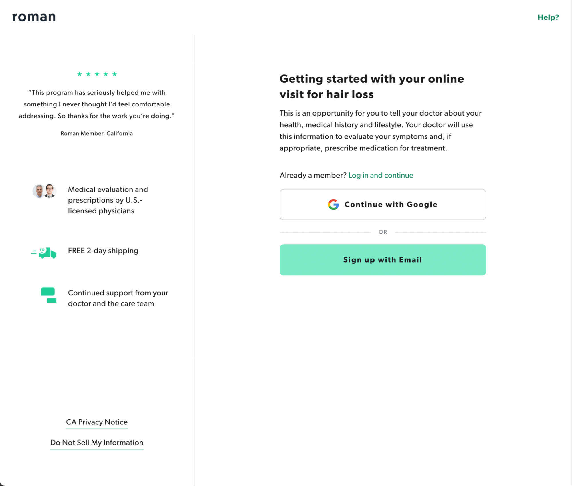
Roman
Hair loss treatment brand Roman uses a left-hand sidebar that features a customer testimonial, value props and legal disclosures. The sign-up form is on the right-hand side of the screen.
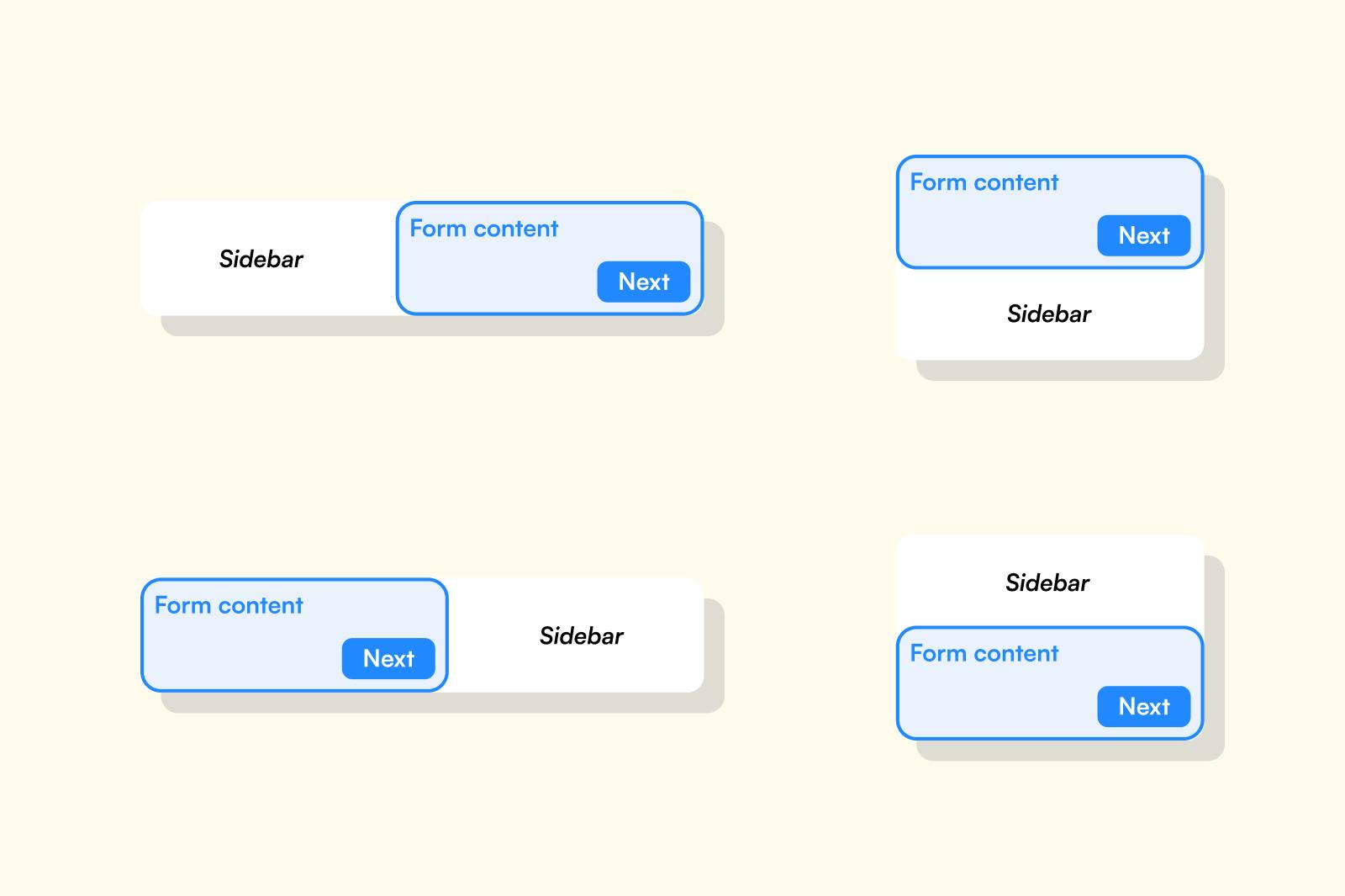
On mobile, the sidebar appears below the sign-up form and the content is condensed: the testimonial is the same, but only one value prop is featured and the legal disclosures are removed.

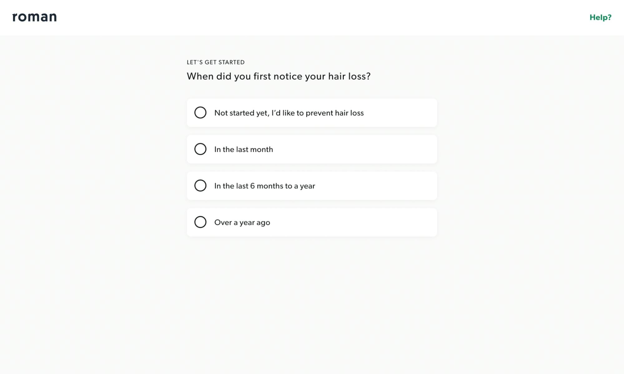
When the customer continues to the sign-up flow, the sidebar disappears, leaving a single column of form content on the screen.
What we like
- Customer reviews are prominent, showcasing social proof.
- Prominent product value props encourage customers to fill out the form and enter the funnel.
- A strong call-to-action flows smoothly to the sign-up form.
- Legal links are appropriately peripheral – easy to find, but not taking up valuable space.
- On mobile, the form precedes the sidebar information, prioritizing the main content and the launch of the customer journey.
- Transitioning from a two-column layout to a single-column layout keeps the customer’s attention on the form once credibility is established and it's time to focus on providing data.
Things to consider
- Having the sidebar on the left-hand side of the desktop version means it will be the first thing most customers will read. If it’s presented without context, it could waste valuable engagement time and appear cluttered.
- Transitioning a UI from single-column to two-column within the experience can feel inconsistent and jarring to a responder.
Takeaways
- Hair loss can be deeply personal, and a company like Roman needs to build trust with the customer quickly in order to encourage them to sign-up. Roman’s sidebar builds that trust through testimonials and product features such as ongoing medical support, and seals the deal with the promise of free shipping. It’s an excellent value add, especially in the more compact mobile layout.
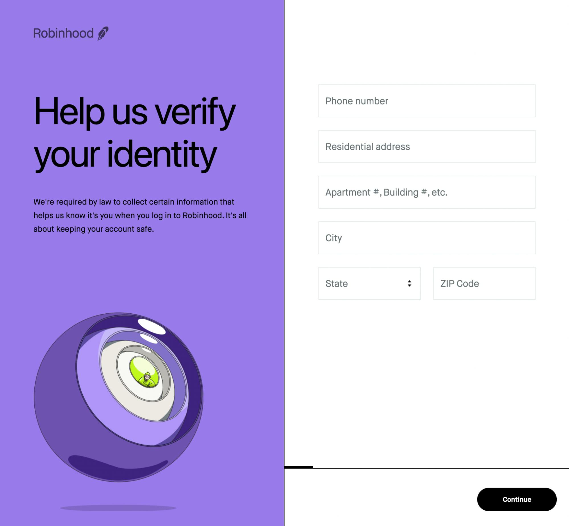
Robinhood
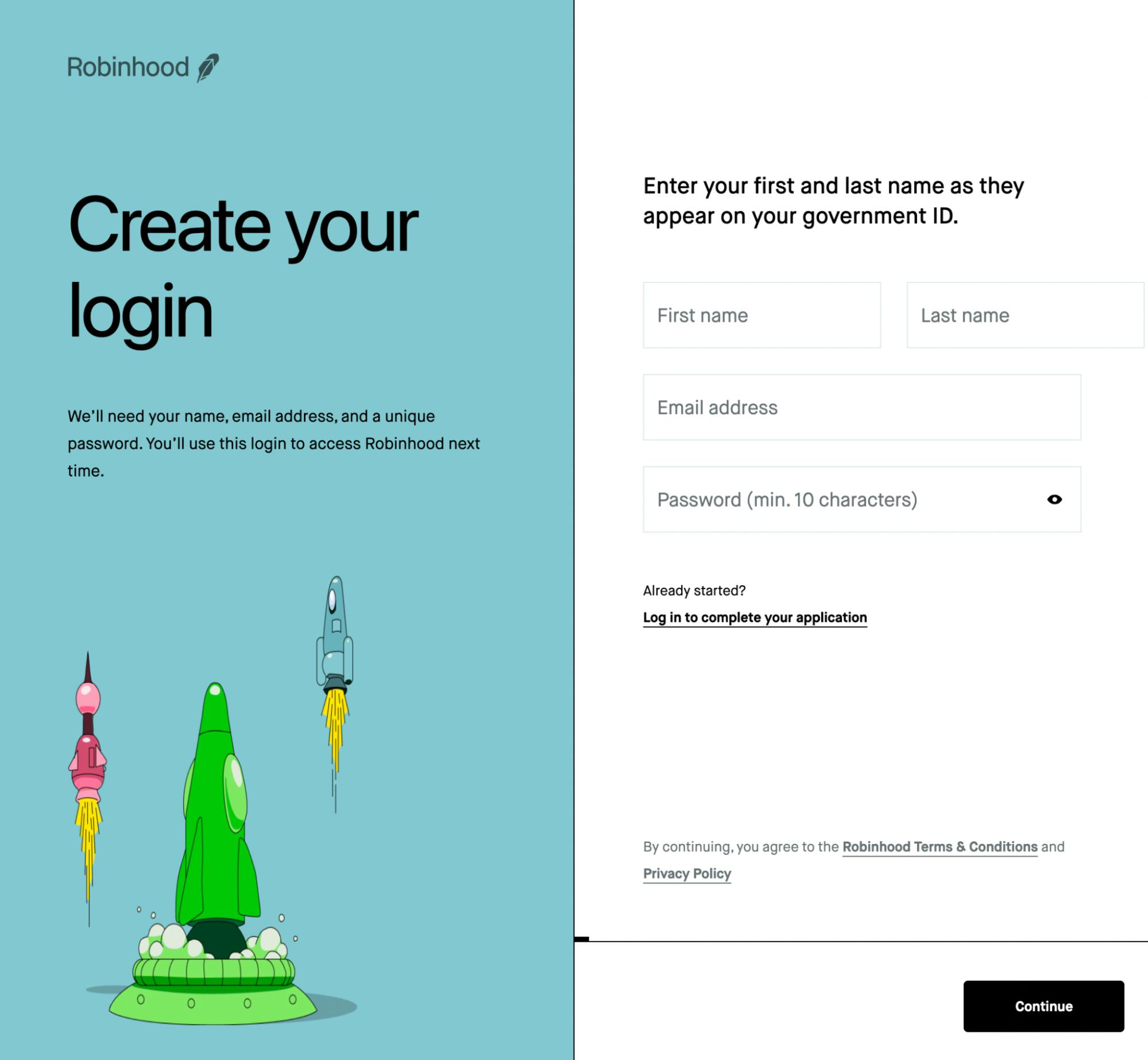
Investment app Robinhood uses a sidebar that appears only in a desktop/laptop format, but not on mobile. When it is present, the Robinhood sidebar appears on the left-hand side and consists of context-setting information and graphics.
On mobile, the graphic appears as a separate screen, and each piece of information is collected on its own screen.
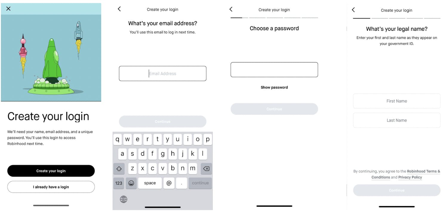
The sidebar continues for several screens in the desktop flow, with the color and graphic elements changing over time. This differentiation helps set the tone for each stage of onboarding.
What we like
The sidebar content sets the scene for the main content, priming the customer on what’s to come and what the UX will be like once they’re signed up.
The contrasting color of the sidebar sets it apart from the main content, while the graphics add personality.
Removing the sidebar for mobile may help guide the customer through the onboarding journey by creating a simpler sign-up process.
Things to consider
Not having a sidebar on mobile increases the number of screens customers have to go through, and could introduce friction in the sign-up process.
Takeaways
A contrasting sidebar is a great way to set your main content apart, and to integrate brand visuals.Changing the sidebar color at each stage of onboarding creates a visual progression for the customer.
TIP: A sidebar can set the tone for the main content. Tell your customer about the form they’re about to use, so they feel equipped and empowered to enter the funnel.
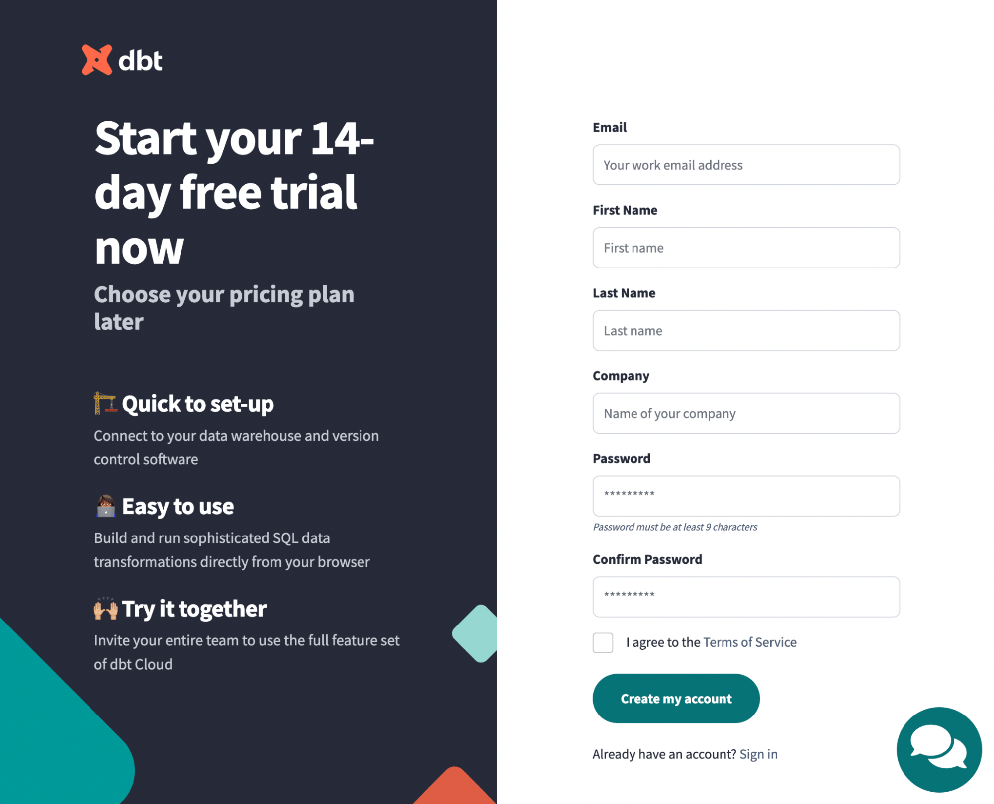
dbt
Database warehousing tool dbt uses a contrasting sidebar that highlights value props and brand colors while flowing smoothly into the main content on desktop.
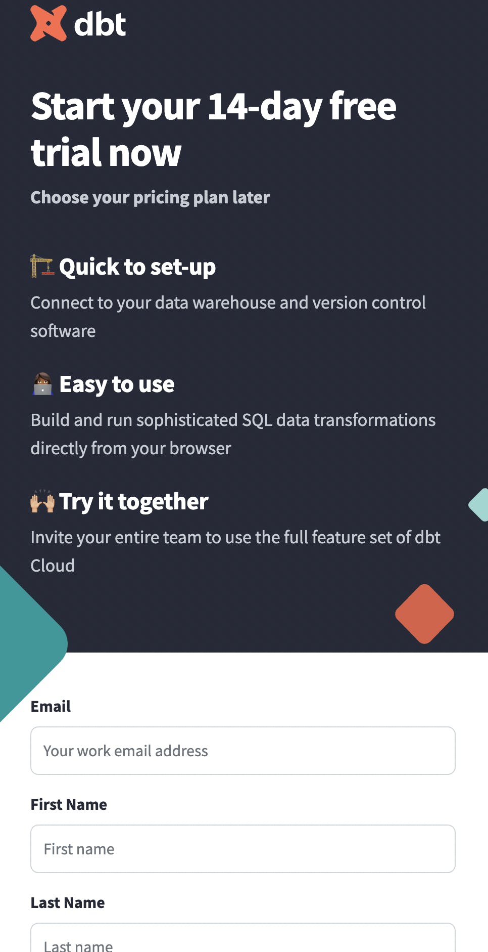
On mobile, however, the sidebar precedes the main content.
What we like
- The sidebar design features several value props.
- The use of brand colors and contrast adds personality to the page overall.
- The sidebar flows seamlessly into the main content.
Things to consider
- On mobile, the sidebar fills the entire screen. This may create more work for the customer, as the most important aspects of the page require users to scroll.
Takeaways
- If you choose to keep your mobile and desktop designs the same, it’s important to ensure that your sidebar content is truly essential, as it will bury the main content until users scroll.
Recap
Reasons to choose a sidebar
- Sidebars can provide important context, value props, and social proof that gets customers excited about your product.
- Sidebar graphics can set the tone for your brand.
- Optimizing a sidebar for specific devices ensures a more consistent customer journey across platforms.
Things to consider
- Cluttered or poorly-designed sidebars can distract users.
- A sidebar doesn’t always make sense on every step of the primary content.
Ready to experiment with some designs? Start building with Formsort!