10 Creative loading indicator examples for forms
Use loading indicator animation to engage and assure form responders while retrieving data
Most online forms have at least one step that processes user input and requires a short wait. Loading indicators keep users engaged during this time and ensure they don’t hop over to other sites. Plus, they’re a great opportunity to build brand awareness.
Loading indicators can be used while a process occurs in the background, such as saving form changes, generating quiz results, and submitting a form. Many of the most engaging flows we see have thoughtful animations in their loading indicators that either relate to content from the flow or inform users about the wait time.
Below we’ll share some best practices for designing forms with intuitive loading indicators based on the flows from Capsule, Fabric, Hims, Lemonade, Nourish, Persona, Proven, Rockets of Awesome, Warby Parker, and Waybetter.
What is a loading indicator?
Loading indicators, also called progress indicators, are animated visual tools that let users know that the system needs time to process the last user action. The process can be as simple as saving answers. In these use cases the wait time is usually a couple of seconds and the indicator design is simple. If the process is more sophisticated, such as running input data through an algorithm to display product or service recommendations, the wait time is normally several seconds long and the design is more involved.
Loading indicators offer 3 key advantages to the user experience:
- Loading indicators assure the user that the system is working and reduce the user’s uncertainty. By confirming something is happening, they provide a reason to wait for the system to finish. Lemonade informs users how different factors like age and geographic location are being incorporated into their quote calculation. This keeps users engaged and lets them know that their wait will be worth it.
- The visual stimulation is engaging and can even be made entertaining. They reduce users’ perception of time: users devote some cognitive resources to the feedback and they pay less attention to the wait itself. Stitch Fix’s graphic plus animated text engage the user while they wait for their results.
- They reinforce the message that someone is listening to users, that their individual responses contribute to formulating a unique set of product recommendations or services (source). For example, a Warby Parker loading indicator informs users that their input is being calculated to determine product recommendations and the next steps towards purchasing.
When should you use loading indicators?
Any process that takes more than one second should be paired with a loading indicator on the user interface. Why? When users feel uncertain for a couple of seconds, they may become frustrated or distracted by other sites. Dropoff risk can be mitigated by using a loading indicator. You should avoid using loading indicators for less than 1 second since they are difficult to read and may add confusion.
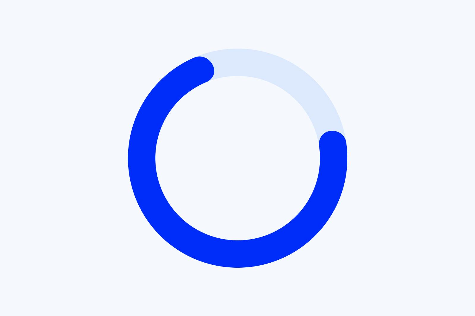
Proven uses a quick classic circular loading indicator before moving to the next step in the flow. This type is great for fast actions lasting just a couple of seconds. There’s a quick logo insertion at the end of the indicator. We might even suggest using the logo as part of the main animation.
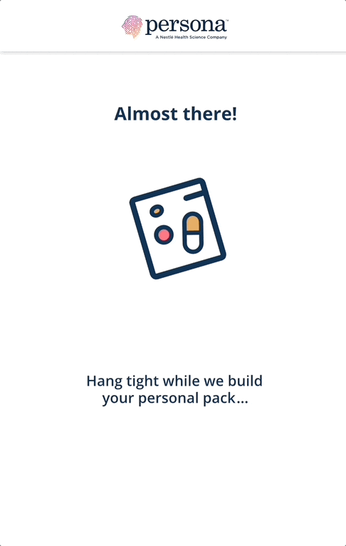
Persona’s loading indicator displays a progress bar to show how long the wait is. Using this type of indicator is ideal because the background process lasts several seconds. Notice also that the design is brand-aligned and a message lets users know that a product recommendation is being developed white they wait.
Which types of loading indicators are available for forms?
There are 3 main types of loading indicators we typically see and they correlate to the length of the background processes they’re used for: looped animation, educational informational screens, and percent-done indicators. The design you choose ultimately depends on how long the loading process will take, with looped animations usually recommended for short processes and percent-done indicators for the longest.
Whichever indicator you use, ensure that the animation is smooth. It’s a good idea to align the timing with the background process (Source). For instance, if users expect the calculations to take a while based on the amount of information they entered or the perceived importance of the results (e.g. credit check), implement a longer-running indicator.
Looped animation loading indicators:
Looped animation loading indicators show an animated graphic on repeat. It’s a quick way to let users know that the system is working on something, but it doesn’t share any estimate about how long users will have to wait. This is a good option for short loading times (<5 seconds), but not a great option for longer loading times, as users may get impatient.
Lemonade uses a simple circular loading indicator after each question, indicating to the user that their input is being added to the database. This kind of loading indicator works well with their conditional routing.
Educational informational screen loading indicators:
Informational screens are a powerful way to educate users on your brand’s product offering while background processes occur. They’re usually a single page in between steps of a flow and can incorporate text, audio, and/or dynamic visual content. They typically reinforce something that was shared in the previous step.
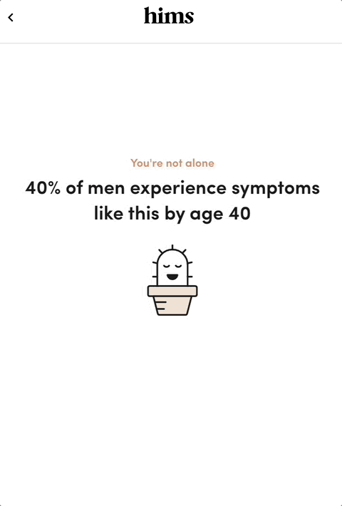
Hims’ informational screen at the beginning of their flow is a great example of educational information as a loading indicator. By sharing a quick statistic on the prevalence of ED, it helps normalize the problem and makes prospective users feel like they’re not alone.
You can easily build informational screens between steps in Formsort by using various content types: video, images, and more.
Percent-done loading indicators:
Percent-done progress indicators are the most informative type of wait-animation feedback. They convey important information about approximately how long the wait time is. This information gives users control–that is, they can decide whether to wait or not–and decreases uncertainty about the length of the process and may reduce the perceived wait time.
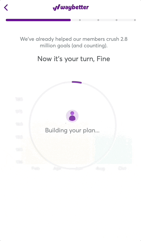
Waybetter’s percent-done indicator occurs right before generating personalized results for the user. The circular status bar gives users a sense of the time remaining, while the text and background image give the user a sneak peak of what’s in store after the wait.
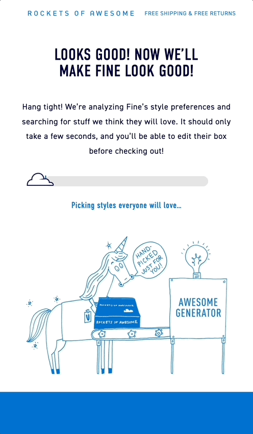
The Rockets of Awesome unique sliding cloud indicator moves along at varied speeds to imply some parts of the process take longer than others. The text explains what is happening in the background while the animated image is on brand.
Ready to build forms with loading indicators with Formsort?
Loading indicators are a great tool to engage and assure users while your form processes information in the background. See how you can use Formsort, a form builder for designers, to easily create looped animation, educational screen, and percent done indicators for your form here. Discover more design inspiration at Fineflows.