10 best patient intake form examples
How to create effective online healthcare forms - learn from patient intake form examples
Patient intake forms play an invaluable role in gathering essential information about patients. Advancements in technology and a focus on patient-centered care (or value-based care) have changed the way healthcare facilities collect data from their patients and leads. In this article, we explore 10 patient intake form examples that highlight healthcare providers' approaches to streamline the intake process, enhance patient engagement, and improve the overall quality of care.
Health intake forms allows digital healthcare companies to securely obtain patient data, qualify them, and get them into the service (or out) quickly. While the form length and question types depend on the needs of your company and patients, some design features have helped top online healthcare providers educate, establish trust, and convert more effectively.
We’ll highlight 10 digital health companies that are building effective patient intake forms to optimize the patient intake process: Nourish, Hims, Origin, Picnic, Arise, Forward, Innerwell, Nutrafol, Marley Medical, and Persona.
What should an online healthcare patient intake form include?
The patient intake form is a place of valuable information exchange between healthcare companies and potential clients, enabling both parties to determine if the services are a good fit for the patient. A patient should have a clear idea of a company’s services, brand, and prices. The healthcare company should have the information needed to communicate with, qualify, and provide service to the patients in an efficient manner.
A patient intake form usually includes:
- Personal Information: Gather basic details such as the patient's full name, date of birth, gender, and contact information (phone number, email, address).
- Medical History: Ask patients about their medical history, including past diagnoses, current medications, allergies, and chronic conditions to the extent that it is relevant to the services being provided.
- Current Symptoms: Have the patient describe their current symptoms or the reason they are seeking digital health services. This information will assist the healthcare provider in assessing the situation and providing appropriate virtual care.
- Insurance and Billing: Collect insurance information, policy numbers, and billing information. This ensures a smooth reimbursement process and helps the provider verify coverage.
- Consent and Authorization: Obtain patient consent for relevant services.
- Privacy and Security: Inform patients about the digital health company's privacy policy and how their personal and medical information will be protected.
Keep in mind that the specific requirements and components may vary depending on the services that the digital health company offers, as well as legal compliance and privacy standards. To ensure comprehensive and secure data collection, the patient intake form should be customized to the business's needs and policies.
HIPAA-compliance is an important factor in healthcare intake forms if you are US based or servicing US patients. Whether you build in-house or using a platform, you will need to ensure your entire tech stack is HIPAA-compliant, including all integrations. Find out more about Formsort's HIPAA compliant form builder features.
How to create an effective patient intake form?
- Make it simple and easy to use.
- Personalize it according to each patient's journey.
- Optimize for mobile devices.
- Provide clear instructions and guidance.
- Ask only relevant questions.
- Validate data and display error messages.
- Emphasize privacy and security.
- Use patient-friendly language. Avoid medical jargon.
- Use progress indicators.
- Analyze, optimize, and iterate the patient intake form.
Best practices and form design trends from 10 patient intake form examples
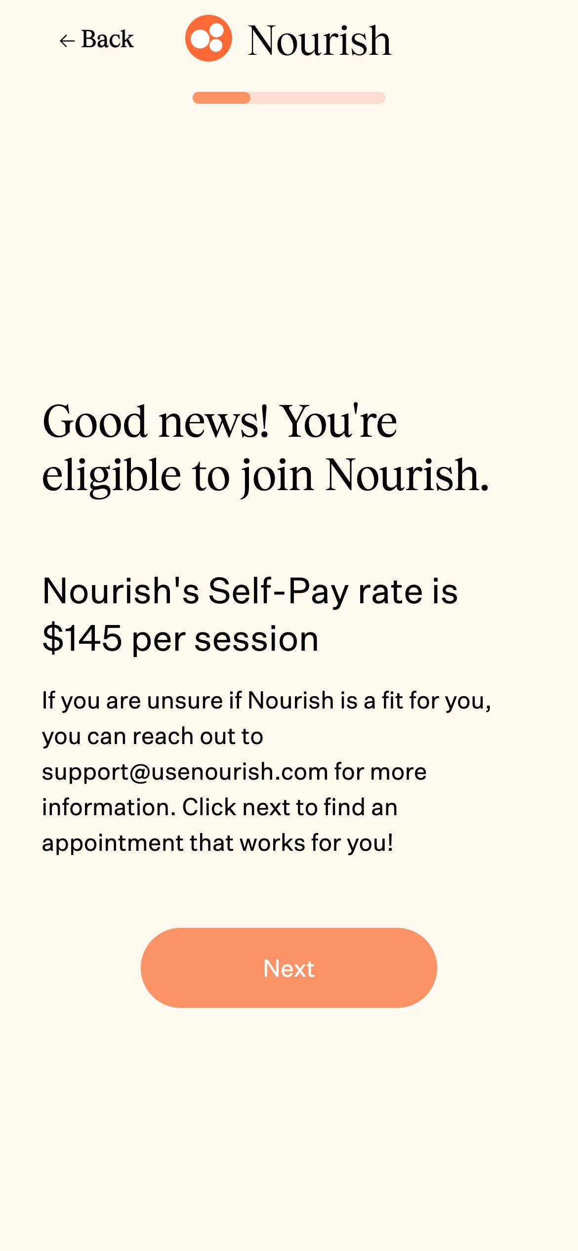
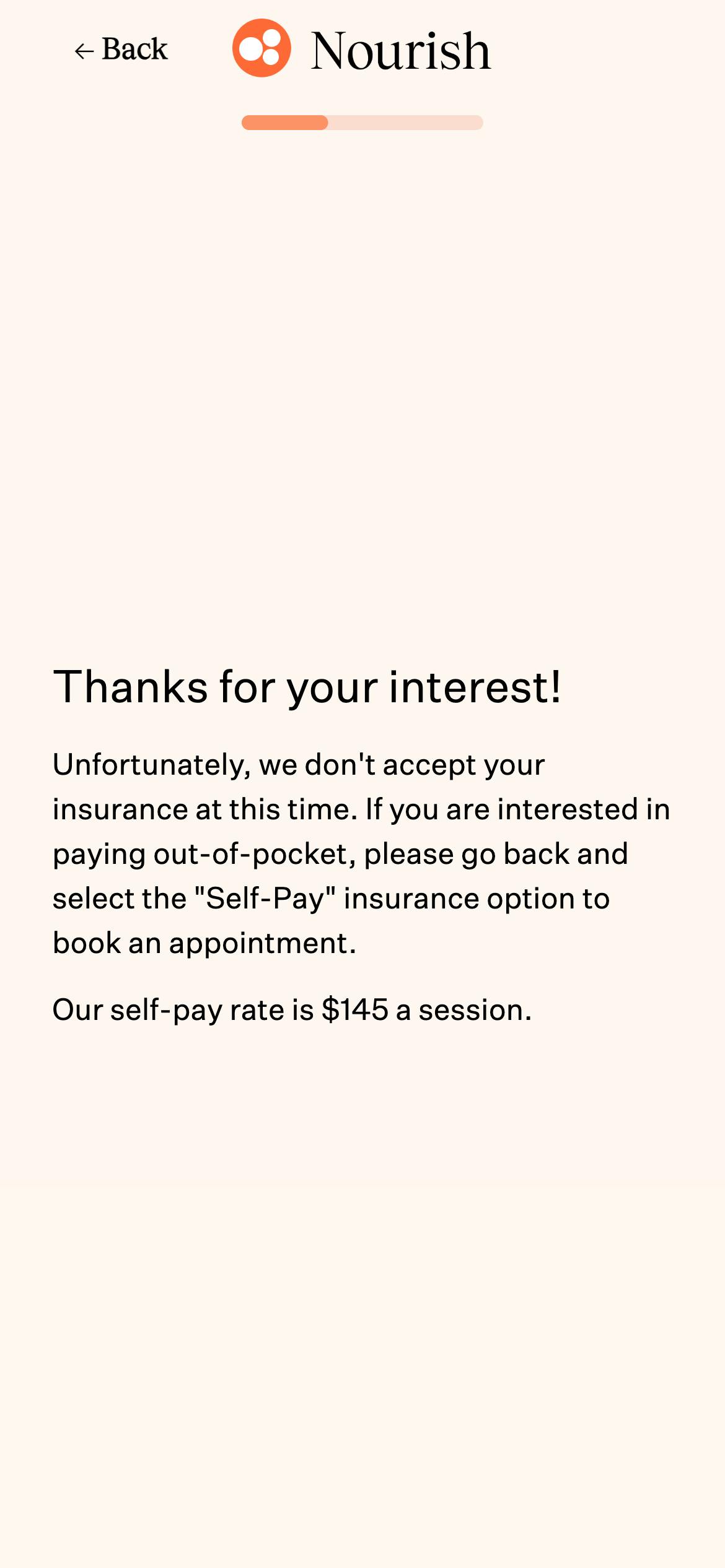
1. Nourish
Industry
Nutritional counseling.
About Nourish
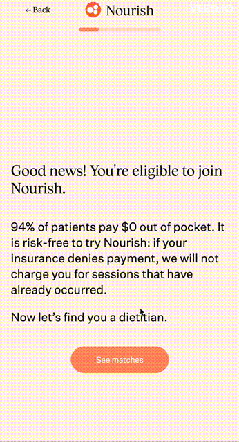
Nourish pairs clients with nutritionists who provide long-term habit-changing nutritional support for weight loss and a healthier lifestyle. Warm and upbeat, Nourish’s intake form has a quick few steps to qualify responders and then it “celebrates” the qualification with confetti. Immediately after, they collect email, phone number, and insurance details. This way, they can reach out to any lead that doesn’t complete the form.
Standout design features
Conditional routing
Logic that directs responders to different pages based on their input lets Nourish inform users if their insurance has been accepted or not, or the self-pay rate if applicable. Conditional logic is a powerful tool that helps build highly-customizable, streamlined flows. You can read more about conditional routing here.
Confetti animation
This is a fun and easy way to stand out in the crowd. Nourish “celebrates” with confetti once a user qualifies for their service. Many companies use confetti or other similar animations to mark significant points of relationship building with their prospective customers.
Auto-suggest filters
Since users today are completing countless online forms, it’s a good idea to expedite filling out common fields as much as possible. That’s why adding supports like field auto-suggest and auto-complete to dropdown lists is so important. Nourish uses this feature in their state and insurance selection drop-down menus.
Reassuring language
Nourish explains why certain information is needed, and they even offer a money back guarantee if insurance refuses to pay. This is an effective way to build trust with patients.
Leveling up
One quick way to personalize the flow even further is to add some dynamically filled messages. So for example, the confetti page can read “Good news {{first_name}}!” This is an easy customization that creates a stronger relationship between the company and the potential customer.
2. Hims
Industry
Men's health and wellness.
About Hims
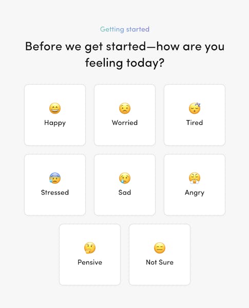
Hims provides a subscription-based treatment plan for various mens’ health concerns, including hair loss, erectile dysfunction, and mental health. Their mental health intake flow collects information about responders’ symptoms, struggles, and medical history. With information presented in a variety of formats, layouts, and styles, this form keeps users engaged and interested.
Standout design features
Select buttons with different elements (Emojis)
Select buttons displaying emojis can provide several benefits, including improved user comprehension and engagement, simplified response selection, and enhanced communication of emotions or sentiments..These simple graphics are relatable, adding personality and emotion.
Animated interstitials
These pages are entertaining transitions between sections that can give a brief brain break in long flows. Animation can improve user experience and alleviate fatigue by providing visual stimulation and diversion from a potentially long and monotonous process. In addition to preventing cognitive overload, animated interstitials can maintain patient engagement and make form-filling more enjoyable and positive.
Informational labels
Traditionally, tooltips are used to add supplemental information about questions. They can help users understand what format the answer should be in or provide context for why they’re being asked. But they can add friction to the process because they pop up only when a mouse hovers over them–this means they’re also not mobile-friendly. By incorporating this text directly into the step, Hims minimizes friction and ensures users have the essential context they need to understand and answer questions.
Leveling up
Currently, Hims does not allow a returning responder to continue the intake form from where they left off. Data is also lost if responders refresh the page. That can be a missed opportunity because data loss is a significant cause of drop off. We’d love to see Hims introduce a data save feature for returning responders so that users can continue flows from where they left off. This can improve conversion rates, especially in longer and more complicated flows.
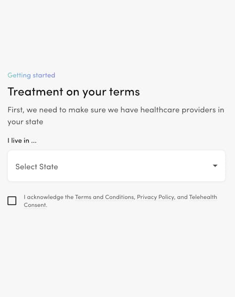
3. Origin
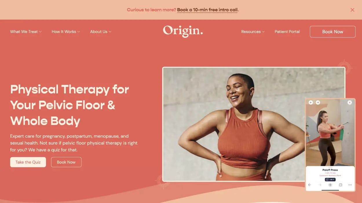
Industry
Women’s health startup
About Origin
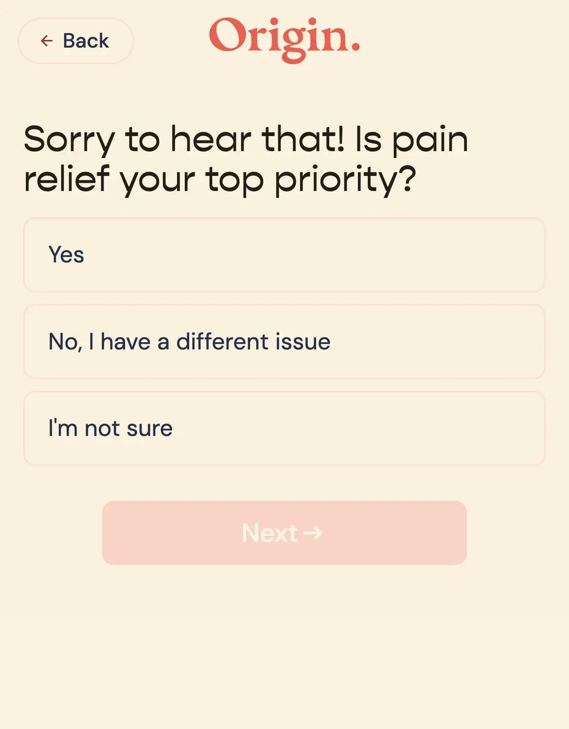
Origin's pelvic floor and whole-body physical therapy is available to women and individuals with vaginal anatomy at various stages of life, such as pregnancy, postpartum, menopause, and sexual health. Origin emphasizes the importance of pelvic floor physical therapy, providing both in-person and virtual care to people aged 18+ with vaginal anatomy.
Standout design features
User-friendly language
Origin's approach to discussing sensitive health issues is impressive. They recognize the importance of addressing the unique health journeys of women and individuals with vaginal anatomy with respect and understanding. Their communication, especially during the intake process, is designed to be comforting and reassuring. This acknowledges the personal nature of pelvic health and the potential discomfort in discussing it. The tone of empathy and care is essential to building trust and encouraging individuals to share accurate and necessary information for personalized care.
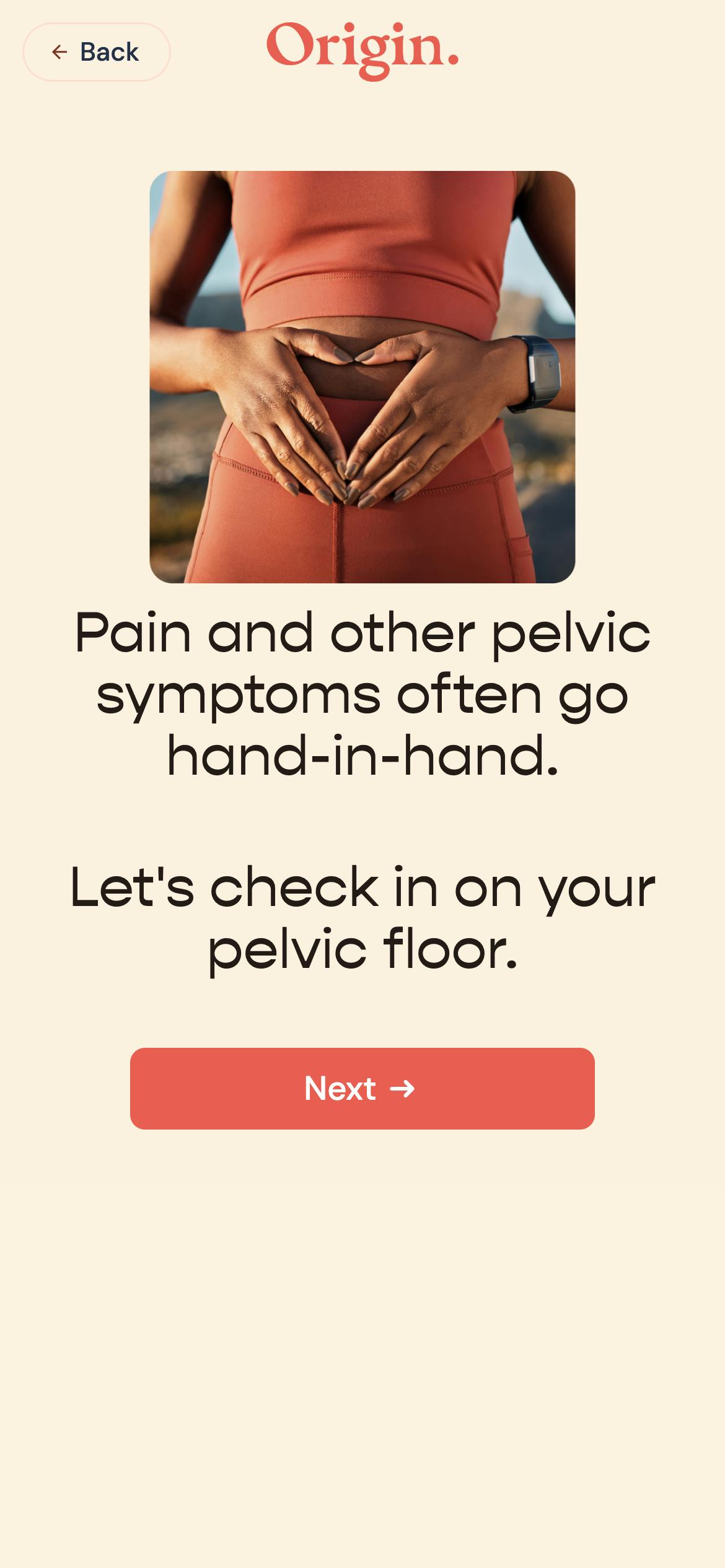
Personalized customer journey
Through their intake form, Origin creates a personalized customer journey tailored to each customer's specific health stage and concerns by asking relevant questions. According to the responses provided, the form dynamically adjusts, ensuring that follow-up questions are relevant to each individual. By taking this personalized approach to form filling, Origin can collect precise information necessary to customize care plans while making the form filling process more engaging.
Leveling up
Origin may consider adding a progress indicator to their intake form to enhance customer experience. Customers could see how far they have progressed through the form and how much is left to complete with this simple yet effective feature. By giving responders a sense of accomplishment as they move through the sections, a progress indicator sets expectations, reduce frustration, and encourage completion.
4. Picnic
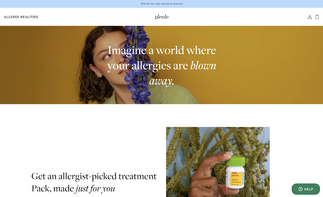
Industry
Allergy care.
About Picnic
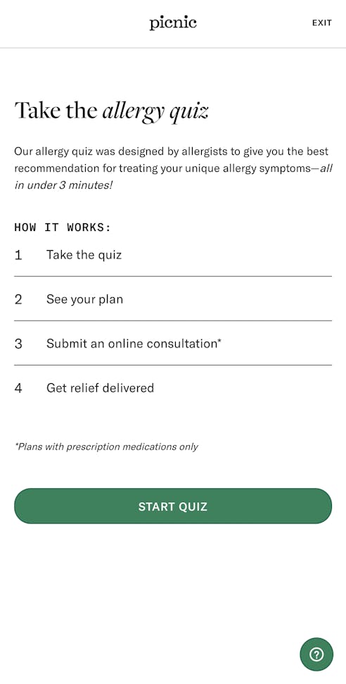
Picnic is an allergy treatment company that provides prescription and over-the-counter medicines and treatment plans. Designed by allergists, this detailed intake form produces treatment recommendations as well as doctor consultation services. The comprehensive form, with specific questions about symptoms and treatment history, builds confidence in the expertise of the service.
Standout design features
Preview
Picnic’s preview lists the exact steps a potential client can expect, reducing uncertainty in the onboarding process.
Inline tooltips
Tooltips are a great way to clarify medical/technical terms or explain why a question is being asked but the need to hover or click adds friction and isn’t responsive to all devices. Picnic’s no-friction tips are added to the bottom of the step, providing insights and clarifications seamlessly.
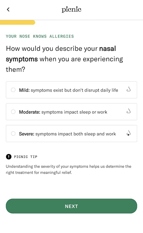
Select buttons with text-supporting Icons
Icons help communicate the meaning of terms and create a vocabulary of on-brand images. They’re also more visually appealing and make the form-filling experience more enjoyable.
Leveling up
Picnic’s intake form is such an effective one for patient onboarding, we’d love to see a prominent call-to-action (CTA) on the homepage to direct users into the form quickly. Adding data validation, such as preventing birth dates from the future from being entered, would also streamline their flow.
5. Arise
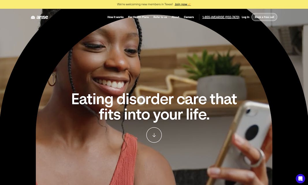
Industry
Eating disorder and mental health.
About Arise
Arise is a young, innovative digital healthcare company specializing in eating disorder care. Their flow qualifies potential customers efficiently–each field a user fills out at the start of the form either moves them forward in the qualification process or ends it.
Standout design features
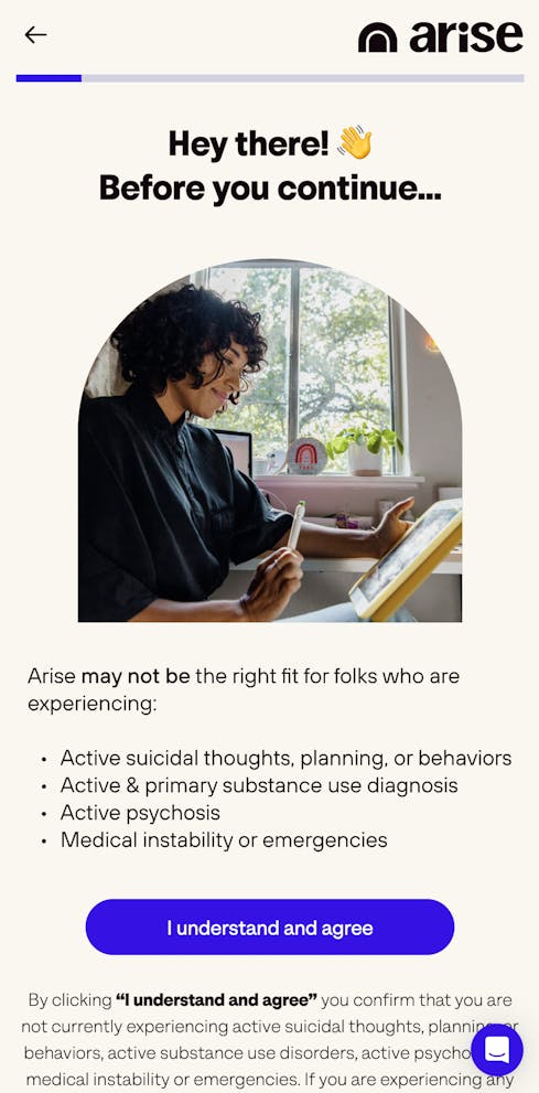
Explicit Consent agreement
Arise’s explicit click wrap agreement brings attention to emergency mental health situations. This legally binding electronic agreement both ensures users know the scope of the services Arise provides and protects the provider. Resources for emergency conditions are also linked in the welcome screen.
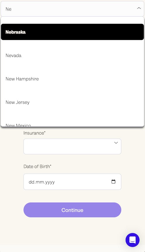
Auto-suggest filter
A dropdown list is a good idea when there are more than 7 options in a select question. Adding autocomplete to this dropdown saves time, improves accuracy, efficiency, consistency, and flexibility. The user can quickly locate and select desired options without having to scroll manually, which improves efficiency. Arise’s auto-complete feature is quick and easy to use.
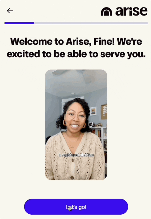
Video introductions
A video introduction of a potential caregiver is key to building trust with potential patients and establishing a personal connection. These videos allow patients to see and hear the caregivers directly, humanizing the experience and creating a sense of familiarity before the actual appointment. This might help convert more leads.
Handling unqualified leads
Including resources for non-qualifying users is a great way to support responders who don’t qualify for Arise’s services and to maintain an ongoing relationship with them. By that point, email addresses have been collected so those users can be contacted in the future when services can cover them.
Leveling up
We recommend adding data validation for Arise’s date of birth selector, at least to prevent entering dates in the future.
6. Forward
Industry
Virtual primary care.
About Forward
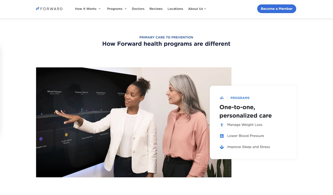
Online platforms like Forward can be a convenient way to seek medical advice right from home. They offer virtual health care services supplemented by onsite visits when needed. Forward’s distinctive proactive approach includes genetic testing and integration with health apps to support long-term health management. Their intake flow educates responders about these features as it collects important patient data.
Standout design features
Prominent CTA
Forward’s homepage has a large, prominent call to action (CTA) button that leads to their intake flow. Asking “Are you a candidate?” on the button is a great way to engage site visitors and invite them to the intake flow.
Interstitials
Forward’s interstitials are dynamically displayed, meaning they incorporate answers provided by the responder. Dynamic interstitials can make responders feel like you are “listening” to them in a conversation about their health. Creating a sense of information exchange and feedback can significantly increase engagement with the flow. Learn more about interstitials here.
Graphics
Informational graphics and images can help communicate important ideas and engage users. Forward’s charts, photos, and diagrams are thoughtfully created to add value to their flow.
Leveling up
If the Forward flow collects email addresses at the beginning, the team can follow up with people dropping off. Responders can abandon forms for a variety of reasons, including not having enough time or getting stuck on a question that feels irrelevant or sensitive. Studies show that about 20% of responders will return and complete a form if the sales team emails them, especially with a link to their partially-filled form.
7. Innerwell
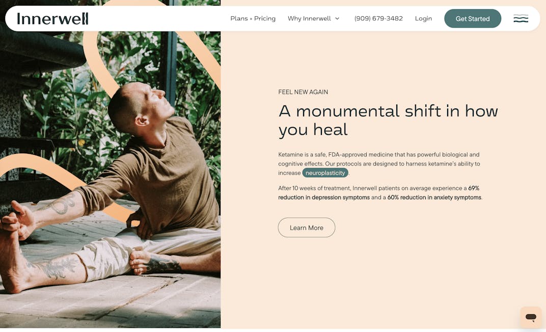
Industry
Psychedelic teletherapy.
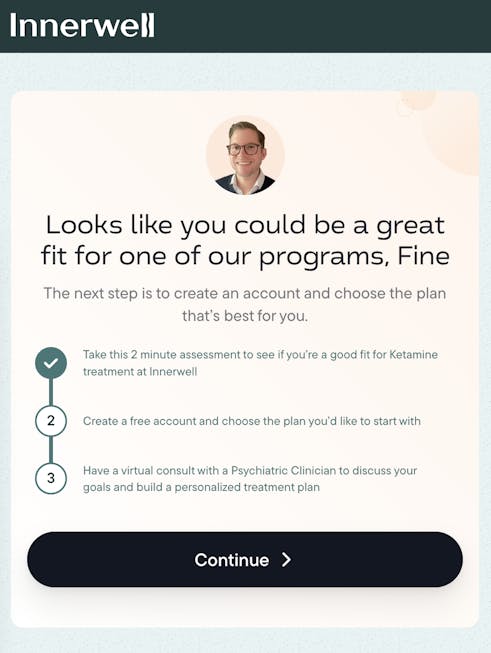
About Innerwell
Offering ketamine-based treatment plans for anxiety, depression, PTSD, and other mental health struggles, Innerwell showcases an array of psychedelic therapy while destigmatizing this area of healthcare. Their flow provides important information about the niche product, helping responders make an informed decision.
Standout design features
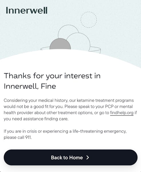
Transparency and support
This intake form educates as it qualifies. It explains that ketamine therapy is a safe and effective form of treatment and also identifies populations that the treatment would not be suitable for. This upfront communication about risk factors builds trust with prospective customers. Including external resources for responders who need help but may not be candidates for ketamine therapy shows their commitment to providing care. Learn more about how Innerwell uses conditional routing logic to handle their qualification process here.
Preview and progress bar
The importance of informing users of a flow's expected length can’t be stressed enough. Innerwell’s transparency extends to its flow. They state that the qualification process is just 2 minutes, meaning they’re not going to waste responders’ time with a full onboarding form if there isn’t a fit. A progress bar shows responders where they are in the flow and an informational page previews the steps after qualification.
Data validation
Secure passwords are essential to protecting client data. Innerwell uses data validation to validate requirements to user-created passwords to ensure only secure passwords are set.
Leveling up
We’d recommend Innerwell add placeholder text that indicates the valid format for the date fields. They already have data validation code written and display error messages depending on the actual error. Displaying the correct format would help get valid data the first time.
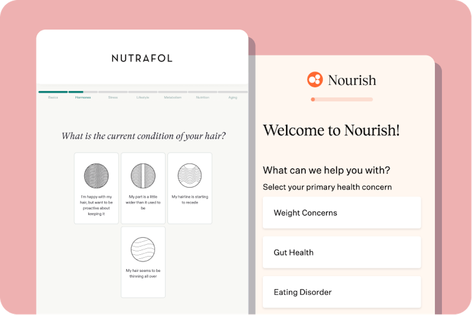
8. Nutrafol
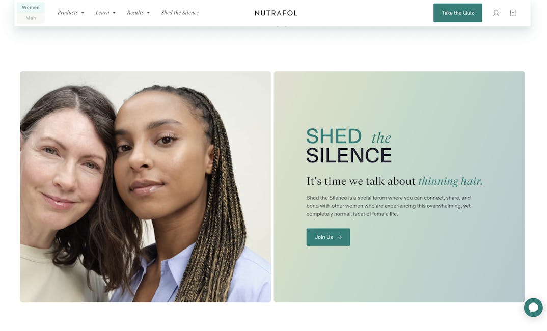
Industry
Hair growth and wellness.
About Nutrafol
Nutrafol’s hair treatment supplements are plant-based and customized for different ages and physiologies. Their comprehensive intake form is conveniently organized by sections and a progress bar shows where a responder is in the flow as well as the section breaks.
Standout design features
Animation and icons
This long intake form uses animation to make the experience seem to move faster. Images supplement text to engage responders and help them provide accurate data.
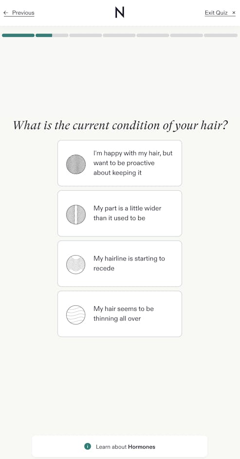
Informational pop-ups
Nutrafol’s detailed informational pages build credibility and trust while educating the user and helping them make the right hair treatment decision.
Retain disqualified customers for future outreach
It’s a great idea to get contact information for disqualified responders. Whether they have a temporary disqualifying status like pregnancy or future products and services might be appropriate, collecting emails from disqualified leads allows for future opportunities as both customer needs and company capabilities may change over time.
See how you can use conditional logic to display different pages based on responder input.
Leveling up
Clear question labels and instructions in forms are essential for improved user understanding and accurate responses. Nutrafol can enhance their email field at the end of their quiz by stating explicitly they are asking for an email address and including a placeholder to show the correct format.
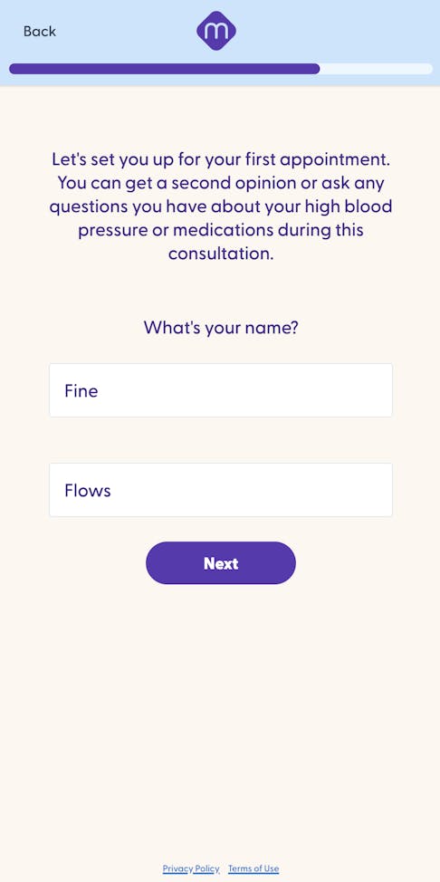
9. Marley Medical
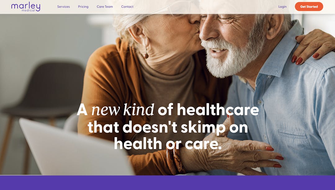
Industry
Virtual primary care clinic.
About Marley Medical
Marley Medical provides healthcare services for patients suffering from high blood pressure. Their website is curated for a mature population, from the images to the large, clear font. The flow in particular is streamlined–qualifying questions are followed by contact data collection and appointment scheduling.
Standout design features
Mobile responsive design
The colors are calming and reflect the brand. The text is in large, high-contrast, clear print, a plus for their target audience of mature patients. A prominent progress bar lets users know where they are in the flow and how close they are to completion. Learn how responsive design can improve conversion.
HIPAA compliance
The Privacy Policy and Terms of Use are linked in each step. Users can review Marley Medical’s full HIPAA-compliant tech stack.
Data-save feature
This Formsort-powered intake form is able to save data at each step. Why is that important? It enables easy analysis of customer behavior, including identifying drop-off points and reaching out to responders who abandon the form.
Leveling up
As a growing company, Marley Medical may expand to other states. Instead of just redirecting disqualified leads out of the form, they can collect email addresses from leads outside their current locations. This will help create a bank of potential clients when they offer services in other states.
10. Persona
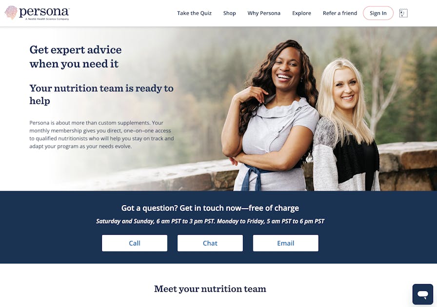
Industry
Personalized nutrition supplement program.
About Persona
Persona curates vitamin supplement packages based on customer health and lifestyle profiles. Nutritionists are available for 1:1 counseling. Their detailed flow collects important data about each customer to provide a highly personalized vitamin regimen.
Standout design features
Prominent CTA and social proof
The central placement and bright pop of color in the CTA button are effective design choices to get users into the intake form. There’s also a product rating badge in a complementary color placed nearby, adding both visual interest and social proof.
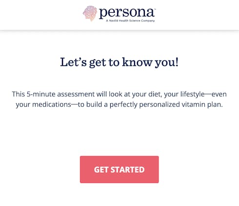
Preview
A 5-minute assessment can feel long but this preview explaining why it’s necessary is a great way to prepare responders.
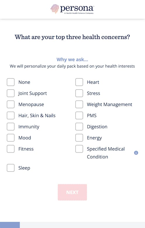
Thoughtfully designed informational labels
What sets the informational labels on Persona’s form from others’ is that they intentionally place the ones about basic details like name and sex in pop-ups and display others that pertain to highly personal and sensitive questions to help attain important for honest, accurate answering within the main container. Because each step contains one question, there’s plenty of space to include the informationals.
Leveling up
The progress bar is very helpful for a user to see where they are in the flow. However, since this is a very long flow, it might help mitigate user fatigue to organize the questions into sections and indicate those sections with markers along the progress bar.
Ready to build your patient intake form with Formsort?
Leading digital health companies have developed intake forms that educate, empathize, and build trust. The best flows feel like informative medical conversations with the use of dynamic responses and condition routing. Previews, progress bars, icons, and animation reduce uncertainty and engage responders. Mobile responsive design ensures all types of users can easily access the flows. With data-save, companies can analyze trends and reach out to potential leads.
Learn more about how you can leverage powerful features like conditional routing, response validation, data save, interstitials, and dropdowns to build flows like the pros with Formsort here or get inspired by other forms in our fineflows gallery.