How to improve conversion rates in your forms
Form UI design best practices in 2023
“Forms are structured conversations between people and computers. People are different.” So your forms need to be designed with your unique responders in mind. That’s the basis of all form UI decisions.
Forms are designed to collect valuable information from people in a structured but conversational manner. The data they collect must be easily processed. To even get that data though, the form has to be able to guide prospective customers through to submission. But since people and use cases vary, there isn’t a one-size-fits-all form design that’s best for every business. An optimal form for a given use case for you might look very different from another company’s.
In this article, we’ll explore some of the key strategies to design your form and boost conversion rates based on insights shared in our recent webinar with Formsort co-founder Fil Zembowicz.
What is the silver bullet to improve multi-step form conversion?
While there isn’t such a magic solution, some strategic elements can help you develop the forms that best fit your customers and your business. These elements include:
- A logically structured flow of questions with a conversational tone
- Minimized friction
- Clean, aesthetically appealing design
- Clear labels, buttons, and progress indicators
The art and science behind supercharging multi-step form conversions involves systematically testing various ideas to develop an effective form that evolves with the changing needs of your business and consumers.

Challenge: Read your form aloud
An often-overlooked yet remarkably effective technique to enhance your form is to simply read it aloud. It’s like shining a light on hidden stumbling blocks in the user experience. When you voice your questions, options and instructions, you gain a fresh perspective on them. Hearing them lets you identify awkward or confusing language, complex instructions and issues with the order of questions.
Reading your form aloud helps you assess its overall structure and coherence. Your form should flow like a conversation so reading it aloud with a colleague should feel natural. A simple step that’s usually skipped, form read-alouds can lead to valuable insights and help you to fine-tune your forms for optimal conversion rates.
Ditch fancy design for familiar patterns
Your users visit other websites and complete other forms. There are conventions of design that they’re accustomed to and expect. So while you can certainly implement innovative form solutions, if your format is wildly unfamiliar you’ll end up confusing responders. Don’t try to reinvent the wheel with fancy designs and behaviors–stick to best practices and customize where it makes sense.
That said, don’t feel overwhelmed by other people’s forms. You’re uniquely positioned to understand your users and design for them. As you test various form elements, know that you’ll be able to optimize your form based on your growing knowledge of your customers.
Identify and open form bottlenecks
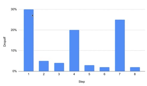
Bottlenecks are steps in a form where a significant number of users drop off due to overly complex or irrelevant questions, unclear instructions, excessive form fields, or technical issues. They limit user engagement and conversion. You can identify bottlenecks by using your analytics tools to compare drop off statistics at each step to the overall conversion rate. Wherever there’s a higher than expected drop off rate, users are getting stuck or frustrated for some reason. Adjusting these steps will clear up the bottlenecks and let users proceed through to the end of the form.
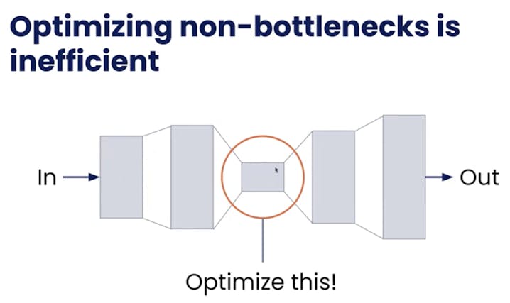
If you fix points before the bottleneck, more responders will come through those points and then get stuck at the bottleneck. Fix steps after the bottleneck and there won’t be an increase in flow due to the bottleneck obstacle remaining exactly as it is. It’s essential to identify the highest dropoff points and correct those steps to effectively improve form flow.
Don't get stuck in the MUD (Motivation, Usability, Difficulty)
Once you find the bottlenecks, you’ll need to identify what’s causing the blockage. We’ve categorized the reasons a user might abandon a form into 3 groups: motivation, usability and difficulty (MUD). These three key factors play a critical role in shaping user experience and conversion rates. When there’s a problem with any of them, users are likely to jump ship.
Motivation
This is the secret sauce behind successful form conversions. Motivation is about making users want to fill out your form willingly and eagerly. Ensure questions are relevant, highlight the benefits, and make sure they know their effort will be worth it. Establish trust through:
- Social proofs
- Explaining why certain information is needed
- Displaying your privacy policy
- Consistent design and messaging
- Providing help desk support
By the time the user starts your form, they’re already somewhat interested in what you’re offering. Use some of the tools listed above to keep them motivated to continue through submission.

Usability
If the user has the motivation to answer, are they able to provide the answer on the form? Usability is making the form journey smooth and hassle-free with clear labels, logical layouts, and minimal distractions. Eliminate technical errors where possible. Ensures that users can move through your form without frustration caused by content, design, or technology.
Difficulty
Your form is perfectly set up to engage a responder and guide them along all the steps. Questions are relevant. Labels are clear. No technical hiccups. But you’re asking them to scan and upload their photo ID, which recently expired. Or you need their spouse’s social security number to qualify them together for a loan and the spouse is at work. These outside factors can cause a user to abandon the form.
Help users complete the form by letting them skip some questions and come back to them later in the onboarding process. Or connect directly to insurance and other companies so if a hard copy is inaccessible, users can obtain necessary information electronically.
Common MUD bottlenecks
First step bounce rate bottleneck - a motivation issue
Let’s look at a common form challenge: high drop off rates in the very first question, referred to as the “bounce rate.” Bounce rate is the percentage of visitors who land on a form and then abandon it without interacting further or submitting the form. In other words, it measures the rate at which users bounce away from the form after viewing it briefly, without taking any meaningful action. It’s usually a motivation issue and definitely a missed opportunity for many businesses.
To lower form bounce rates, think of it as inviting guests to a party. First, improve traffic targeting to ensure that the right guests arrive. Provide context by explaining what's inside the party. Set expectations by giving guests a heads-up on what to expect. Offer encouragement to keep them engaged and comfortable. Finally, use photos of people to make the party feel welcoming and relatable.
Improve traffic targeting
To refine your traffic targeting, leverage data analytics and audience segmentation. Understand your ideal users, their demographics, interests, and behavior. Use this information to focus your marketing efforts on channels and strategies that resonate with your target audience, ensuring that the right people are landing on your form.
Provide context
Start by crafting a clear and concise headline or introductory text that explains the purpose of your form. Use straightforward language to convey the value users will gain by completing it. Briefly outline what they can expect and why it's beneficial. Context sets the stage for a positive user experience.

Set expectations
Be transparent about the form's length, estimated completion time, and any potential follow-up steps. If there are multiple sections or steps, clearly indicate them with progress indicators. When users know what to expect, they are more likely to commit to the process, reducing the chances of abandoning the form prematurely.
Give encouragement
Use encouraging language throughout the form to motivate users. Positive affirmations like “Let’s create the best nutritional plan to support your weight loss goals!” or "Build your dream wardrobe and wear it!" can boost morale. Additionally, consider providing help or support options, such as live chat or a contact email, to reassure users that assistance is available if needed.
Use photos of people
Incorporate photos of real people, ideally those who have successfully engaged with your form or benefited from it. You can also add images of your service providers. Authentic images of individuals can humanize the experience and build trust. Ensure that the images are relevant to the form's context and align with your brand's identity to create a relatable and welcoming atmosphere.
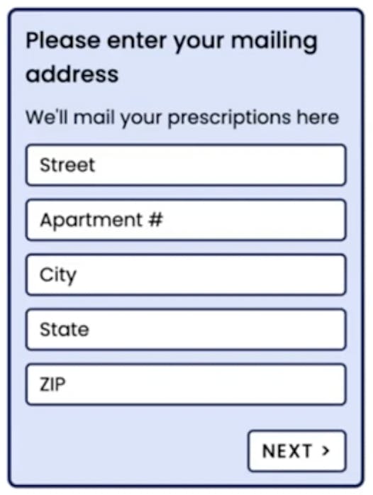
Address question bottleneck - a usability obstacle
Address input fields can be some of the most repetitive, cumbersome parts of a form. To alleviate this nuisance, start by applying form field best practices to simplify the address input. Implement browser autofill and autocomplete features to expedite the process. Be cautious with validation to avoid unnecessary user frustration. And if you already know some information, prefill or skip it to save your users precious time.
Use form field best-practices
Simplify the address input by breaking it down into clear and concise form fields. Use labels that specify each component, such as street address, city, state, and ZIP code. Ensure proper field order and formatting, aligning with regional norms to make it intuitive for users.
Use browser autofill or autocomplete
Maximize user convenience by enabling browser autofill and autocomplete features for address fields. These tools can automatically populate address details, saving users time and reducing errors. Ensure your form's field names and attributes align with what browsers expect for autofill to work effectively.
State fields, for example, can be challenging to fill if they’re just drop downs. Scrolling down a list of 50 states on a phone isn’t a great user experience so allowing responders to type in their state and adding an autocomplete feature like Arise does makes it much easier for responders.
Take care with validation
Implement thoughtful validation rules for address fields to catch errors without causing frustration. Use geolocation services to verify addresses in real-time when possible. Offer clear error messages that guide users in correcting issues, ensuring a seamless experience even when errors occur.
Prefill or skip already-known information
Leverage known user data or previous interactions to prefill address details whenever feasible. When users have already provided this information in a prior form or session, skip those fields to expedite the process. Just make sure to offer an option for users to review and update pre-filled details for accuracy.
Upload document bottleneck - a difficulty challenge
Easing the bottleneck at a document upload question in your form can significantly boost completion rates. First, encourage users to return later to upload documents, reducing the pressure to do it all at once. Secondly, offer the option to skip document uploads if they aren't immediately necessary, streamlining the process. Lastly, provide alternative submission methods, like email, for added flexibility.

Encourage returning later
To ease the burden on users and encourage them to return later to upload documents, use a clear and friendly message near the upload field. Let them know it's okay if they don't have the documents on hand at the moment, and provide a convenient option to save their progress and return when ready.

Allow skipping if not immediately necessary
Give users the flexibility to skip the document upload step if it's not immediately essential for their task. Use a clearly labeled "Skip" or "Not now" button to let them move forward with the form without uploading documents. Make sure to inform them that they can provide the documents later if needed.
Provide alternatives
Offer alternative methods for document submission, such as email attachments, fax, or mailing physical copies. Provide clear instructions on how users can use these alternatives and ensure they know where to send the documents. This flexibility can accommodate users who may face difficulties with the online upload process or prefer alternative submission methods.
How to test form improvement ideas with limited responders
Even with a modest number of responders, optimizing your form is crucial. The key thing to remember is that for smaller numbers, you need to make big changes to have noticeable impact. So don’t sweat the small stuff like button colors–these minute adjustments won’t yield results. Focus on eliminating bottlenecks that might deter potential respondents. Ensure a smooth and user-friendly experience free of errors and hiccups along the entire flow. Add timely customer support to handle any tricky spots. Focusing your efforts on optimizing high-value elements is essential in driving those valuable conversions.
Experiment to optimize your form
Experimentation is really the cornerstone of effective form optimization. It's not about guesswork; it's about refining and fine-tuning your forms based on real data and user feedback. A/B testing and experiments allow you to make informed decisions, uncover what works best for your audience, and drive improvements in conversion rates. By embracing experimentation, you can stay agile, adapt to changing user preferences, and ensure your forms are consistently delivering the best results. Let’s look at a few types of experiments that can enhance your form.
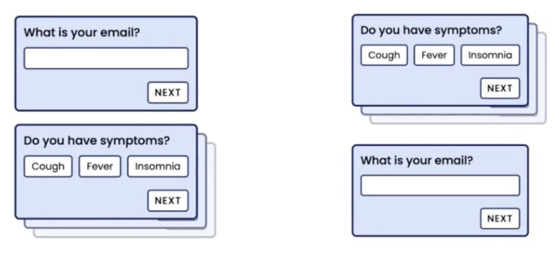
Experiment 1: Ask for an email upfront or at the end of a form
When it comes to form design, the placement of the email field can be a game-changer. You have the option to ask for it upfront or at the end of the form, and both approaches can be effective. The key is to let experimentation be your guide. By testing and analyzing user behavior, you can determine which flow works best for your specific audience and objectives. This flexibility ensures that your forms are finely tuned to maximize conversions and create a smoother user experience.
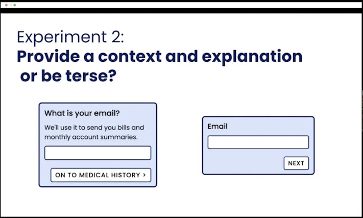
Experiment 2: Provide a context and explanation or be terse
Experimentation with providing context and explanation versus being more concise is a strategic choice that can significantly impact form conversions. It's not a one-size-fits-all scenario. While reducing steps can be tempting, it's equally important to consider the needs of your audience. For newcomers or those less familiar with your process, a little extra context can make all the difference. On the other hand, experienced users may prefer a more streamlined approach. Don't hesitate to explore both avenues, even branching into two distinct experiences – one catering to beginners and the other to pros. Experimentation will reveal which approach aligns best with your flow and drives optimal results.
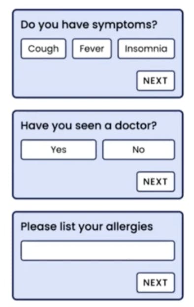
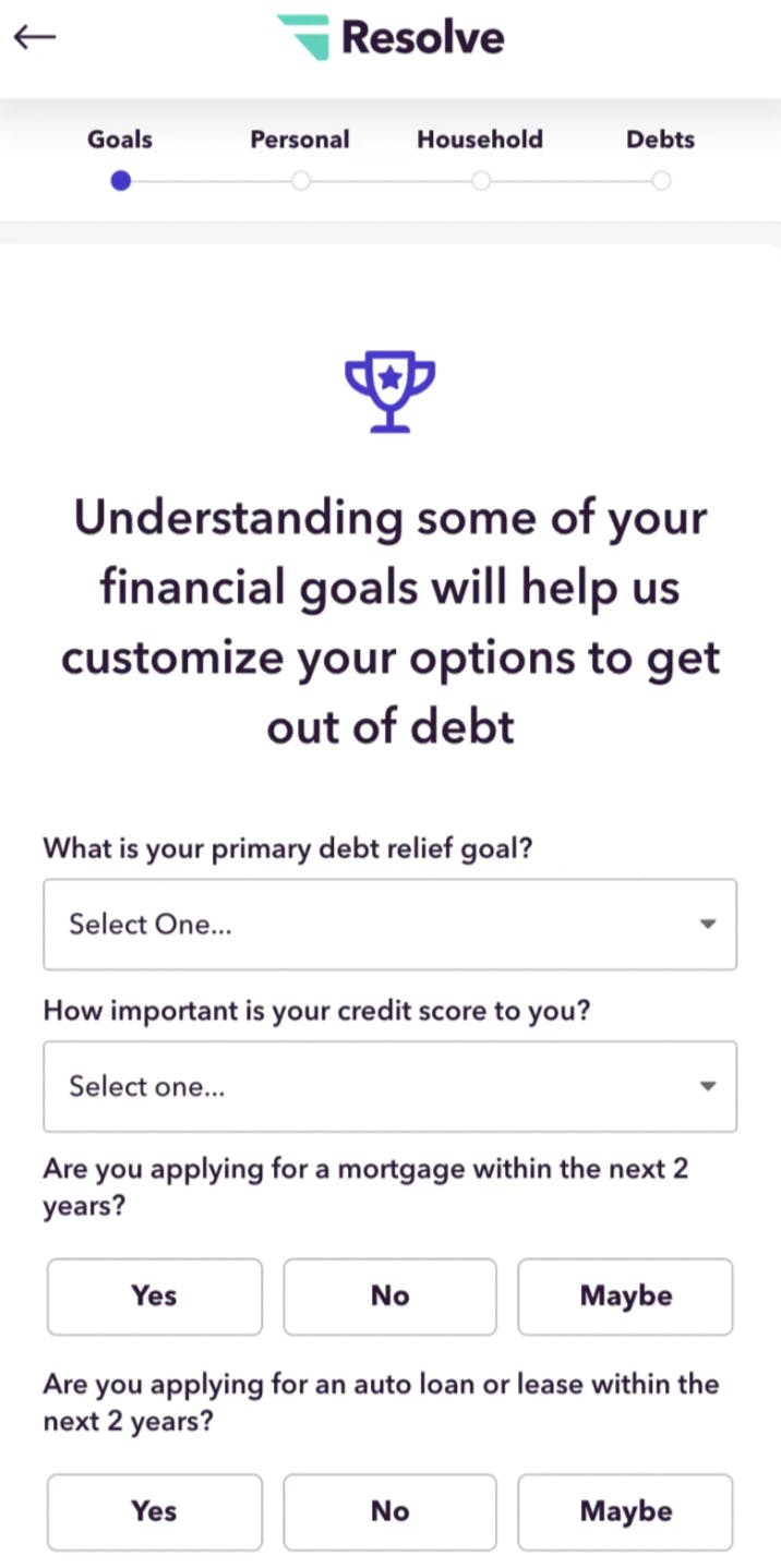
Experiment 3: Many questions per page or space it out
Experimenting with the number of questions per page in your forms is a valuable strategy that can impact user focus and experience. Having many questions on a single page can provide a quick overview, allowing users to see the big picture. On the flip side, spacing questions out can offer a more focused approach but might introduce uncertainty. To mitigate this, consider including a progress bar and optimizing the order of questions. It's all about finding the right balance that aligns with your user's expectations and enhances the overall form completion experience.


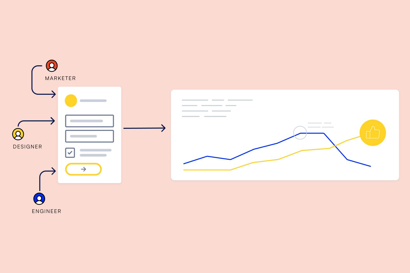
Use Formsort to create your optimized form
Formsort is a powerful form builder that lets you create forms personalized to each user, customized to your brand, and optimized to convert. Leverage auto advance functionality, custom validators, admin API access, returning responder behavior management to enhance your forms.
Formsort specializes in simplifying the experimentation process, making it incredibly easy to conduct A/B tests and implement changes swiftly. With Formsort, growth and marketing teams gain the autonomy to make form adjustments independently, while engineers retain control over critical elements to ensure form functionality. This dynamic approach ensures that your forms remain effective, preventing any unexpected hiccups or disruptions when publishing changes.
Read more about how Formsort can help boost form conversion rates in our latest interview with website planet.
Build forms that convert with Formsort
There are many great strategies to improve conversion rates, from the power of reading your form aloud and emphasizing simplicity in design to the importance of opening form bottlenecks and experimentation. We've also discussed tailored approaches for different audience sizes and highlighted the importance of minimizing obstacles of motivation, usability, and difficulty. Leverage Formsort to build and optimize intuitive, dynamic forms that convert. You can also request a free review of your existing form with the Formsort form grader.