Optimizing your onboarding form: tips from a product manager


Best practices for your SaaS onboarding form
It takes a lot of planning and investment to get a potential customer to your website, culminating in a crucial moment: a purchase of your company’s product or a signup for your service. Since the average form abandonment rate is 68%, a high-quality onboarding form experience is often the difference between a potential customer converting, or abandoning you entirely for your competition.
Creating the best onboarding form experience for your customers begins with accepting that beyond reaching a baseline quality level, there is no single checklist to follow or one-size-fits-all solution for improving onboarding forms. I’ve seen the same experiment, performed in similar companies in the same industry result in opposite outcomes. Instead, you should plan for iteration, experimentation, and taking a few risks over time in order to learn and build the optimal onboarding form for your product.
I’ve been a part of various product teams (Google, Better.com) for over 10 years – and have worked with dozens of companies on their onboarding as Head of product at Formsort. Let me share a few strategies about what's worked.
Optimizing your onboarding form strategies
Don't be afraid of a longer onboarding form
The common wisdom is that reducing the number of clicks is the best way to convert new users to a product or website.
While cutting clicks may be effective for optimizing for micro-interactions like shopping carts or logins, counterintuitively, at my last company (better.com), we found that in the mortgage application, increasing the form length with supporting content can improve conversion in a statistically-significant way. We showed users reasons why information was being collected in the form, added informational steps that served the user (instead of focusing on what they provided to us), and gave context on what to expect on every step.
We even added psychographic questions (such as "How are you feeling about this process"?) that weren’t truly essential to signing up for better.com on a data level, but instead served to build an emotional connection between the user.
Treat your onboarding form like a conversation
Adding "filler" steps and content is effective because it mirrors real-world conversations, where both sides partake in providing information, even if the process itself is asymmetrical (such as a conversation with a medical professional).
A form is a digitized conversation whose primary goal is the exchange of data, but also exists to build trust and establish a relationship. Treat the form as a two-way dialog: there is knowledge and information to exchange both ways.
Use conversational language. Approach your questions and prompts as an informal interview or coffee chat. Take your form and read it out loud, then read it out loud again (on a Zoom call is fine, or even in the mirror). Have a second and third pair of eyes and ears on your form and onboarding copy to ensure it’s as natural and easy to understand as possible.
Does it sound like something you'd actually say out loud? Or do you sound like a robot? Feeling rude or harsh? Act on those feelings, and remember, there is a human on the other side filling in your form, so make sure that you treat them with the respect they deserve.
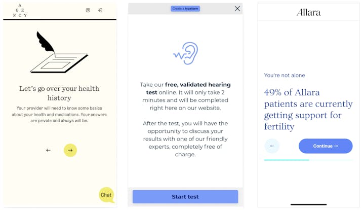
Take a look at some great examples of informational steps from Agency, Lexie Hearing, and Allara Health (a Formsort customer). Each of these examples extends the form length but can increase overall conversion by providing context and educational information to the responder.
Decrease friction and frustration
Just like a poor phone connection or a noisy background can ruin a conversation, take care to remove the possibility of death by a thousand cuts by bugs and glitches. If your onboarding form isn't converting, it should be because of the content or targeting (which you can improve through iteration and experimentation), and not because the keyboard has disappeared or a button doesn't work.
Many forms end up with numerous small bugs and glitches when they’re not polished and regularly tested. Any single one of these issues is not usually by itself a show-stopper, but these little details add up to a form that is filled with friction.
Potential bugs and errors that cause friction in forms:
- Email validation might not work properly.
- International addresses can't be added.
- Toggling between questions and changing responses is impossible or broken.
- Users aren’t able to abandon the form and return to it.
- Your layout looks busted on an older phone.
- The back button doesn't work.
The list goes on – there are hundreds of these kinds of things.
Pay attention to these edge cases and details to remove roadblocks for users converting.
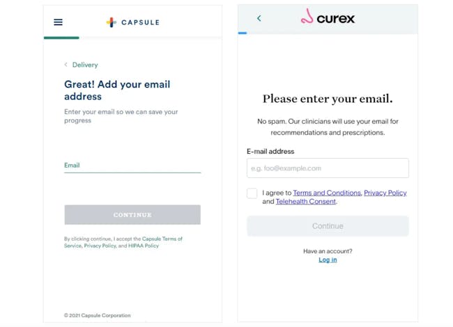
If you can only do one thing, then my number one tactical piece of advice is: say no to scrolling. Luckily, this is low-hanging fruit from a technical perspective. Put each step of the form on a single, mobile-friendly page to focus users on the single most important next question at hand, allow spotting validation errors easier, and put navigation one tap away at all times.
As an example, check out how Capsule and Curex collect email addresses in a single step of their forms.
Accept that people are busy and mistakes happen
People don't live their lives on one device, so you need to offer your experience seamlessly across devices. Whether users are onboarding from a cell phone, tablet, or desktop, the signup form should be just as usable and easy to use. Better yet, should users return to the onboarding form on different devices, ensure that their progress is not lost. You can easily enable this on Formsort by passing the responder UUID between devices.
Don’t punish the user for not having an answer immediately. Especially if you're asking for something private or hard-to-find (think: uploading a specific piece of paperwork), potential customers might not know an answer immediately. Often they will put a placeholder response but feel inclined to go back and provide a different response later.
Just how verbal conversations can take turns, onboarding forms are rarely followed absolutely linearly, so don’t punish the user for wanting to backtrack. Ensure navigation is seamless and that there are few points of no return beyond which changes cannot be made.
Never make the user re-enter data. Entering the same information twice is one of the most frustrating experiences, yet is surprisingly common. This is especially true if you are being asked to start over again from the beginning. Ensure you support autocompletion, and that responder's answers persist across sessions and navigation.
If you can, skip collecting low-value information outright or obtain it from a third party, obviating the need for error-prone manual data entry in the first place.
To pre-fill a responder’s information, Formsort supports 3 different ways to send data into a form: via URL parameters, by reading from (and writing to) cookies, and by POSTing values from another form. If they reload, all their answers will be right there, waiting for them to continue when they are ready.
You can also check out how other companies approach repeating inputs in our Fineflows gallery.
Increase motivation to complete the onboarding form
Even a seamless, conversational form requires motivation to complete. After all, we'd all rather be doing other things than data entry.
To create incentives, reward the users frequently. Take this beyond the information and acknowledgment mentioned previously– remind users what they’re receiving at the end of the form. Show them that it’s worthwhile to finish onboarding, and include text that’s encouraging to them. Give tangible rewards along the way, such as discounts, or any interesting new information you gathered along the way, such as a credit score from a credit report or an estimate for an amount they may save by using your product.
Demonstrate progress to show users where they’re at in the onboarding process. This makes it easy to see the light at the end of the tunnel and understand how much longer they need to invest in onboarding. It also gives an overview of what to expect as they go through the form, and how far they’ve come– making them less inclined to abandon onboarding.
Just like a subway map omits irrelevant details of geography, your progress bar should be an indicative guide to your form. If you have lots of steps, strongly consider grouping them into sections (like Formsort's grouping feature allows) and only showing group-level progress.
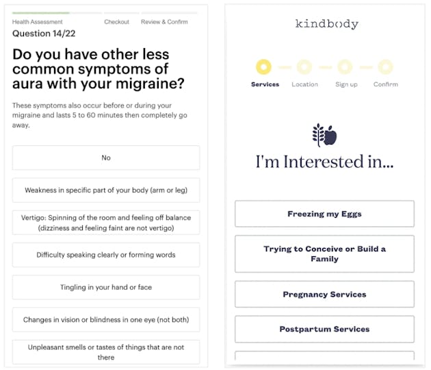
A good example is Kindbody’s or Nurx's progress bar (see below), where the order of events is clear and I know what to expect.
Designing the best onboarding form is a fluid process.
Again, there’s no silver bullet or golden rule for designing the best onboarding process. Instead, maintain a flexible, user-driven mindset to improve your conversion.
Understand how your onboarding form is currently performing, what the bottlenecks are, and what sticking points have a high drop-off rate. Communicate this to everyone involved, and follow up with continuous testing and evaluation.
A fast iteration process and tight feedback loop on your onboarding form begins with the right tooling. Thankfully, we've built a lot of what we know into Formsort. We make the building, testing and measurement process seamless for your entire team.
Have more sign-up form questions?
The next time your product or marketing team has an onboarding form idea but is blocked on engineering resources, give Formsort a try. Learn more about our product through our documentation, or talk to our team.