Sign-up form teardown: Shopify and Ramp
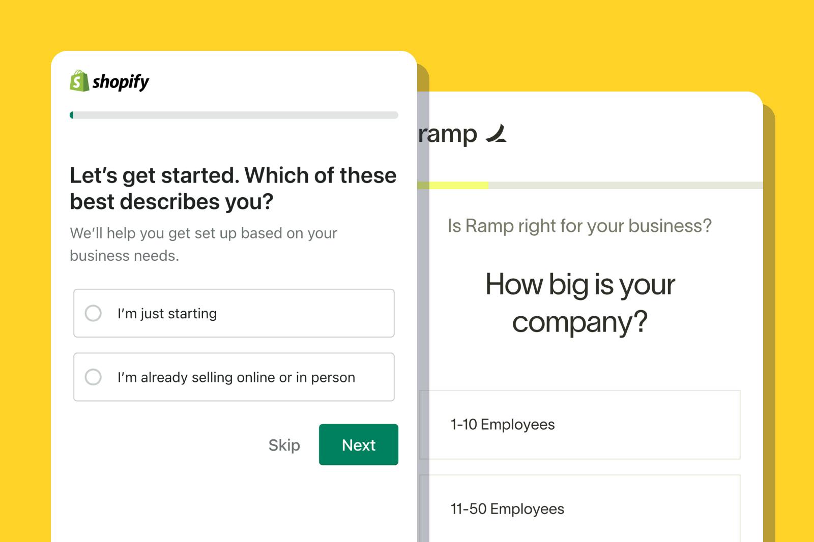
Tips on SaaS sign-up design from two category leaders
Previously we shared sign-up flow trends from our favorite SaaS products. Today we’re doing a deep dive on two SaaS companies' signup forms - Shopify and Ramp - to share what we like, and takeaways you can incorporate into your own form.
For more SaaS sign-up form inspiration, check out Fineflows. When you’re ready, start building your own SaaS form using one of Formsort’s free form templates.
Tap into color psychology
Shopify’s goal is simple: it wants to make e-commerce businesses more money. It reinforces this value proposition with green accents throughout its homepage. This is a clever marketing strategy: psychology research shows that 93% of buyers focus on visual appearance when making a purchase. Of these, over 80% claim that colors are the primary visual draw.
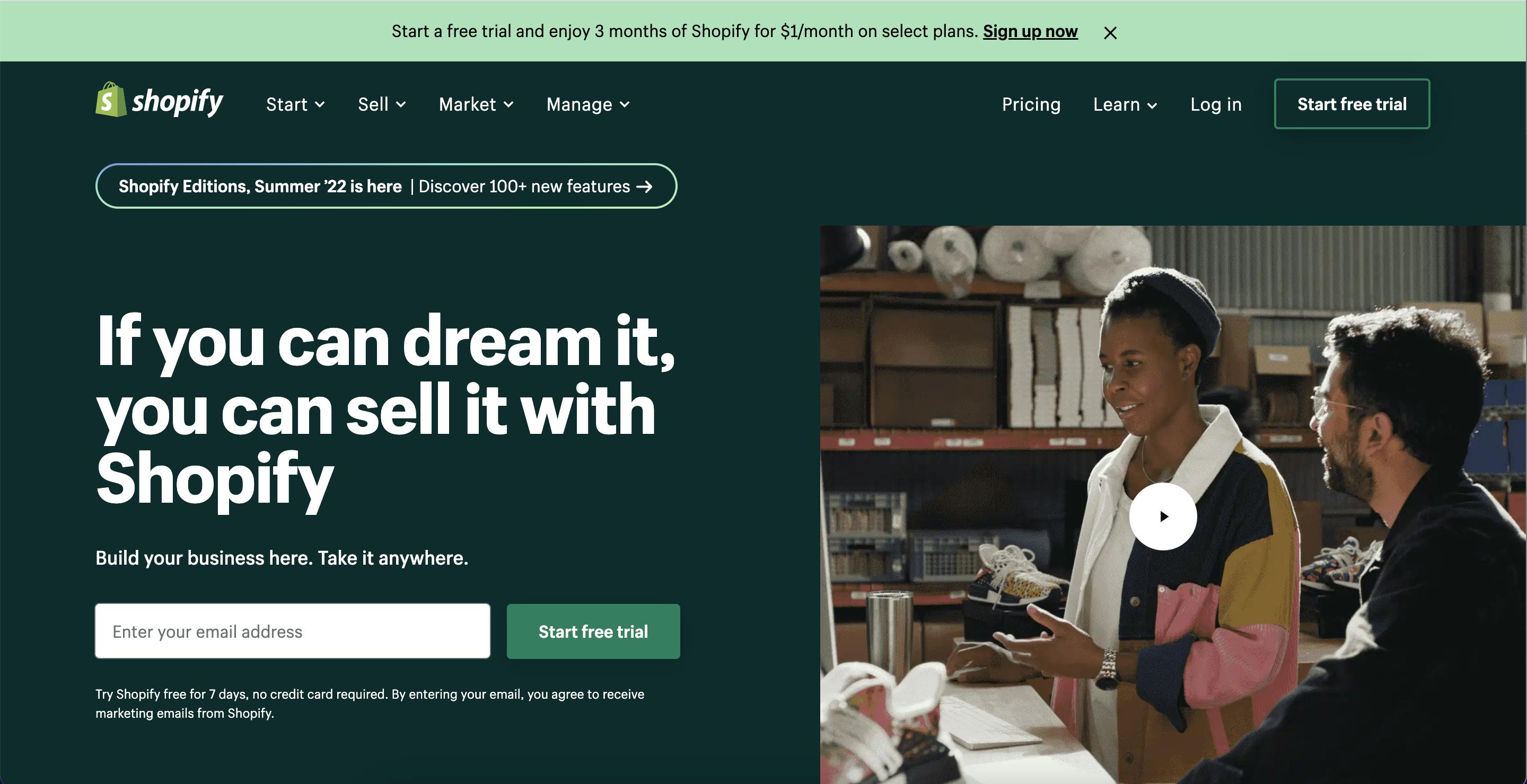
By incorporating green into its homepage and sign-up design, Shopify is taking advantage of the psychological association between green and financial wealth and growth – outcomes its customers aspire to by using the platform.
Meanwhile, Ramp is going to “ramp up” their customers’ business. It reinforces this value proposition through its logo (an upwards slope) and an up-and-to-the-right graph on its homepage.
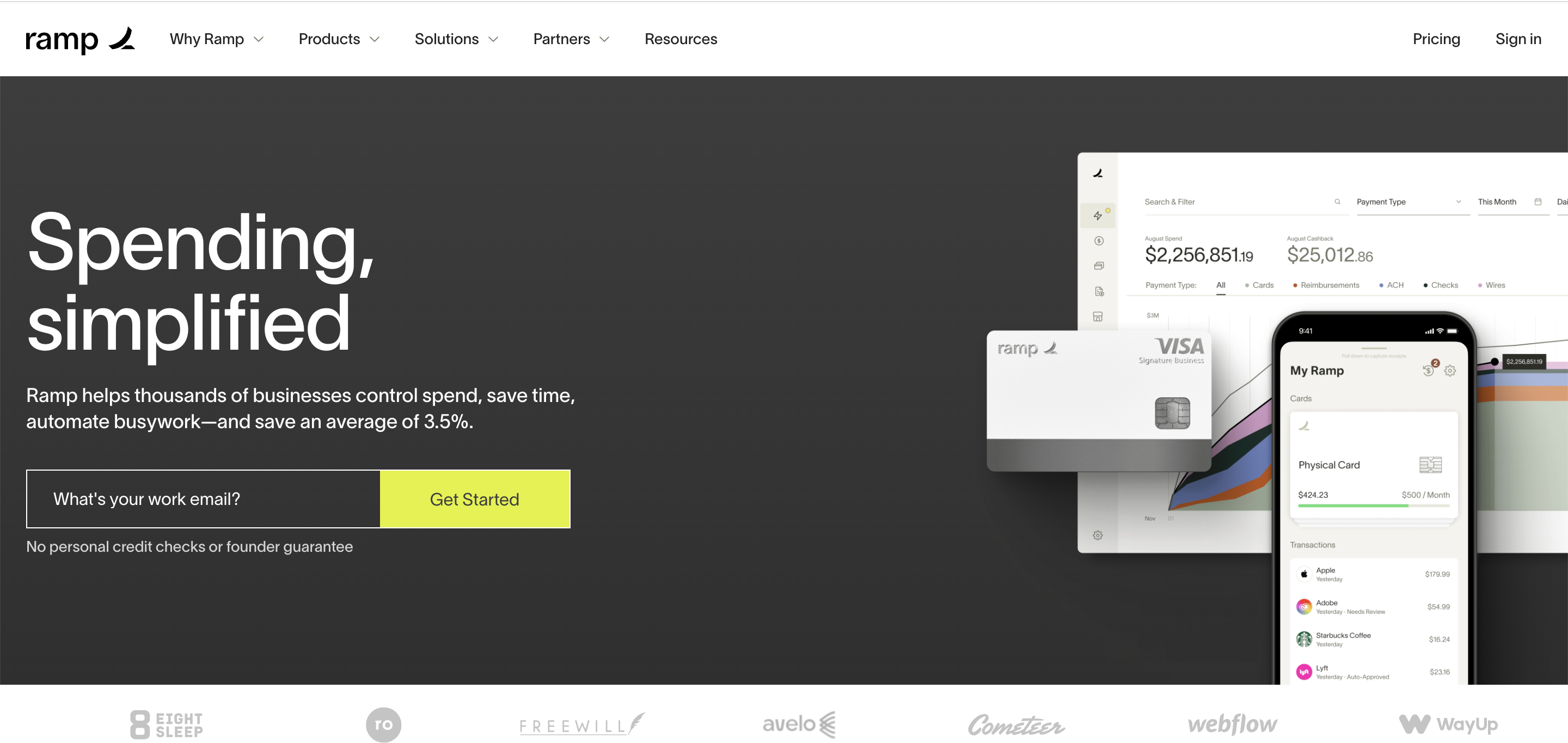
Ramp utilizes contrasting colors on its homepage: its dark gray background pairs well with the large neon sign-up button. Marketing research shows that contrasting color schemes help important content – like sign-up call-to-actions (CTAs) – catch visitors’ immediate attention. Ramp implements a contrasting color scheme throughout its sign-up form, leading to a consistent user experience.
Minimize friction
In our previous SaaS article, we covered the pros and cons of adding friction to your SaaS sign-up form. Both Shopify and Ramp lead with a frictionless sign-up experience: they ask for emails upfront, but they don’t ask for any sensitive corporate information like credit card details or employer identification numbers (EINs). This lets users learn about the platforms’ offerings before sharing further information about their business.
In case Shopify users don’t want to enter an email from the get-go, they can click the alternative “Sign up now” link at the top of the homepage, which leads to a sign-up experience without an initial email requirement.
Customization is king
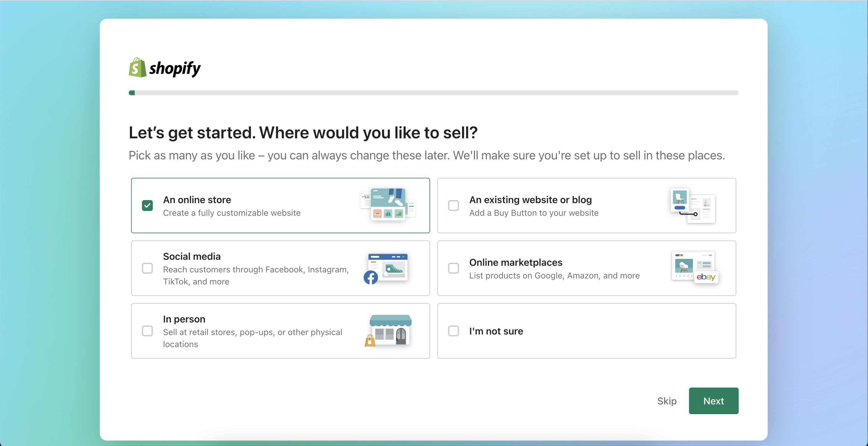
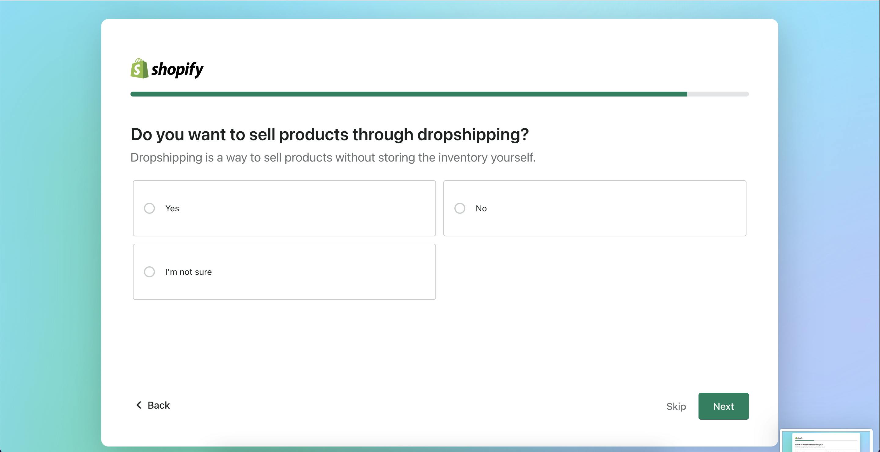
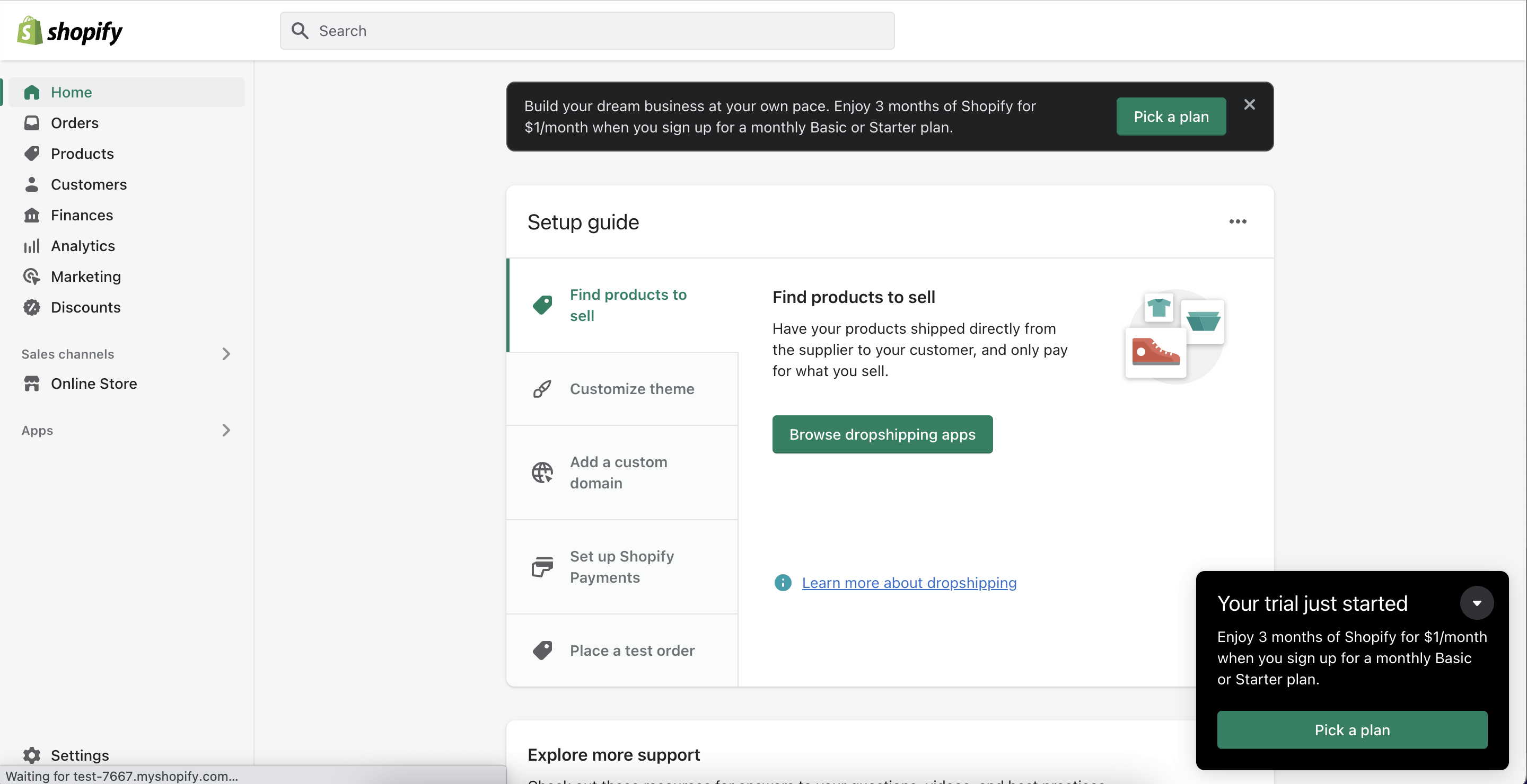
Shopify’s sign-up form meets business users where they are and creates a personalized experience. Responders have the option to skip questions, and any responses help customize their sign-up experience. For example, if a responder enters their store name, Shopify will generate a temporary URL with the name. This is a fun way to personalize the user experience and get responders to visualize their business on the platform.
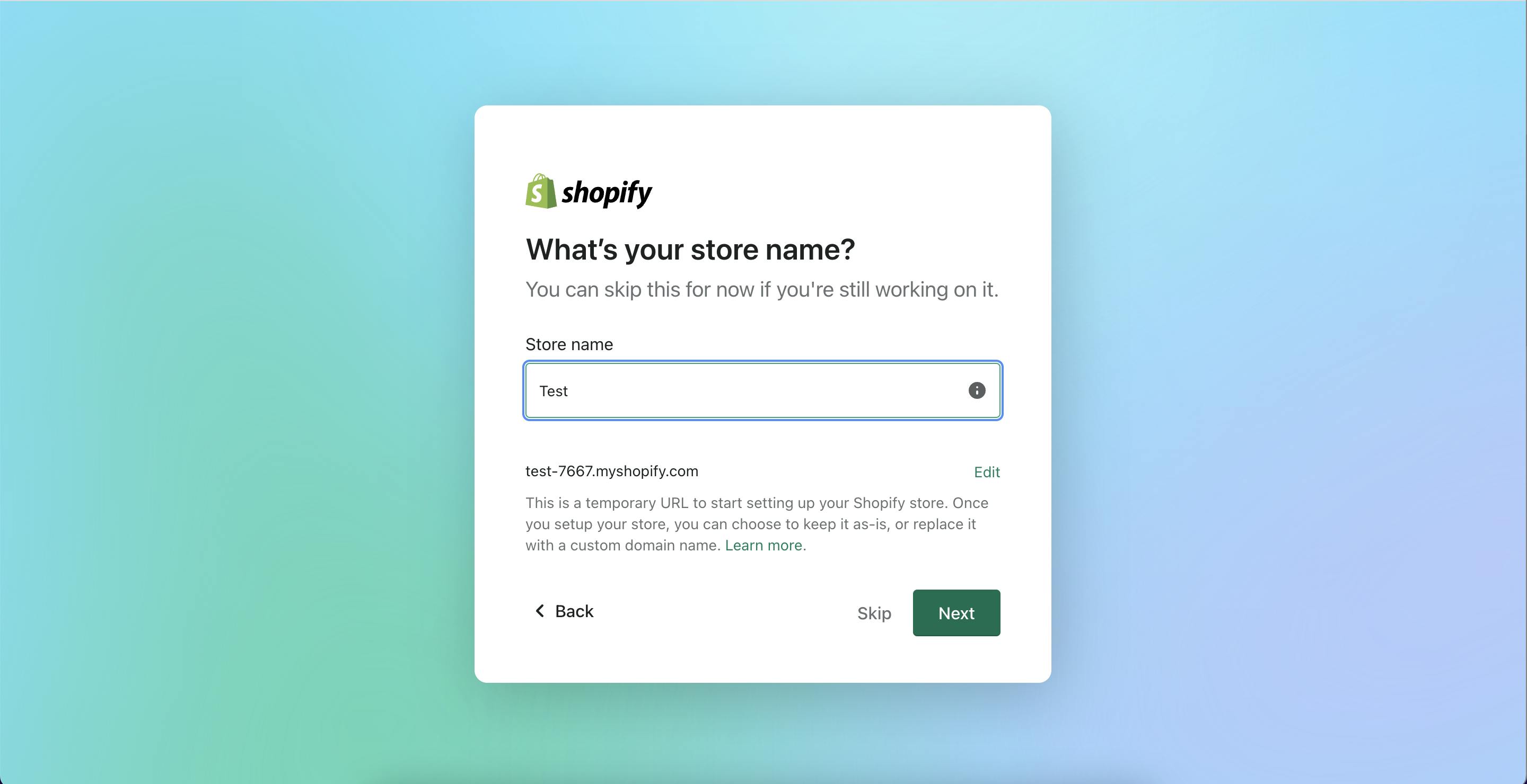
Shopify also customizes their starting offering based on the user's business needs. By asking where a user wants to sell (online store vs. on social media) and interest in drop shipping, Shopify can point them to the most relevant tools after onboarding. This builds empathy with users and helps increase the likelihood of product activation.
Break up onboarding forms with interstitials
Like we mentioned earlier, Ramp leads with a frictionless sign-up experience. However, for business and regulatory reasons, it needs to qualify potential users by asking them a series of questions about their business.
Before asking these qualification questions, Ramp displays a 1 minute video explaining the benefits of using Ramp. Interstitials like this help humanize Ramp’s brand and are a fun way to engage potential customers on its value proposition. This engagement can help incentivize users to complete the subsequent qualification process.
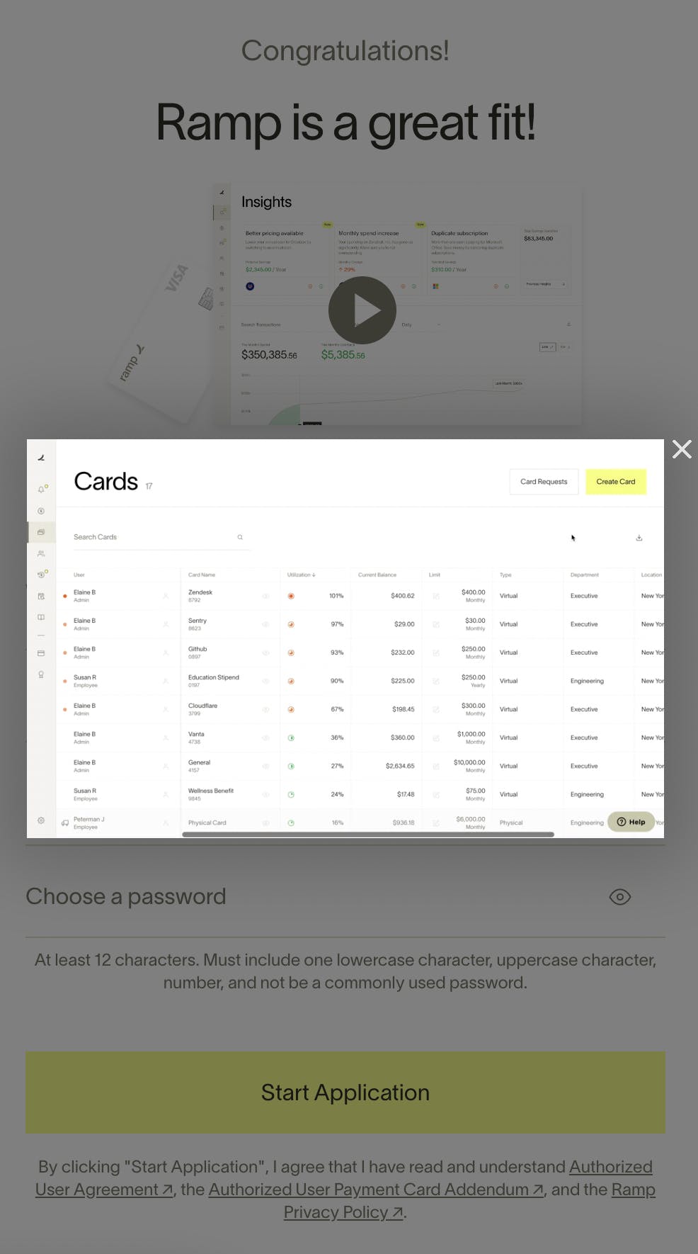
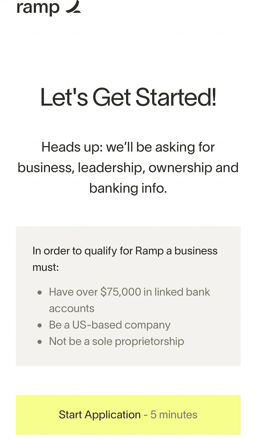
Formsort’s informational question type and video content type allow teams to build similar interstitials to break up the sign-up experience into more engaging phases.
Want to learn more?
Check out more sign-up form inspiration on Fineflows, and start building your first SaaS form for free with Formsort.