Signup form tips from 10 leading SaaS onboarding experiences
How to create a signup form that converts more leads
Software-as-a-service (SaaS) signup forms are designed to get potential users registered and inside the product as quickly as possible. While SaaS signup forms are typically short (<10 screens), there are several business and design decisions that inform the experience: should you have a pop-up or landing page? How much friction should you have in the signup process? Should you drop new users into a free trial of a paid tier, or in a freemium tier?
This article is takes a look at 10 of our favorites SaaS signup forms: Airtable, Basecamp, Canva, Figma, Loom, Notion, Ramp, Retool, Shopify and Webflow. You can find further design inspiration on Fineflows, our design gallery of signup forms from leading businesses.
Homepage design - the first step of a SaaS signup experience
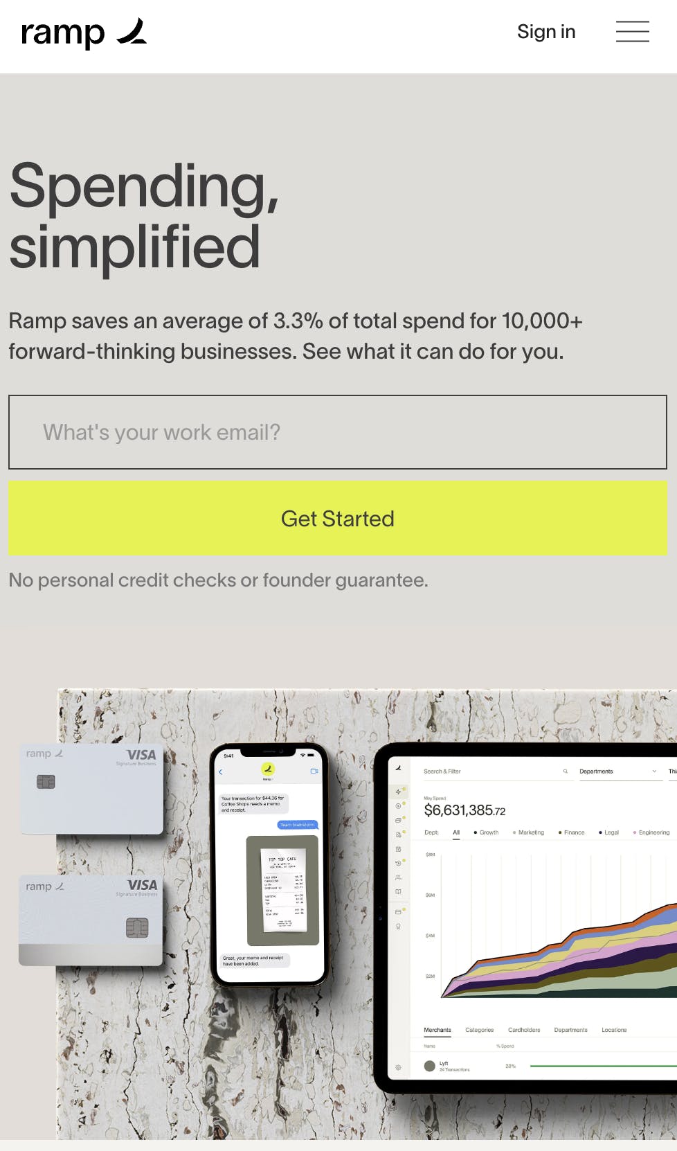
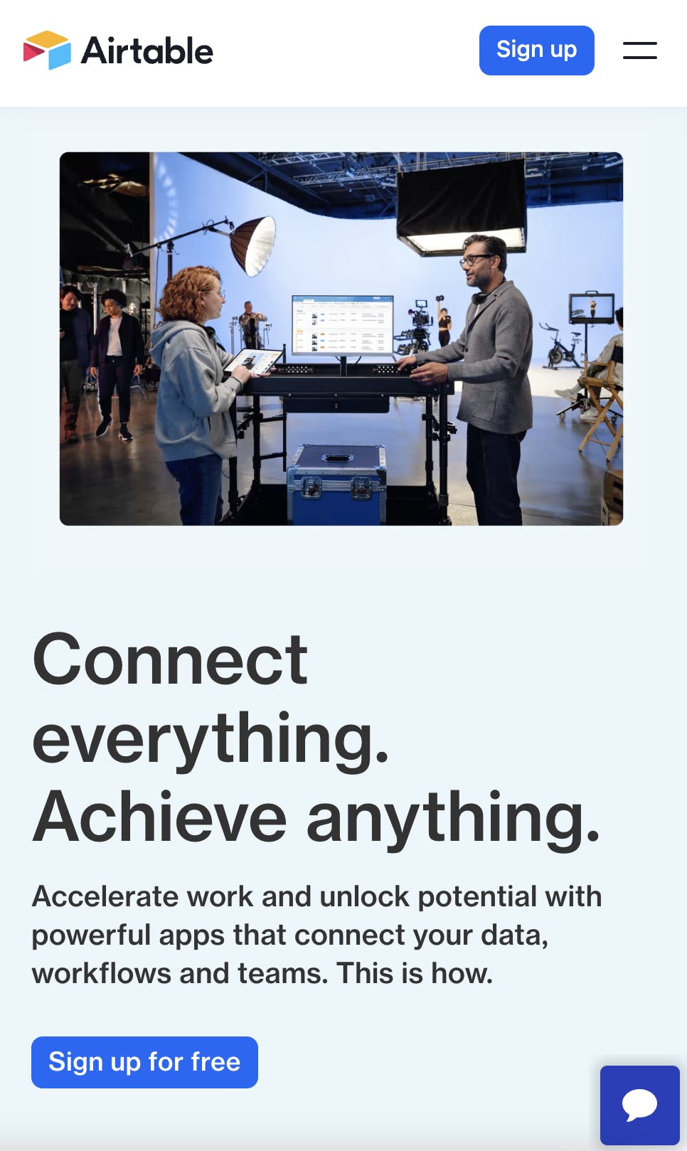
The homepage is usually the first touchpoint for organic website visitors, so we’ll start our analysis here. A prominent call-to-action (CTA) button is essential for hooking leads on the homepage. All of the companies we analyzed have large, bright CTA buttons leading to their signup forms, but the number of CTA buttons varies. Ramp has one button, Airtable has two buttons, and others have one button for mobile screens and two for desktop screens. This article is a great resource for CTA design.
Signup page design
Pop-ups vs. landing page
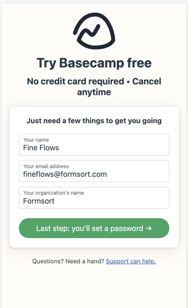
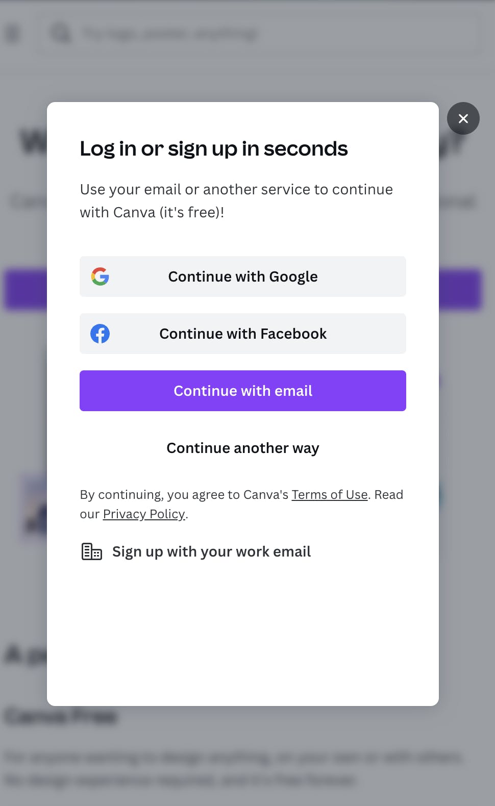
After clicking the signup button on the homepage, a lead can be directed to a new landing page or a pop-up. Most companies (8/10) redirect users from the homepage to a separate signup page. See Basecamp below as an example. By contrast, Canva and Figma use a pop-up signup modal in order to get users into the product as quickly as possible.
Sidebars
A few companies have sidebars on their signup pages to help organize information. Sidebars are a great way to feature value props and social proof in a left-to-right fashion.
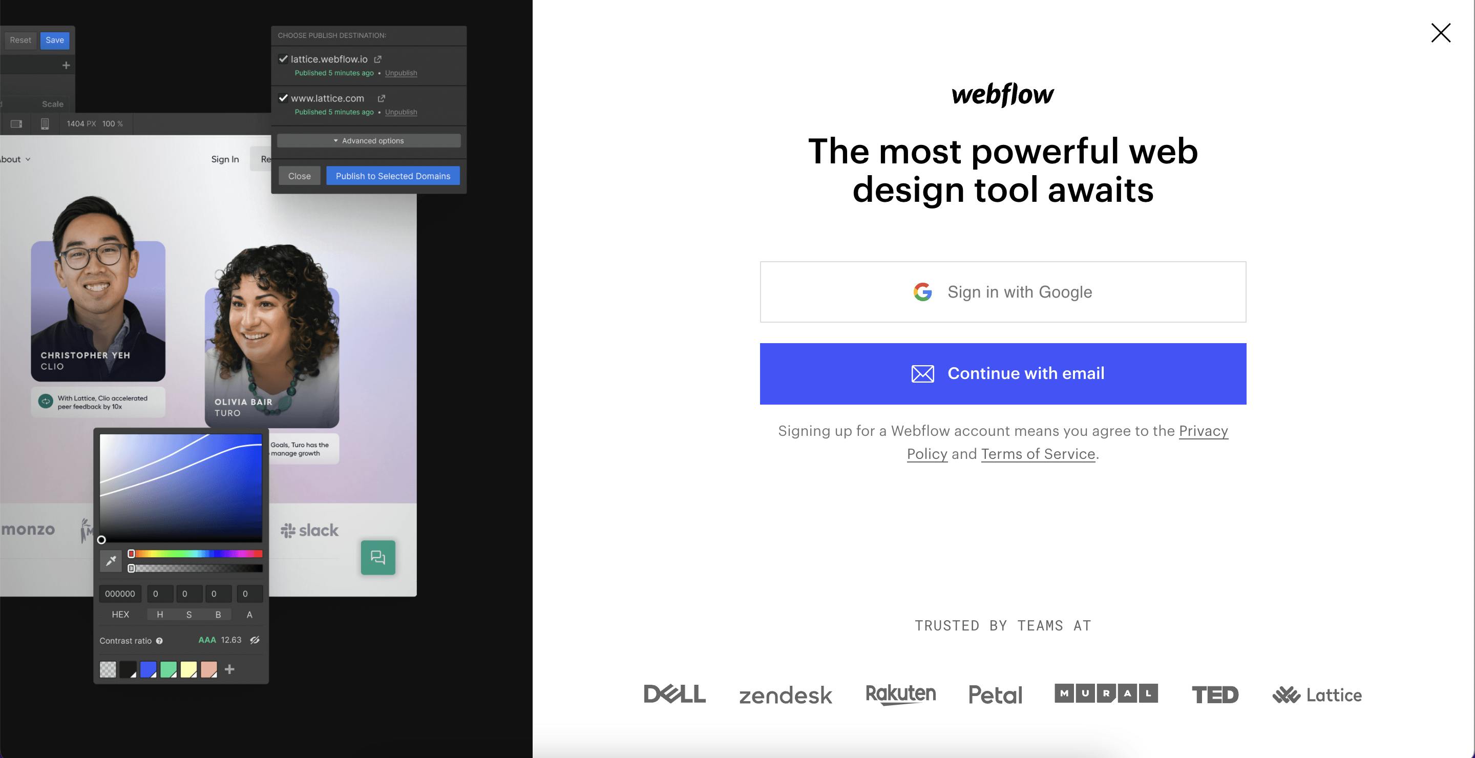
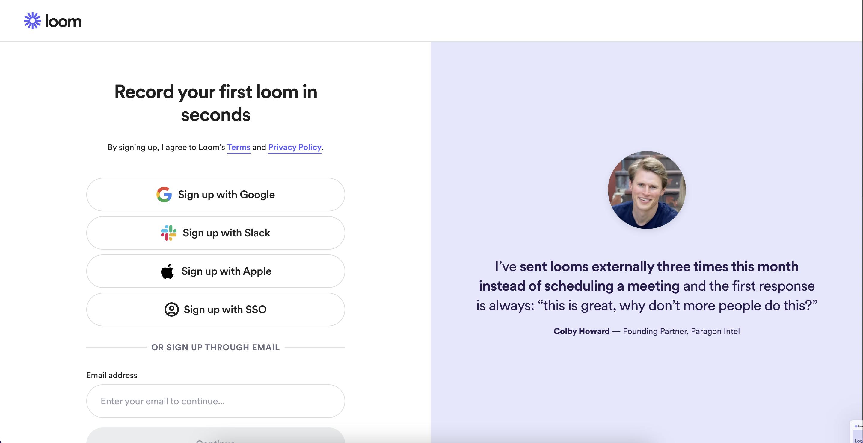
We like how Webflow and Loom have designed their sidebars. Both feature social proof, but in different ways: Webflow features customer headshots, while Loom displays a customer testimonial on the entire right hand side of the page.
In each of these forms, the sidebar stands out with brighter colors, designs and messaging. The account creation side of the page is much simpler, with a white background and minimal text. This is intentional and designed to draw the visitor's attention to the social proof and help build credibility.
Animations
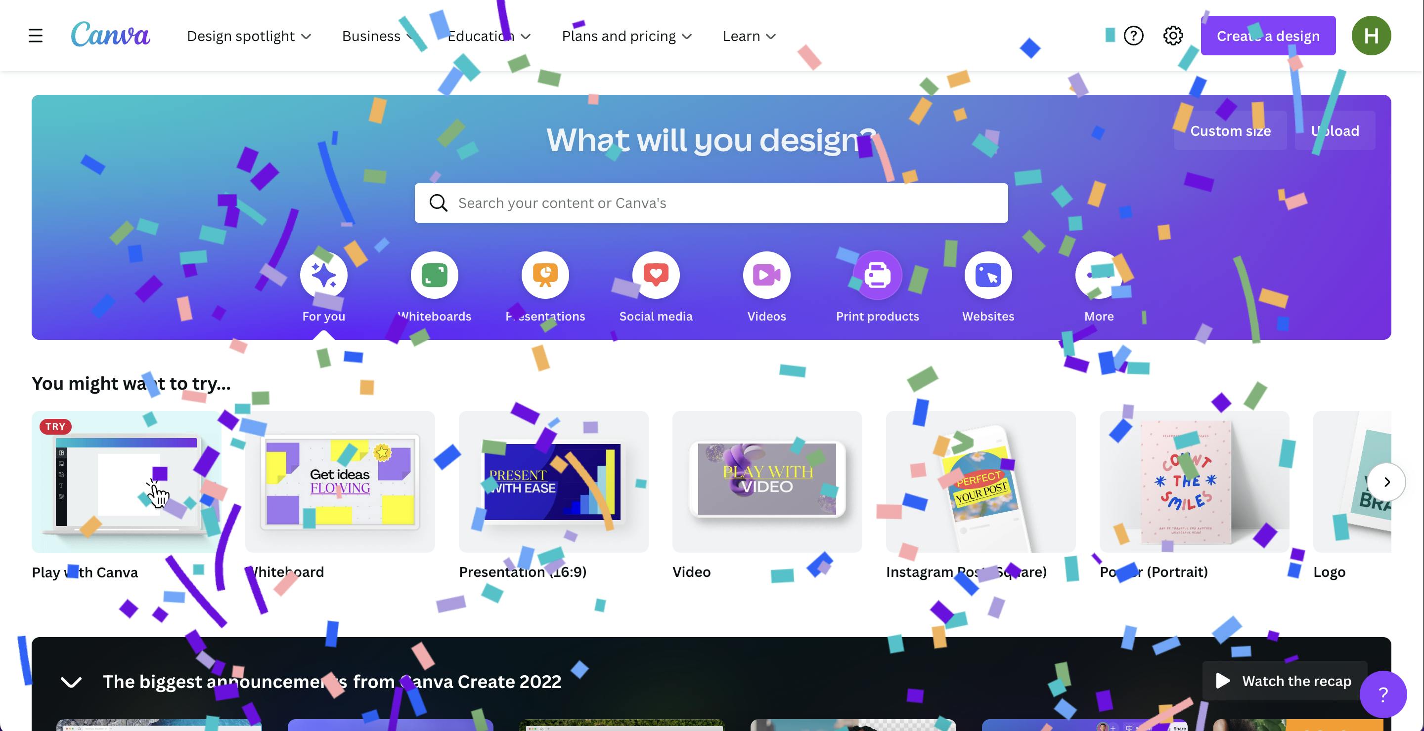
Animations can help liven up any form. Canva and Ramp both celebrate milestones in the signup experience with confetti animations. This is a nice way to get customers excited about the product and increase the likelihood of product activation.
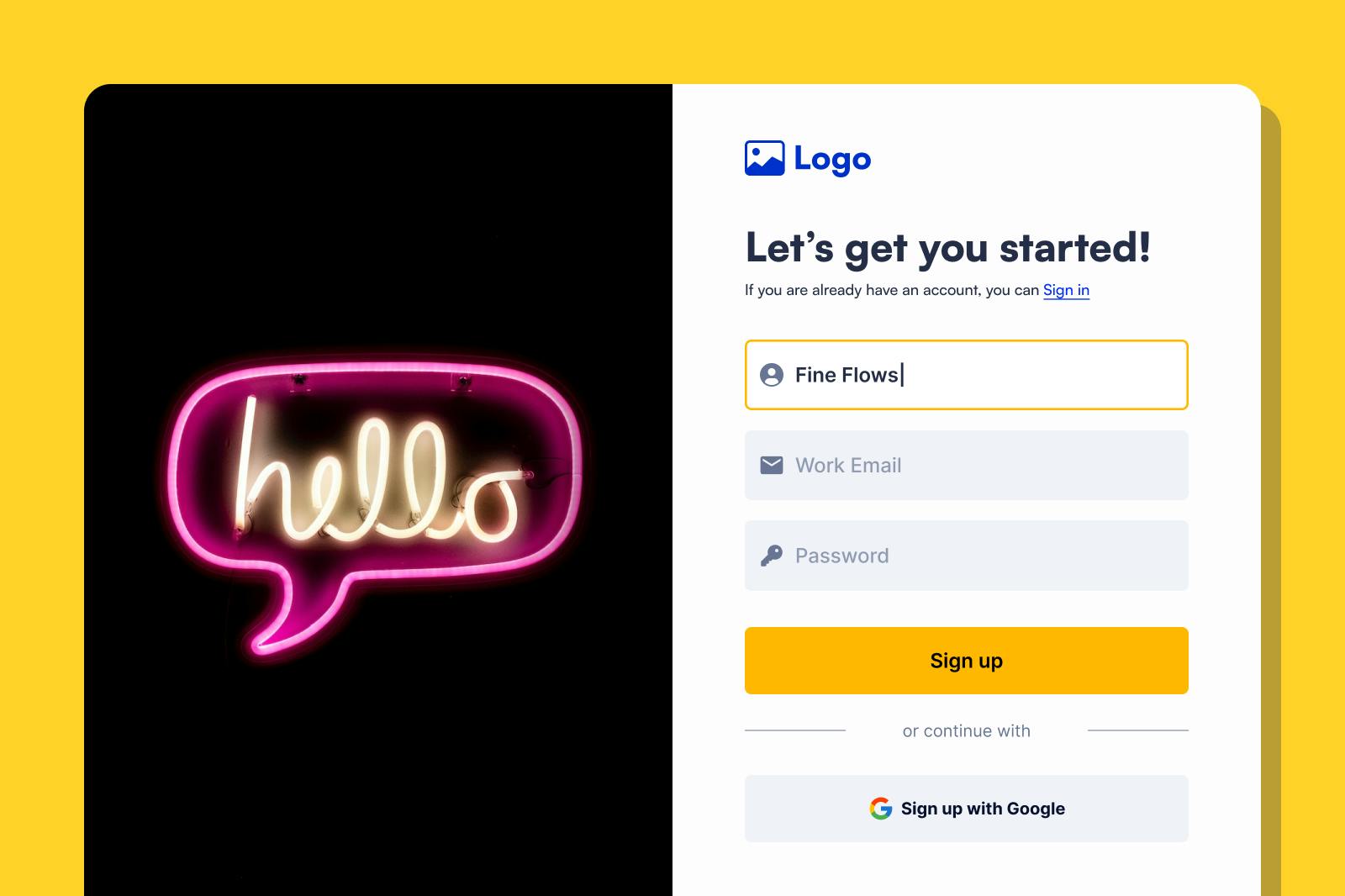
Formsort offers a confetti animation so customers can add some flair to their form.
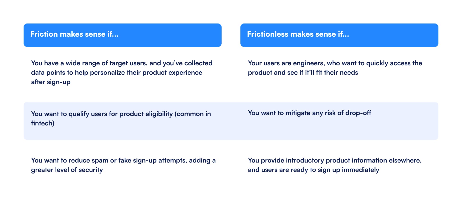
Friction vs. frictionless signup forms
Signup forms are the first conversation with a potential customer. The questions you ask can help leads learn more about the product and feel more invested in the relationship. However, this “friction” also has a flip side: each additional question can increase the risk of drop-off.
The majority of SaaS companies we analyzed (8/10) have some friction in their signup form.
Should you add friction to your signup form?
That depends on a few factors:
1. Who is your target customer? What kind of UX do they want?
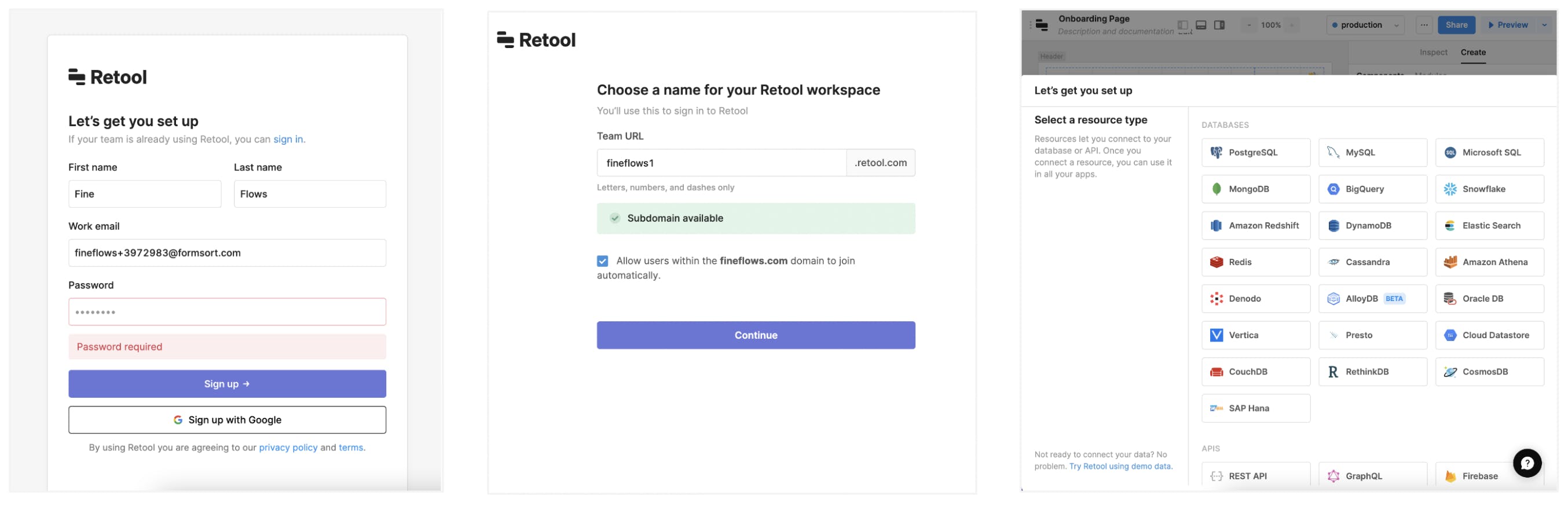
For example, developers want to jump through as few hoops as possible. They want to try out your product quickly and see if it’ll fit their needs (or not). As a result, dev-oriented tools like Retool have near frictionless signup experiences.
Retool’s signup experience is very straightforward: enter your name, email and password, then choose a Retool workspace name. After that, they drop you into the product and let you choose the type of database to work with.
2. What do you want to ask, and why? Every question you ask adds another hurdle between your prospect and product activation, so make sure each question has a clear purpose. Here are 2 common reasons for adding questions to signup:
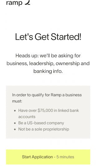
- Qualify the user and determine eligibility: For example, Ramp is a B2B fintech and has strict requirements on who they can take on as new customers. This is partly for regulatory reasons (e.g. they need to be an actual business) and partly for financial reasons (e.g. they need to understand a business’s health in order to qualify them for credit products).
After asking a few basic questions, Ramp puts each user through a 5 minute application to determine if they meet their basic requirements.
- Personalize the user’s product onboarding experience: Canva, Airtable and Webflow all personalize new users’ onboarding experience based on their function and/or product goals. Airtable and Canva offer starter templates based on a new user’s self-reported role/function. For example, after they sign up, marketers will see some of Airtable’s most popular marketing templates.
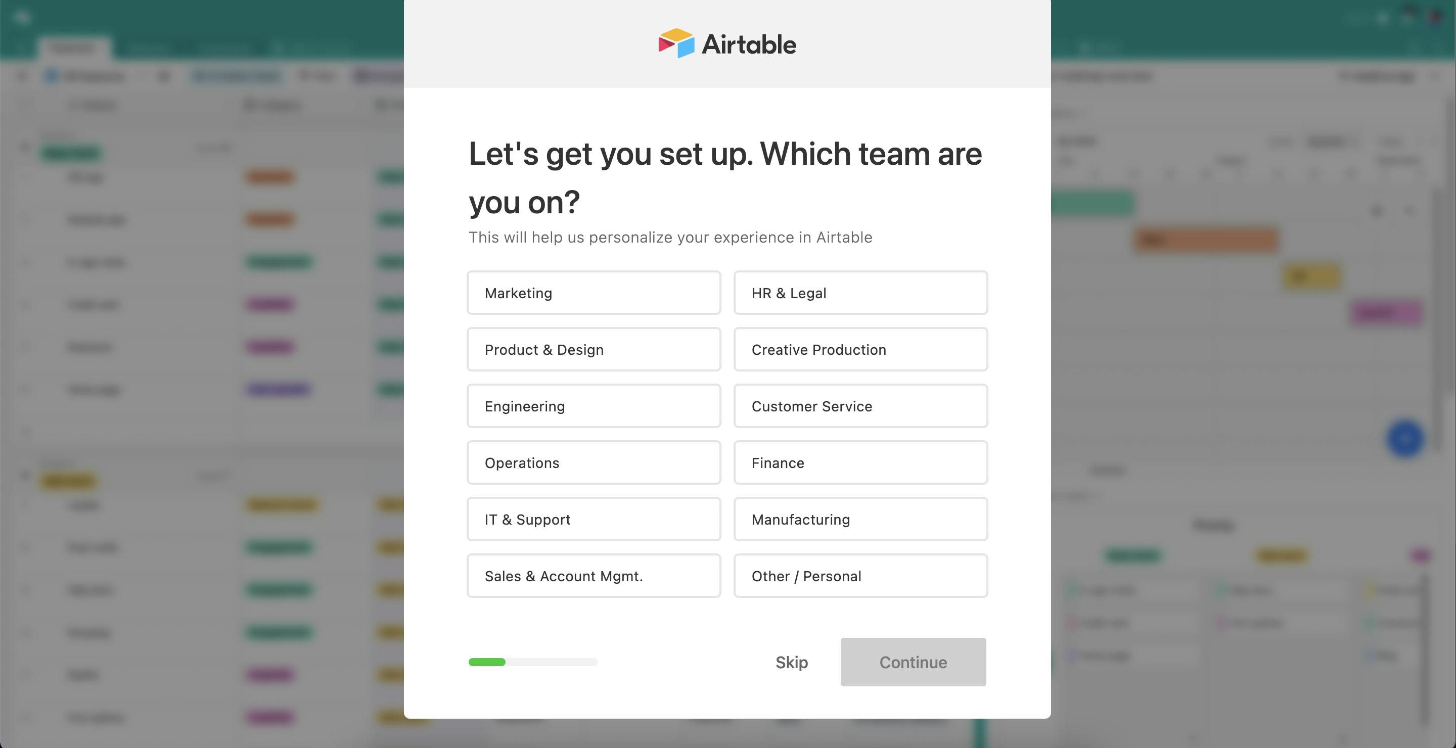
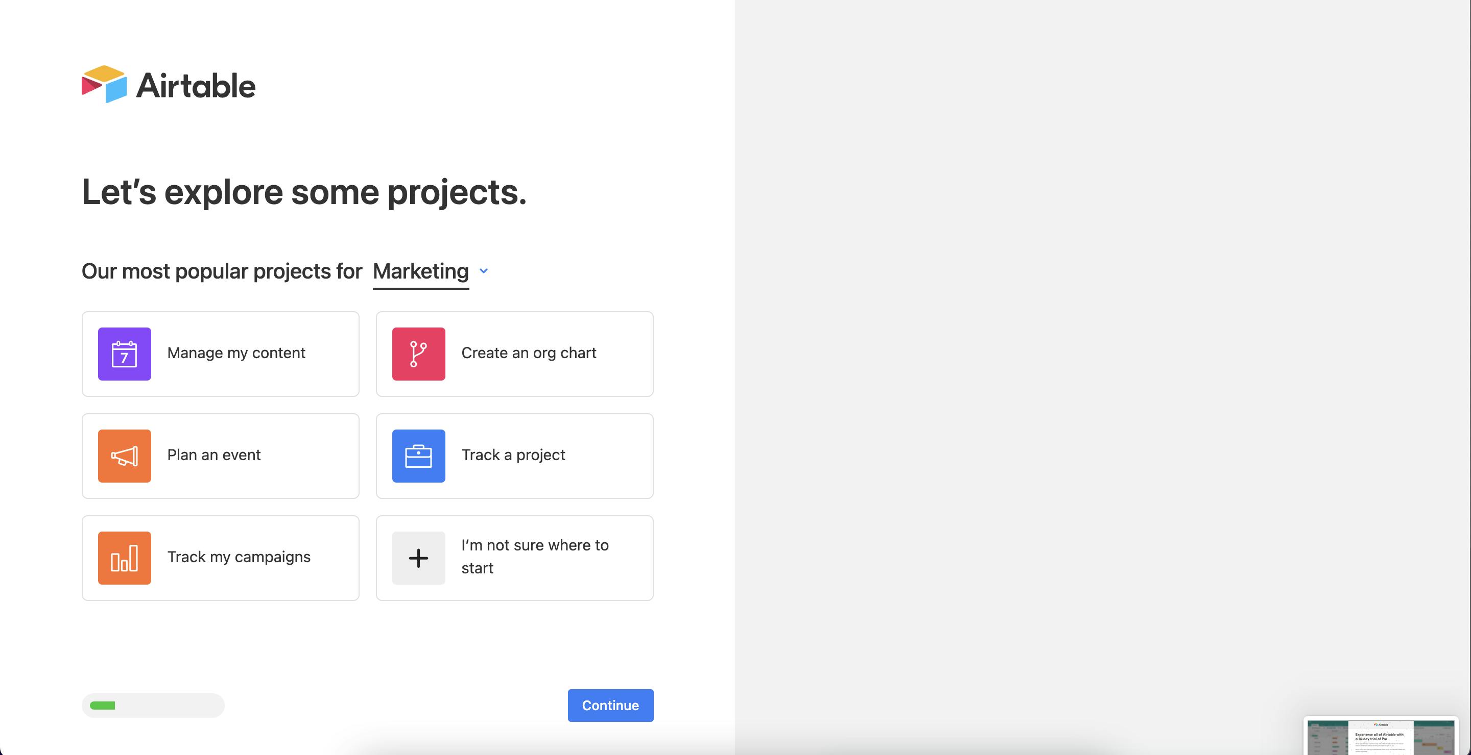
Personalization makes sense when the product has a lot of potential functionality and use cases - which is the case with Canva and Airtable. The number of potential starting points can overwhelm first-time users and risk losing them. By tailoring the starting point, companies make it easy for new users to get started and see the product’s value.
Account registration method
Fake accounts and account hacks can pose serious security, financial and reputational risks for businesses. To mitigate these threats, set guardrails to make sure users provide valid emails and strong passwords.
All 10 of the companies surveyed ask new users to create passwords. Several also offer single sign-on via popular social media accounts like Google, Facebook, etc.
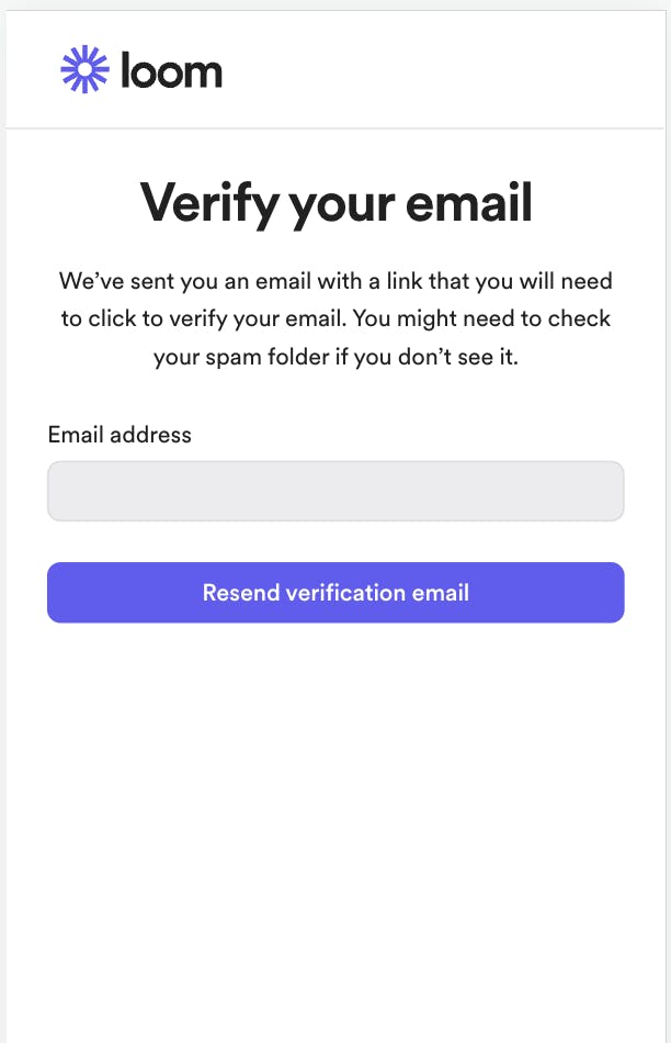
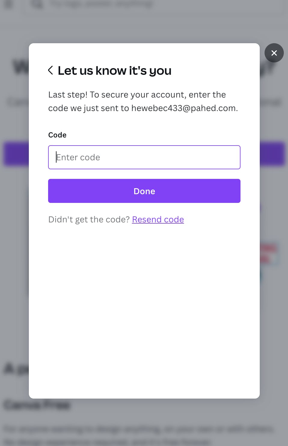
Email / code verification
Email verification and password strength add validity and security to user accounts but might lead to drop-off in the set up process. The majority of companies (7/10) have some sort of email verification: most include magic links, while Canva and Notion send users verification codes to their emails.
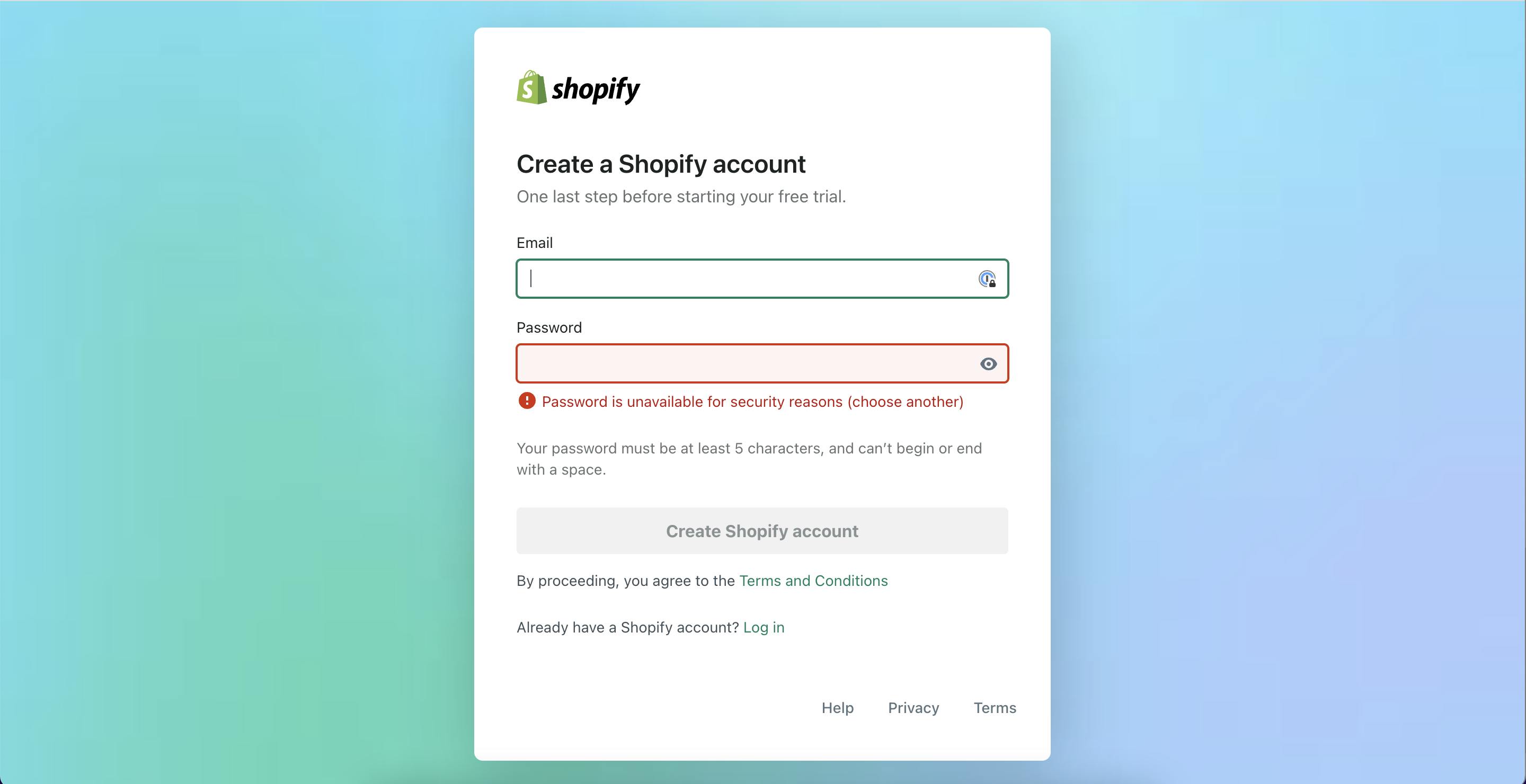
Password security checks
As an added measure of security, Shopify and Basecamp both check users’ passwords against a database of passwords involved in notable security breaches. If a user enters a password that’s been compromised in a breach, they ask users to create a different one. This is a great way to build trust with customers - it shows the company truly cares about their privacy and security.
A free trial can ask for credit card information or not. None of the free tier companies we analyzed collected credit card information. Asking for this upfront can lead to significant drop-off: users are still learning about the product and may be hesitant to share such sensitive information.
An alternative option is to offer a free trial without a credit card requirement. While this can prolong the conversion process, it gives users a chance to try the product, see the value, and establish a relationship with the company.
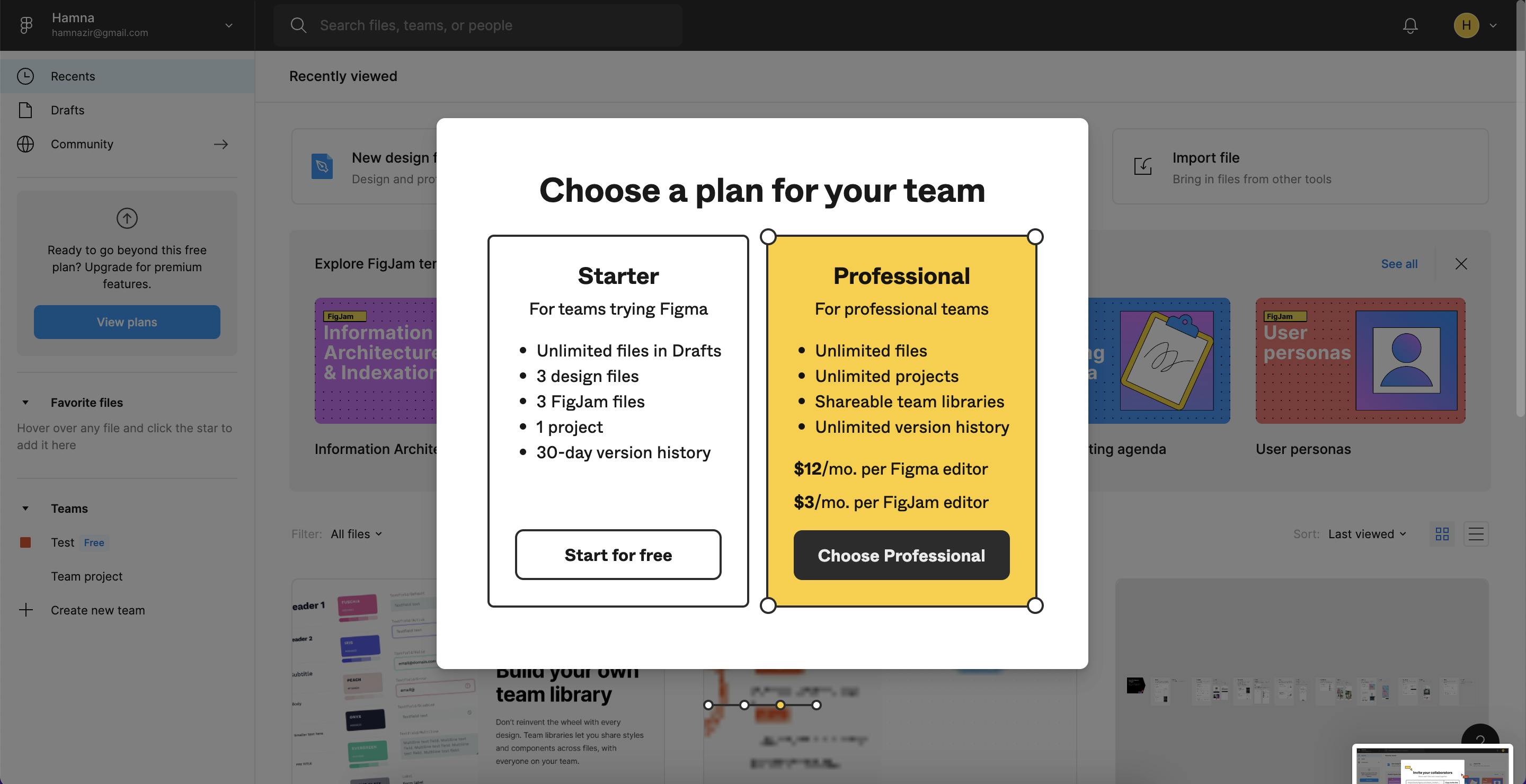
Figma and Canva have an interesting twist on the tier experience. Both offer users the option to choose a plan - free or pro - in the last step of signup. What’s the rationale for doing this? Users who reach the end of the signup process are higher intent, and may be more likely to convert to an upgraded experience.
Free tier
Basecamp, Notion, Loom, Figma, Webflow, and Canva offer a free version of their product. They open up opportunities to engage with newly activated customers to market other tiers directly through email.
We’ve taken this same approach at Formsort. Our self-serve product is free for anyone to use.
The decision to go free trier versus free trial is an important strategic question. Check out guidance from Product Led and Open View to decide which one is right for your business.
Want to learn more?
Use our SaaS templates and start building your own signup form today.
If you’re looking for more design inspiration, check out Fineflows, our design gallery of signup form from leading businesses.