Key form completion stats

Frequently asked questions about online forms
Companies can gain valuable insights into user behavior and increase conversion by tracking form completion rates and comparing them with industry benchmarks. Whether you want to enhance your lead generation forms, customer feedback surveys, or any other type of online form, understanding how users interact with your forms is critical. In this article, we will explore some of the key metrics and insights derived from form completion statistics.
What’s a good completion rate for forms?
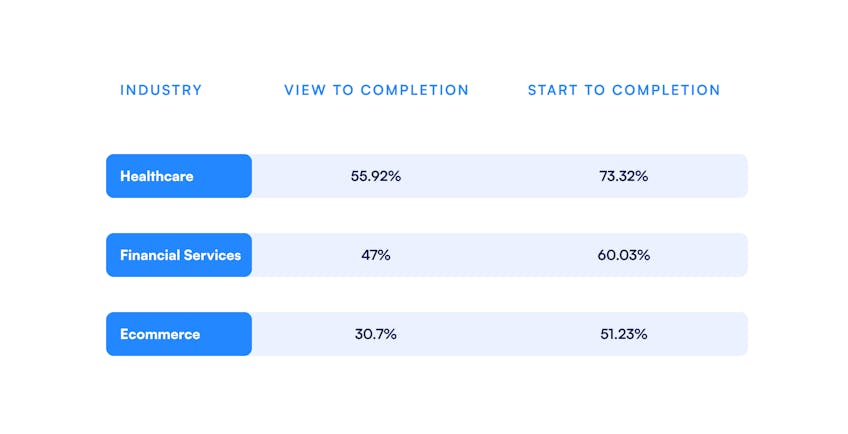
According to Zuko, 44.96% of users who view a form complete it, while 65.99% of responders who start a form complete it. This significant bump indicates that users who start a form have a strong level of interest in the product. Below is a breakdown of some completion rates by industry. We’re highlighting statistics from healthcare, fintech, and ecommerce, which represents most of our customers' interest.
In today's competitive markets, what can you do to stand out? Across all these industries, better form design can significantly impact these numbers. Below we’ll cover some factors that can impact your business’s form completion rates. Read more about how experimenting with these factors can help optimize your flows.
Minimize form abandonment and reclaim potential customers
Reaching out to responders who didn’t complete a form is also a great way to nurture leads. Up to 19% of people will return to complete a form if the company emails to re-engage them (source). Formsort lets you save partially filled forms even if they were not submitted, so you can easily follow up with responders and let them pick up their form from where they left off. Koalafi was able to get 13% abandoned leads back using their Formsort-powered flow.
How many people are viewing forms on a mobile device vs a desktop?
n the last decade, online shopping has surpassed onsite shopping in terms of market share. Within the online category, mobile device usage has also increased. Worldwide, mobile traffic has exceeded 50% while desktop traffic is closer to 40%. In the United States, both are around 50%, with desktop performing slightly better but mobile usage gaining each year (source).
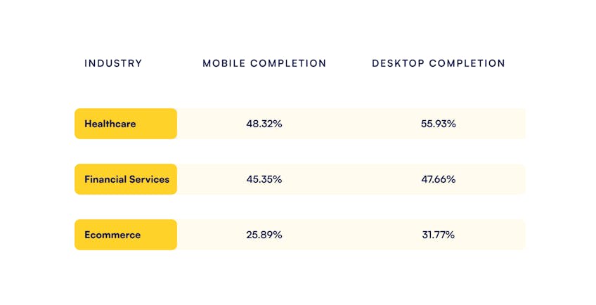
People still spend more time on websites on their desktops vs phones. Factors might include the nature of mobile usage on the go, desktop browsing occurring when users are higher intent, internet accessibility outside the home, and design features on the different platforms. It might also be harder to fill out forms on a phone. Out of all the users that start a form on a mobile device, almost 43% convert. On desktops, about 47% convert (Zuko). There is room for growth, especially in the mobile market category, so designers should have mobile in mind when designing a form.
Here’s a breakdown by industry:
In all industries, designing responsively to optimize user experience on mobile devices can turn the needle when it comes to increasing conversion rates (source). Many companies are even taking a mobile-first design approach (source). Mobile-friendly design includes
- Vertical, scrollable component layout for smaller screens
- Mouseless-navigation, including an alternative for hover effects
- Simpler pages that load faster and are easier to read and
- Buttons that are appropriately sized
Formsort enables responsive design with dimension variables, which lets you easily design for desktops, tablets, and smartphones, saving valuable engineering hours.

Should you include more than one question per step?
Multi-step forms with one question per step convert 86% higher than single-step forms with many questions because they are more dynamic and engaging (source). Single-page forms can feel long and overwhelming for responders. Consider designing multi-step onboarding flows with attractive, engaging, and easy-to-navigate single-question steps. For example, Food52 includes fun illustrations. Headway’s design is bright and friendly.


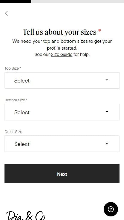
Within multi-step forms, it might make sense to group 2-3 questions together in some scenarios. For instance, Dia & Co’s onboarding flow groups together questions about users’ clothing sizes.
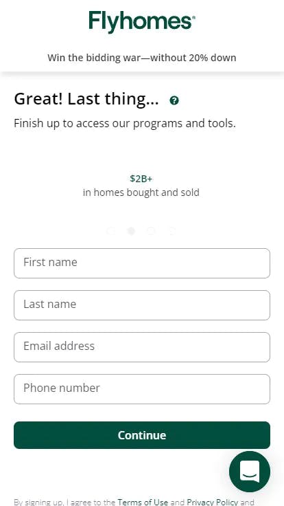
Most commonly, we see multi-field pages in account creation and checkout pages. For example, Flyhomes ends their onboarding flow with a quick account creation page.
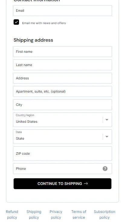
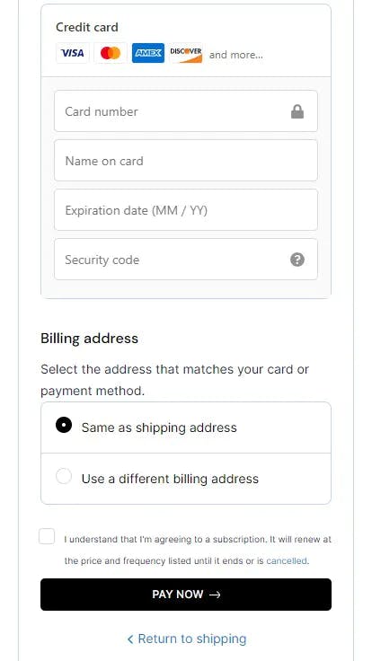
Also, shipping and payment pages within the checkout stage like the ones at the end of Found’s onboarding flow group together relevant fields in order to ensure quick, accurate completion.
How many steps should a form have?
A Zuko study found that the length of the form has no correlation with form completion rates. Yet, form length is the second highest reason cited by responders for form abandonment, right after security concerns (source). Vial saw an increase of 30% in conversion rates by reducing the number of questions in their flow (source). Unbounce found that shortening their form resulted in a 14% drop (source). Why the discrepancy? When the data is disparate, it’s important to take a closer look at the factors involved.
“The ideal length of a survey depends on the purpose behind it” (source). The numbers on this topic seem to be conflicting–some studies find shorter forms are better while others find longer ones are more successful. It really depends on the industry and the use case. Ecommerce signup flows and quizzes are usually best kept short but if you need to qualify leads you can–and should–have longer forms. Healthcare and financial service forms generally need to be longer than ecommerce ones. Your forms should be long enough to help users make informed decisions and select the right products or services, as well as give you the insights you need to decide if you can service this lead or disqualify them–and no longer.
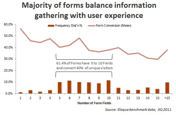
A study conducted by Eloqua yielded some nuanced results. Most of the forms they analyzed had 5-10 fields. There is a general decline in conversion rates as the number of questions increases. There are, however, notable peaks at the numbers 4, 7, and 11. These might be ideal numbers for short forms. For example, Casper, a mattress company, uses a 7-step quiz (including an email page) to recommend mattresses based on customer needs and preferences.


There’s a downward trend until the number 15 in the Eloqua graph. Then there’s a significant uptick past 15 questions. We’ve noticed that more and more companies today have well over 15 steps, including question fields, section headers, and interstitials.
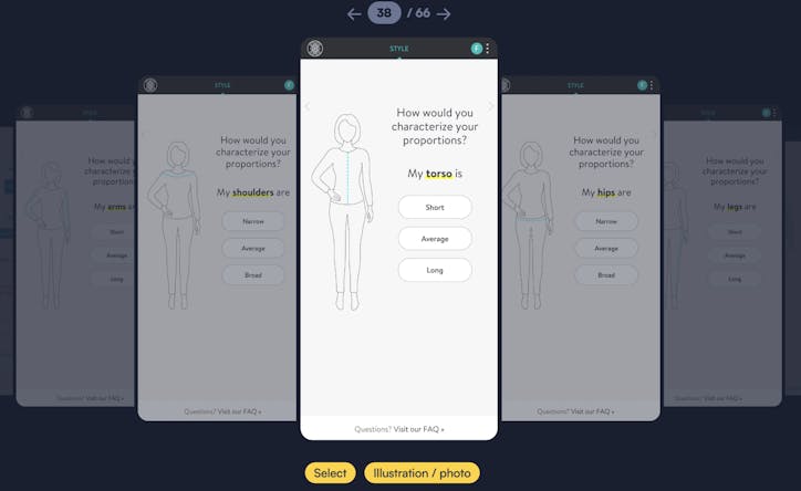
Stitch Fix, for instance, has a long product recommendation process, including 8 general
questions, then many personal style-related questions, designed to help the company learn about the customer’s style preferences. Note that these steps are gamified–they have low-stakes, easy-to-answer questions supported by illustrations and photos, making them engaging. Users can see their value and enjoy going through them almost like scrolling.
Casper’s short flow and Stitch Fix’s long flow are respectively appropriate for their products.
So why would one company experience a bump in conversion when they reduced the number of questions while another experienced the exact opposite? Online purchasers today are savvy and well-informed. They will answer questions they perceive to add value to their purchasing journey. Conversely, they will quickly abandon forms that have unnecessary questions or not enough details to make educated decisions.
Experiment to optimize your form length
Each step in your form should be intentionally designed and tested for efficacy. Running experiments will let you gauge how each step is affecting your conversion rates. Use these tests to identify dropoff points in your flow and try different solutions. You can do this easily with Formsort’s split testing.
What are the main reasons responders abandon forms?
People abandon forms for many reasons. Responders cite security concerns (29%), form length (27%), ads (11%), and unnecessary questions (10%) as the top reasons for abandoning (source). Up to 37% of people will abandon a form asking for their phone number, unless the field is optional, which nearly doubles completions (source). Given that security is such an important concern, you should only ask for personal information such as phone number, address, and date of birth if it is necessary to deliver your product or service. Trust-building throughout the funnel will help mitigate drop-offs if you do need to ask for this data.
How can experimenting with forms double conversion rates?
If we’ve learned anything from trends in today’s online marketing, forms are not a one-size-fits-all solution. They are a great way to nurture leads and drive sales–if they are designed and customized based on your products and target market.
How can you learn what form specifications are best for your business? The best way to tailor your flows is through testing and analysis. We see that “data-driven marketers are outpacing everyone. Running A/B tests, using form analytics, and running user tests are all correlated with higher form conversion rates and satisfaction with lead generation efforts” (source).
Allara saw the conversion rate on its sign-up flow more than double using Formsort vs. their previous, custom-built form. This was primarily driven by improved form design and faster experimentation timelines. You can also read more about the experimentation process here.
How important are performance and stability?
Many startups quickly learn that attempting to build all parts of their funnel in-house is expensive and time-consuming. Whether for form-building or data storage, partnering with vendors can have many advantages compared to customize-designing every stage in your funnel.
Candid found that with the performance and stability of the Formsort platform, the content-controlled experiment resulted in an unexpected double digit percentage improvement in completion versus their in-house infrastructure (source). Whereas before their custom flow design process could not keep up with their scaling business demands, a Formsort-powered form supported their growth, freed up in-house engineers to focus on company-specific solutions, and proved to be ROI positive.
Better forms with Formsort
Find out how you can boost your form completion stats and increase conversion with Formsort-powered forms. Explore our form builder here.