How to build a marketing quiz that converts leads
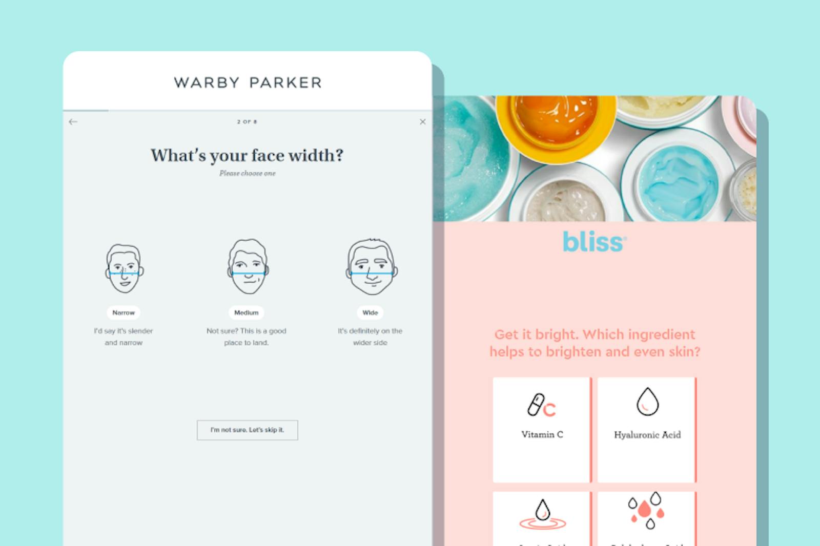
Designing lead generation quizzes to educate and nurture potential customers
Ever heard of the marketing rule of 7? It means that, on average, potential customers need to see your product at least 7 times before making a purchase. Interactive content like a marketing quiz can help accelerate this conversion: marketing quizzes are twice as likely to engage a website visitor than static content (source).
A well-designed marketing quiz helps you throughout the marketing funnel: it can help you generate more top-of-funnel leads, educate high-intent leads to make them sales ready, and boost conversion through personalized product recommendations.
We’ve highlighted some best practices for e-commerce quiz design based on the flows of Sephora, Warby Parker, Nutrafol, Picnic, Modern Fertility, and Kiwi Biosciences, a Formsort customer.
Start building your marketing quiz for free with Formsort, or check out more examples at Fineflows, our design gallery featuring the Internet’s finest forms.
Table of Contents
Select the marketing right quiz type
There are two main types of marketing quizzes:
- Personality / product matching quizzes: These marketing quizzes place people into categories based on their answers to certain questions. They’re a great way for brands to learn about potential customers first-hand, and develop personalized product recommendations based on their responses. Oftentimes these quizzes are attached to a sales CTA, thereby enhancing conversion, but they can also work for general brand awareness building.
- Knowledge quizzes: Who doesn’t love a good brain teaser? These marketing quizzes test responders on their knowledge on a given topic, whether that’s your specific product (e.g. haircare products) or your general space (e.g. hair health). They’re a great top-of-funnel mechanism because they educate leads on your topic in a lighthearted way, without pushing them to purchase.
In the healthcare sector, health quizzes can also play a crucial role in patient education and preliminary health assessments, offering an engaging way to impart health information and gauge wellness levels. You should choose the quiz type that best aligns with your marketing goals. We typically recommend product matching quizzes since they’re most effective for optimizing marketing ROI, but knowledge quizzes can also be an effective way to nurture top-of-funnel leads.
First impressions matter
A prominent and catchy call-to-action (“CTA”) on your landing page helps draw visitors' attention to your quiz. Here are 3 ways you can make your CTA stand out:
- Place it front and center: Picnic has a large CTA button for their quiz right on their homepage. The contrast between the green button and the background helps it stand out.

- Communicate user benefits upfront: Warby Parker’s CTA is crisp and to the point - answer some questions about your eyeglass preferences and they’ll recommend 5 frames to try on. Communicating your value prop upfront helps visitors see the immediate benefit of your quiz.
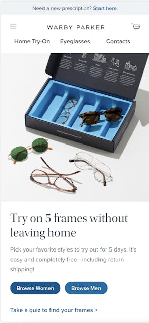
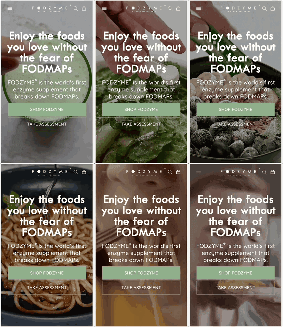
- Pair it with relevant visuals and animations: Warby Parker’s hero image doubles down on their value prop of D2C, personalized frames. Kiwi Biosciences takes a slightly different approach - their background animation draws visitors’ eyes to the only static component of their landing page: the CTA button. In both examples, graphics help guide users to the quiz CTA.
Keep the marketing quiz short and engaging
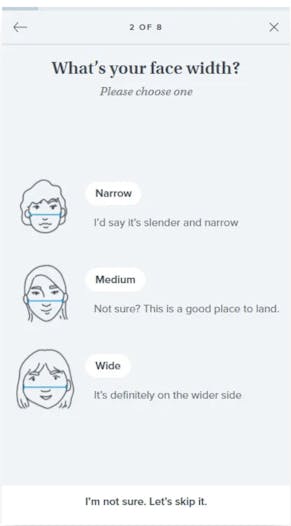
When it comes to content, keep your marketing quizzes short and your questions relevant. In general, we recommend 5-10 well-designed questions that can inform responders’ results. Warby Parker has 8 questions and helpfully calls this out in their progress bar. This helps set time expectations with responders.
If you want to ask more than 10 questions, consider the risk of drop-off vs. the benefit of more insight from each question. Is the question necessary to build a customer profile for product customization? Will the user see the value in the question as they proceed through the flow?
Educate responders throughout the marketing quiz
Ecommerce quizzes are a powerful way to educate leads about your space, or contextualize the intake questions that are being asked. Since there’s no face-to-face interaction in a quiz, content like informational screens can help build trust and make responders feel both supported and empowered. Formsort’s informational question type gives you a lot of customization options on this front.
We like how one of Modern Fertility’s first screens explicitly explains what responders will gain from taking their general fertility assessment. This helps visitors assess the benefits of the quiz and decide whether they want to move forward.
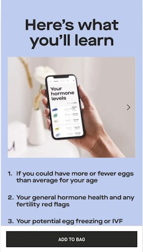
Informationals are just one way to educate quiz takers. If you’re looking for more options, consider using tooltips, videos and testimonials to educate leads about your product or topic.
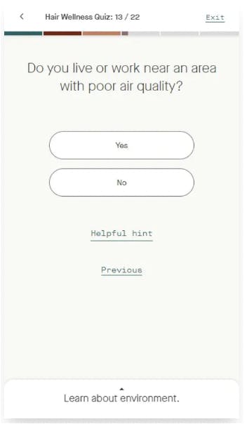
- Tooltips: Nutrafol has tooltips throughout the flow that help responders understand why they’re asking certain questions. One section of the quiz is dedicated to environmental factors, and there’s a tooltip that helps responders understand how environmental factors can impact their hair health. Formsort lets you enable tooltips at any point in your flow.
- Videos: Kiwi Biosciences includes a video from their co-founder and CEO in their “results” page in order to further educate responders on their product’s impact. Video content can also generate trust by hearing directly from the team. Kiwi was able to incorporate this video into their flow using Formsort’s video content type.
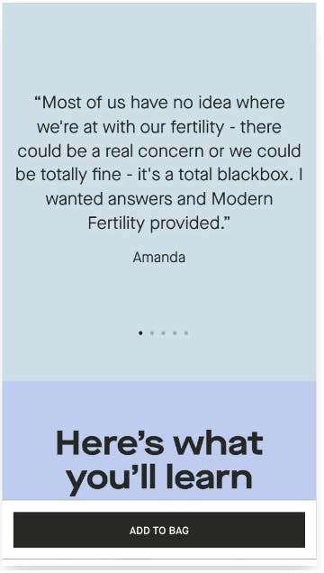
- Testimonials: Modern Fertility features a customer testimonial after sharing their fertility test kit recommendation. This social proof helps build greater trust. You can easily incorporate testimonials into any stage of your flow using Formsort’s informational question type.
Generate quiz scores for personalized results
So far, our tips have focused on design and content tips to make your marketing quiz intuitive and relevant for visitors. However, there are several easy ways to improve the internal quiz building experience for your team as well.
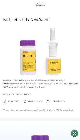
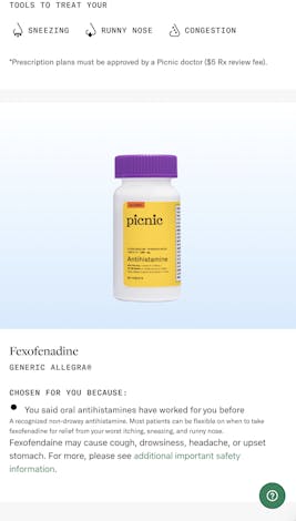
Many product recommendation quizzes use a scoring framework to place responders into concrete categories and generate personalized results. While these scoring frameworks are never shown to responders, they play an integral role in the quiz experience. Essentially, they assign responses to each question a score, and use each individual response to calculate an overall score for the responder that is tied to an output. The output can be a product recommendation - like Picnic’s highly customized allergy prescription plan - or a general assessment - like a sleep score.
This gives immediate value to responders by educating them on the problem and recommending opportunities for improvement. It’s a great opportunity to surface your product organically and persuade responders to purchase it.
Building this scoring framework from scratch can be tedious and time-consuming. You can use Formsort’s calculated variables to easily implement scoring frameworks in your quiz.
Tie quizzes to checkout with limited-time promotional offers
After sharing quiz results with product recommendations, many brands transition to a purchase CTA. Why? If someone reaches the end of your quiz, they are likely a high intent lead and have a higher likelihood to convert into a paying customer. Adding a promotional discount adds a time-sensitive incentive to convert.
As an example, Picnic offers 20% off your first order right after receiving your quiz results.
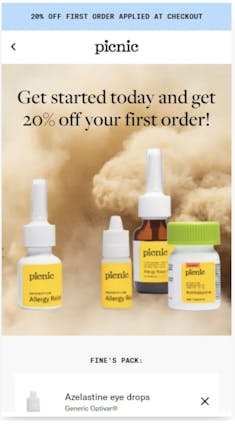
Many brands immediately transition to the shopping cart after the quiz results page, and add the recommended products to the consumer’s cart. They then shift to checkout and automatically include any relevant promotional discounts tied to the quiz.
Check out our article on checkout best practices for more inspiration.
Analyze the quiz’s performance over time
While the actual responses to quizzes yield valuable zero-party data, it’s equally important to assess the quiz funnel over time. Identify any common drop-off points and adjust content. Add an optional comments field to get feedback that you might not have accounted for.
Formsort’s built-in analytics give you a high-level overview of quiz completion rates and drop-off points. For more granular insights, you can leverage our native integrations with Google Analytics, Optimizely, and Amplitude.
Use Formsort's quiz builder to create your marketing quiz
Build your quizzes with Formsort and get more inspiration from Fineflows.