The UX/UI designer’s guide to forms

Best practices for creating engaging and user-friendly forms
Forms are integral to web-based interactions, driving processes like online purchases, patient intake, feedback surveys, and live support. As form technology evolves, understanding good form design is essential for UX/UI designers. The design of a form—its clarity, ease of use, and intuitiveness—has a direct influence on user engagement, completion rates, and overall satisfaction.
What is form design?
Form design is the art of shaping the structure and appearance of forms to create a seamless extension of the brand and website to optimize user experience. It balances visual aesthetics with functionality to make interactions smooth, efficient, and engaging for users.
Key aspects of form design include:
- Content structure: Organizing questions logically, grouping related fields, and determining what information is essential.
- User experience (UX): Ensuring forms are easy to use, intuitive, and accessible for all users, including those with disabilities.
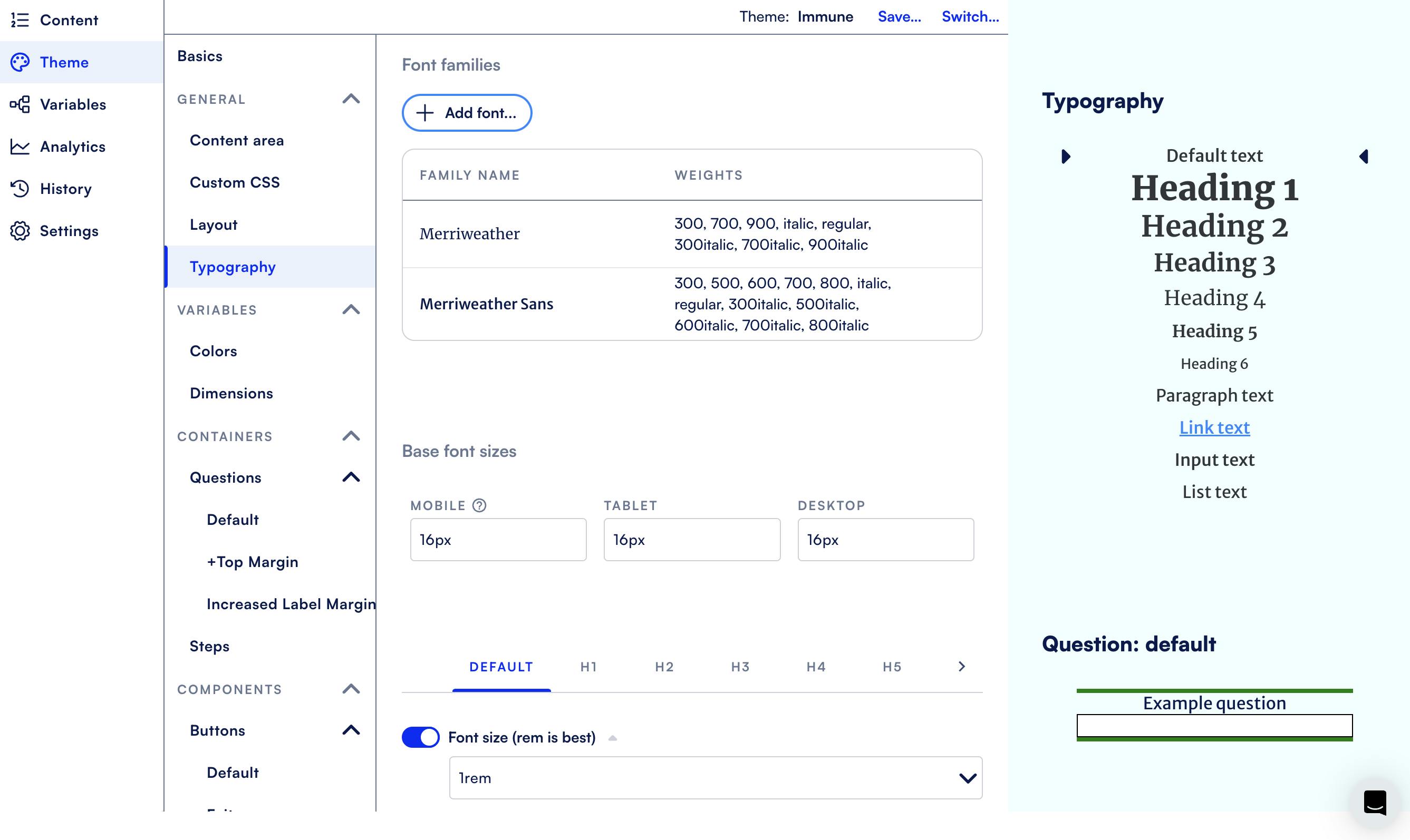
- Visual design (UI): The layout, typography, spacing, and color schemes that make forms visually appealing and aligned with the brand identity.
- Interaction design: Elements like buttons, progress indicators, error messages, and inline validation that guide users through the form.
Design best practices
Before you build - plan your information architecture
Structuring the overall framework of your form includes three components: content, flow, and visualization tools. While you, as the designer, may typically be more involved in the final part of this stage, it’s good to know how all three elements work together. Let’s take a closer look.
Content and flow
As a UX/UI designer, you typically won't develop the actual content of the form, which should already have a defined core purpose, target audience, and well-crafted questions. Essential and optional questions should be marked and longer forms broken into smaller sections.
Will any sections be displayed based on user input to customize the experience? Dynamic elements like template functions, branching paths, and redirects that create engaging, unique user journeys should be identified.
Prototype with visualization tools
Before you dive into the form build, you can use design tools like Figma or Axure to create wireframes and mockups of your form. This allows you to visualize the layout and flow of questions, test different designs, and gather feedback before development. Prototyping helps to align stakeholders and identify potential issues in the design and usability early on, ensuring that the final product is both functional and appealing to users.
Dynamic forms and form design patterns
Engage users with dynamic forms
Dynamic forms are the standard in form design because they provide an interactive and personalized user experience. By adapting to user input in real-time, dynamic forms simplify data entry and present only relevant questions, leading to higher completion rates.
To create effective dynamic forms, you can leverage established design patterns–proven solutions or templates that address common challenges in form creation. They help streamline the design process and enhance user experience.
Some high-impact design patterns that can make your forms more dynamic are:
Template formatting functions
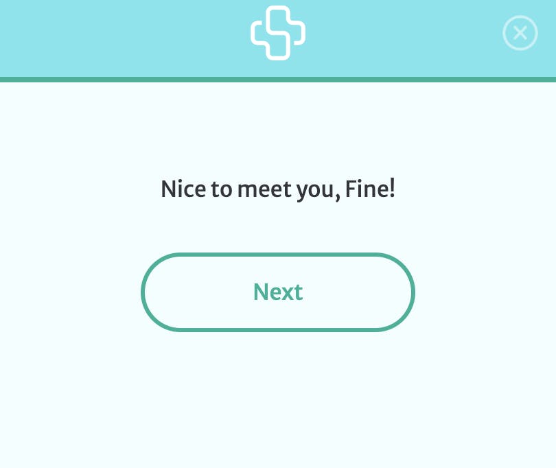
You can personalize greetings by dynamically populating users’ names, display calculated results, show product prices retrieved from an API call, and more using template formatting functions. As users interact with the form and see their inputs and relevant information reflected in real-time, they experience a more engaging form journey.

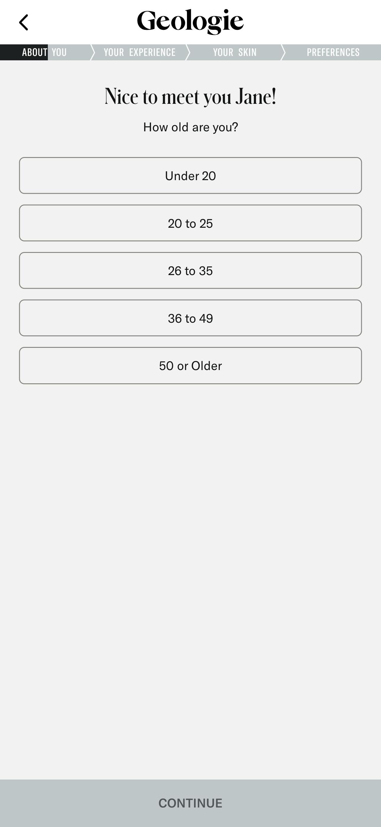
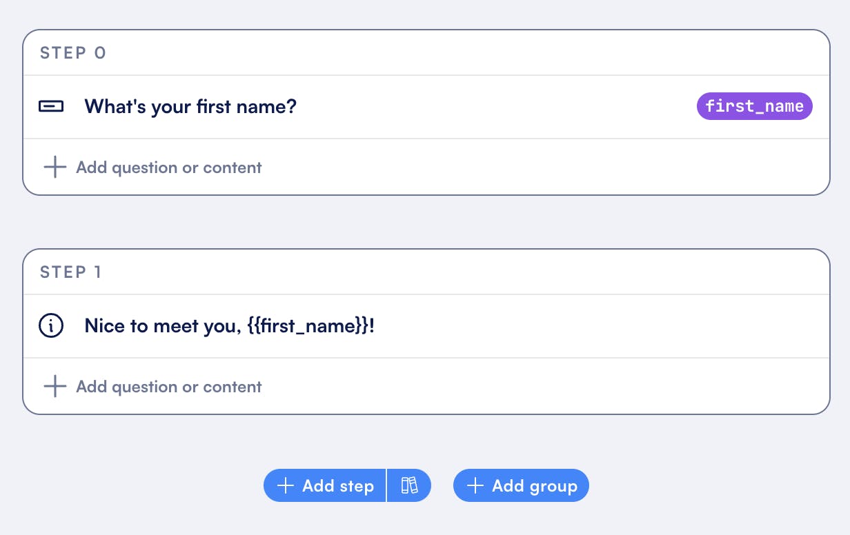
Formsort makes it easy to personalize forms using prefilled fields. To create a dynamic greeting like the example above, you would first prompt the user to enter their first name. Then, a template function uses the provided value to automatically insert it into a friendly message like, “Nice to meet you, {{first_name}}!"
Autofill and autocomplete
Use autofill to pre-populate form fields with stored information, like a user’s name, email, or address. By automatically filling in these details, autofill saves users time and reduces the likelihood of errors.
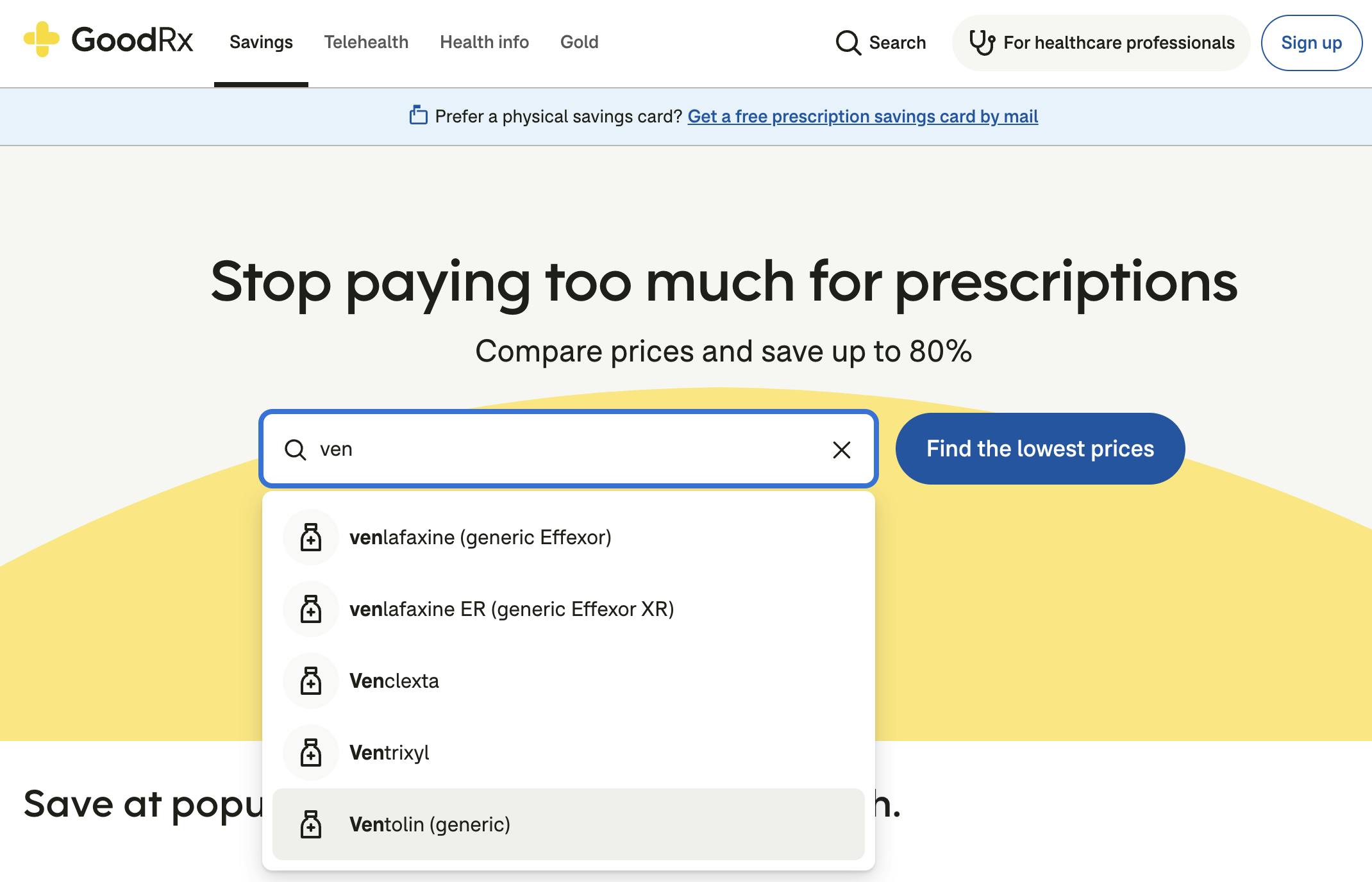
Autocomplete suggests possible answers based on user input as they begin typing in a field. Data can be retrieved from a variety of sources to generate these suggestions, including:
- Databases: This is where previously entered user data or predefined lists of common terms, categories, or product names are stored. For example, a form might pull from a database of frequently used addresses or products to suggest options as the user types.
- External APIs: Autocomplete can be powered by external APIs, retrieving data in real-time from services such as geographic databases or location-based APIs to suggest relevant cities, states, or other location-specific information.
- Calculated variables: These are dynamically generated based on user input or logic set within the form. For instance, suggestions might be calculated from previous selections or patterns in user behavior, adapting the form to each individual interaction.
GoodRx, an online prescription refill center, incorporates autocomplete functionality to enhance the user experience when searching for medications. Recognizing that medication names can be challenging to spell or remember, GoodRx allows users to enter partial names or alternative terms in their search. The autocomplete feature suggests relevant options as users type, making it significantly easier for patients to access the medications they need.
Autosave stores user input at intervals so if they leave the page unexpectedly or return later, their progress is retained. They can pick up where they left off and complete their form.
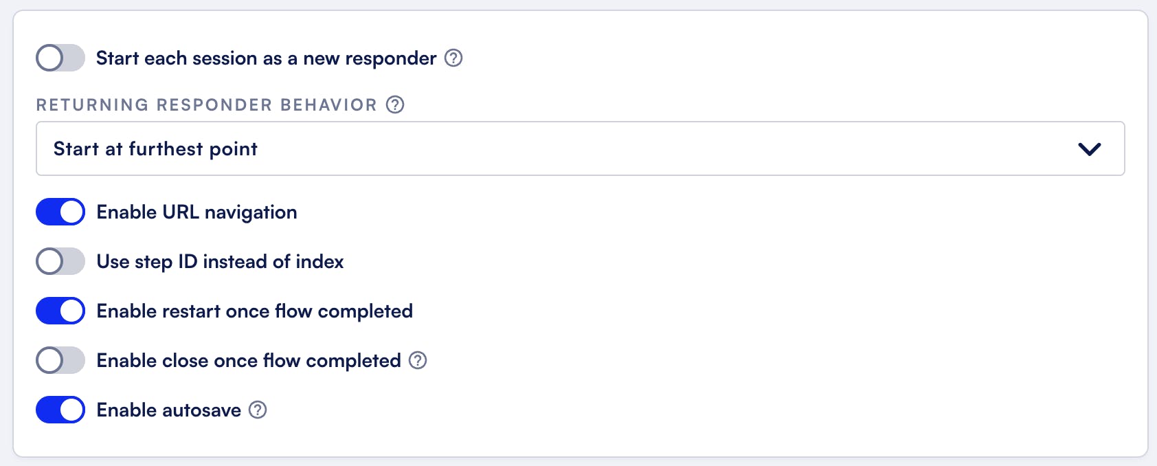
In Formsort, you have control over how user progress is saved and where users are directed when they return to a form. You can enable the autosave feature to automatically store user input periodically, ensuring that they can return and pick up where they left off, even if they accidentally leave the page or close the browser.
Then, use the returning responder dropdown to define where users should start upon returning to the form. Options include starting from the furthest point reached in the form (as shown in the screenshot), ensuring users do not need to repeat steps.
By combining autosave and returning behavior settings, you can ensure your users can complete complex forms with minimal disruptions while retaining progress and context.
Inline form validation
Real-time validation provides immediate feedback as users fill out each field, allowing them to correct errors as they go, rather than waiting until the end of the form. The easiest way to do this is to leverage structured data inputs. If you’re building on Formsort, for example, you can select the appropriate input data type for each question to ensure that the user input is valid and aligns with the type of data expected. You’d select Yes/No for boolean questions or Address if you require the street, city, and zip code fields. Built-in data validators alert users if there are any invalid entries.
Custom validators: If you’re using Formsort, you can leverage custom validators–rules you tailor for your form’s specific needs. You can define unique requirements, such as verifying a custom format for an ID number in your database or ensuring that a password contains specific characters. Custom validators give you more flexibility and control, ensuring the data collected fits your form’s exact needs.
Confirmation messages
Encourage users as they move through the form with positive statements like "Looks great! Keep going!" or "Nice! Just a few more steps." Adding messages such as "All fields are correctly filled!" or a green checkmark beside validated fields reassures users they’re on track. These messages should be clear, informative, and encouraging to keep users motivated and confident throughout the form.
Branching logic and redirects
Want to efficiently gather a patient’s medical history or a customer’s interior design preferences? Use conditional logic to display questions based on their initial responses, customizing the form journey to reflect their unique needs. You can also redirect users to the appropriate follow-up diagnostic form after completing an initial qualification, streamlining the entire process.
Origin’s branching form paths include targeted follow-up questions for each complaint a patient submits, ensuring all necessary information is collected efficiently and accurately. Patients feel heard and valued, allowing them to provide all the details important for their treatment, which in turn builds trust and confidence in the care they receive.
Forgiving format
This feature allows flexibility in input, accommodating various ways users may provide information. For example, allowing partial addresses or nearby landmarks when users are searching for store locations can enhance their experience by making it easier for them to find what they need without having to input exact information.
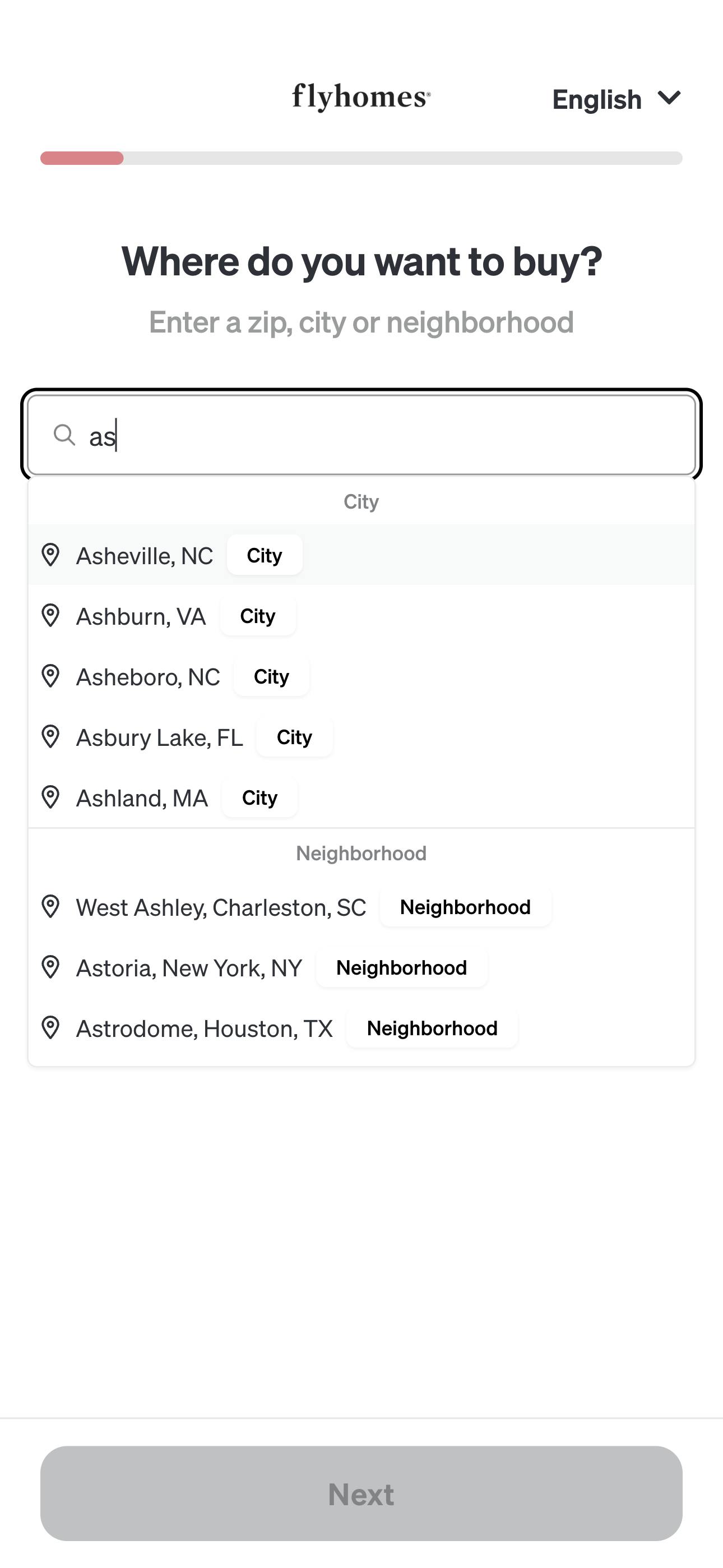
In the form for Flyhomes, a real estate platform, users can search for homes to buy by entering a city, zip code, or neighborhood. The forgiving input format accepts partial information (e.g., the first few digits of a zip code), allowing users to quickly identify relevant areas. This approach reduces friction and makes the form more user-friendly.
Create a seamless visual experience
A seamless visual experience enhances brand recognition, guides users intuitively through the process, and fosters a sense of comfort and familiarity.
Let’s explore some key elements to achieve this:
Infuse brand aesthetics
Your form is an opportunity to deepen users’ understanding of your business’s values, ethos, and approach. Your form builder should give you enough design customization options to choose the colors, typography, and imagery that reflect your brand identity. Here are some ways companies have effectively utilized design elements to align their forms to their brand vibe:
Playful - Bright colors, fun fonts, and whimsical illustrations create a light-hearted atmosphere. Often used for surveys, quizzes, or events targeting younger audiences.
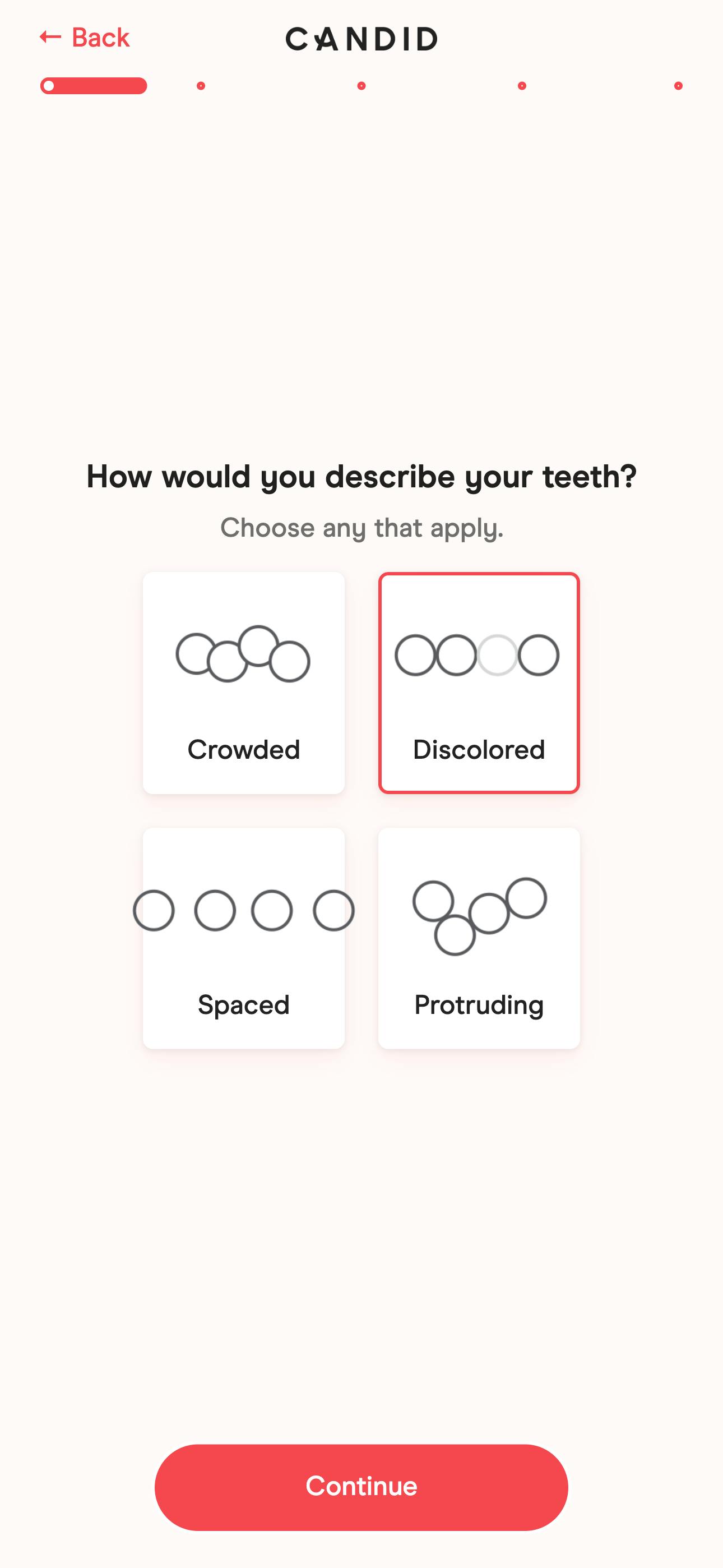
Candid, a dental aligner provider, uses a colorful form design to ease the anxiety often associated with dental care.
Modern - Sleek, contemporary design with bold typography and vibrant colors. Appeals to tech-savvy users and startups.
Ramp is a fintech company that exudes professionalism and innovation with its sophisticated yet dynamic color palette.

Friendly - Warm colors, rounded fonts, and approachable language to create a welcoming environment. Effective for community-oriented organizations and services focused on user support.
Waybetter, a weight loss and wellness platform, builds a sense of community through its wording and visuals. Inclusive language and images communicate that everyone is welcome, fostering a supportive atmosphere for all users.

These are just a few examples, and it's possible to create forms that are minimalist, elegant, professional - the important thing is to ensure alignment with brand identity
Embrace the single-column layout
Aligning questions vertically and to the left margin, rather than in a zigzag pattern, is a proven way to streamline the form-filling process. A single-column layout saves time and minimizes the chances of users overlooking questions.
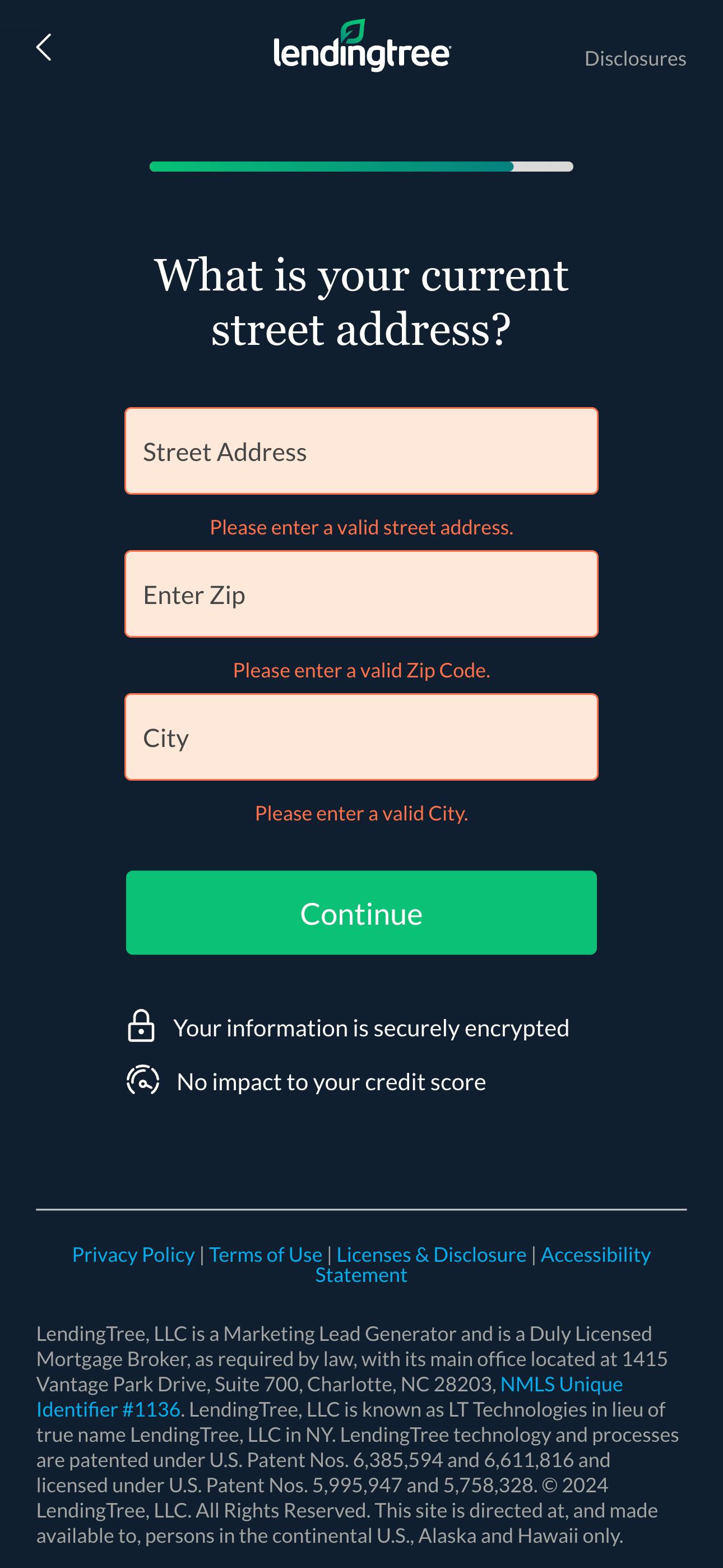
Make sure to apply this principle to grouped form fields, such as address fields, and multiple answer options. For instance, presenting address components—like street address, city, state, and zip code—vertically rather than horizontally allows users to input their information in a clear, logical order.
Stacking answer options vertically also enhances readability and simplifies the selection process.
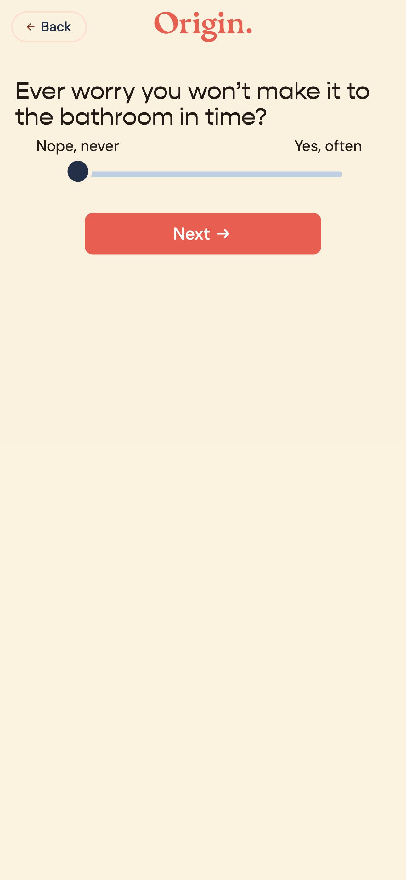
Exceptions include phone numbers, which display the country code alongside the main number in a horizontal format. Similarly, sliders are horizontal because that’s more intuitive.
Leverage microcopy to guide users
Microcopy consists of small text elements in a user interface that guide and clarify tasks for users. Clear and concise wording is essential, but well-placed instructions or tooltips can greatly enhance the user experience. Effective microcopy helps users understand why specific information is required and clarifies input expectations, improving form completion rates and overall engagement.
Some examples of microcopy that can enhance your form’s usability are:
Field instructions
These help users understand what’s expected, reducing errors and confusion. For example, “Preferred first name (optional)” is clearer than “Preferred first name.”
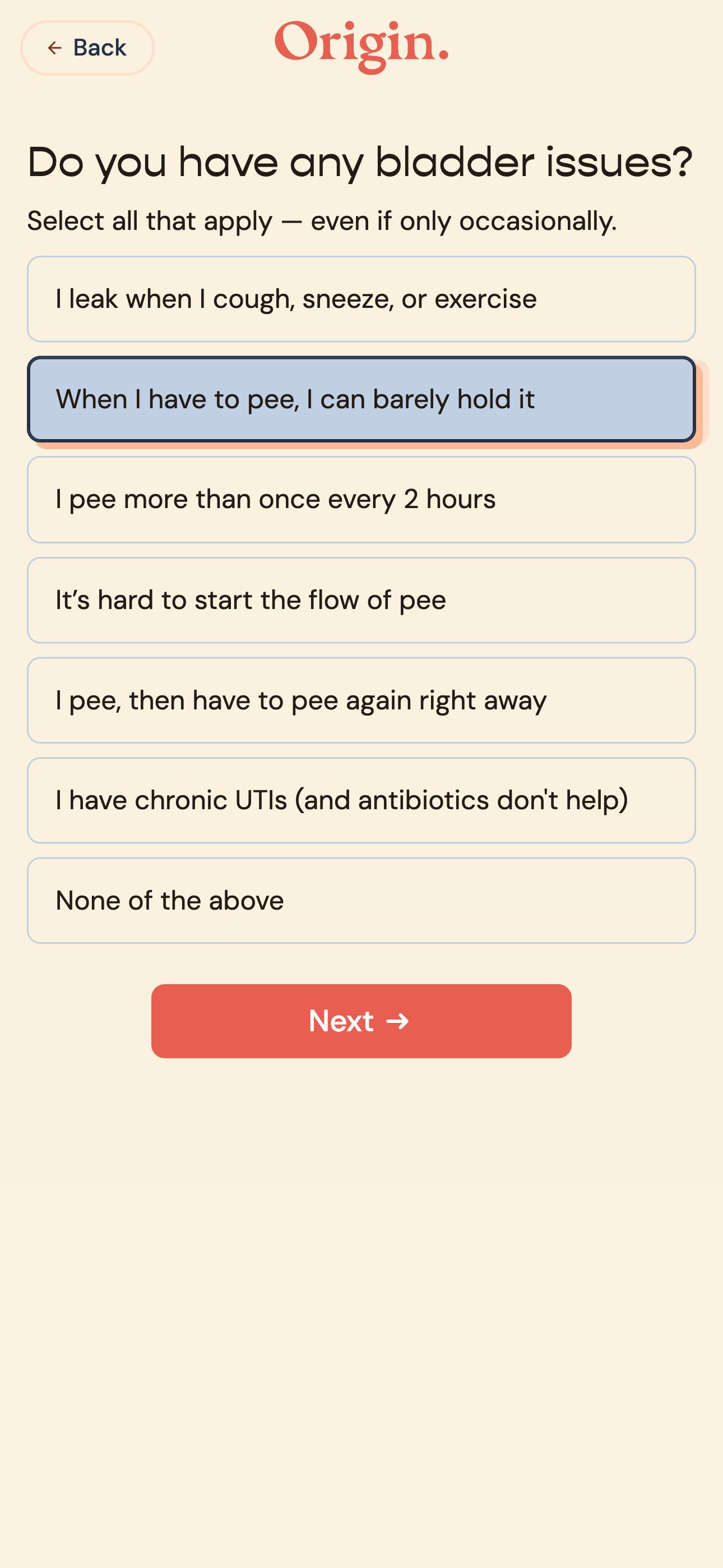
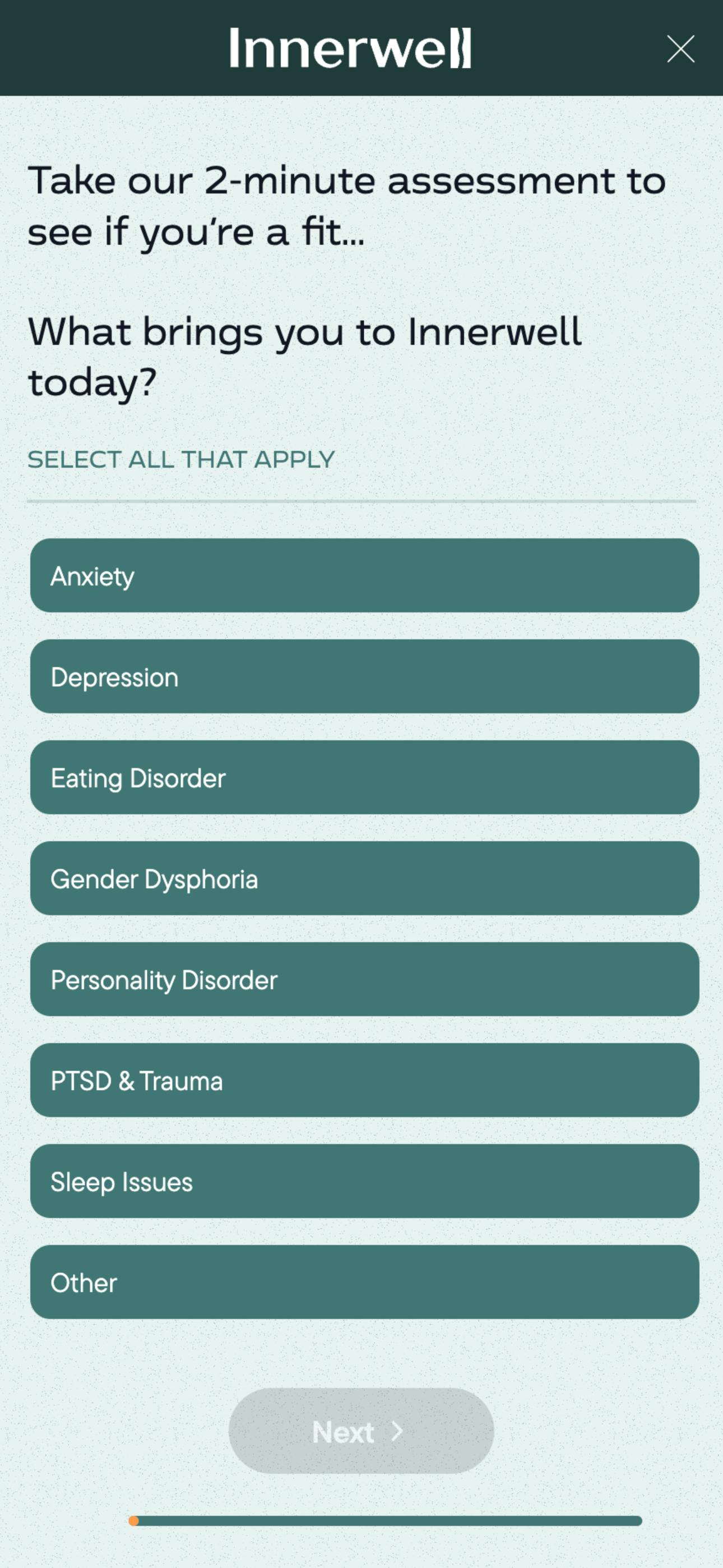
Innerwell, an online depression treatment center, instructs users to select all options that apply so they can get the most complete data from their signup form.
Action-based button wording
Instead of vague terms like “Submit” for buttons, use action-based wording that clearly tells users what will happen next, such as “Finish and pay” or “Sign up now.” This not only sets expectations but also makes the process feel more engaging and direct.
Supplemental placeholder text
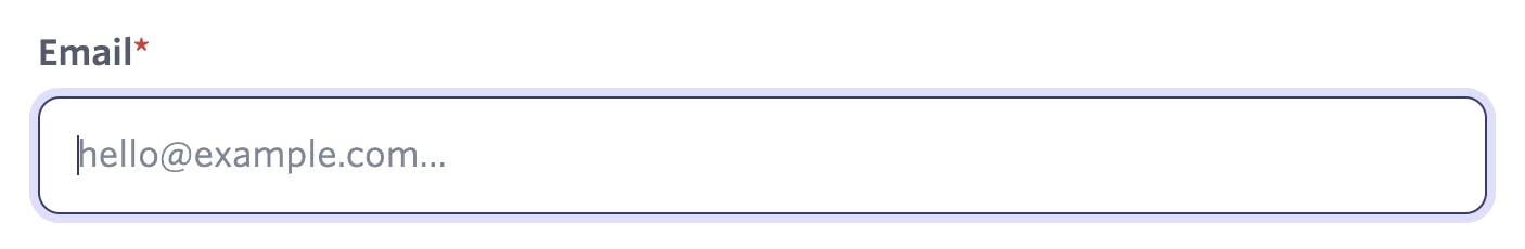
Use placeholder text in addition to the question or label, as accessibility issues can arise when it disappears upon typing. For example, if the label is Phone number, the placeholder text can show the expected data format, e.g., "123-456-7890."
In the example below, the email field’s placeholder text reads "hello@example.com." To enhance accessibility, the placeholder text could be adjusted to provide more specific guidance on the expected data format, such as "name@domain.com" or "example@provider.com."
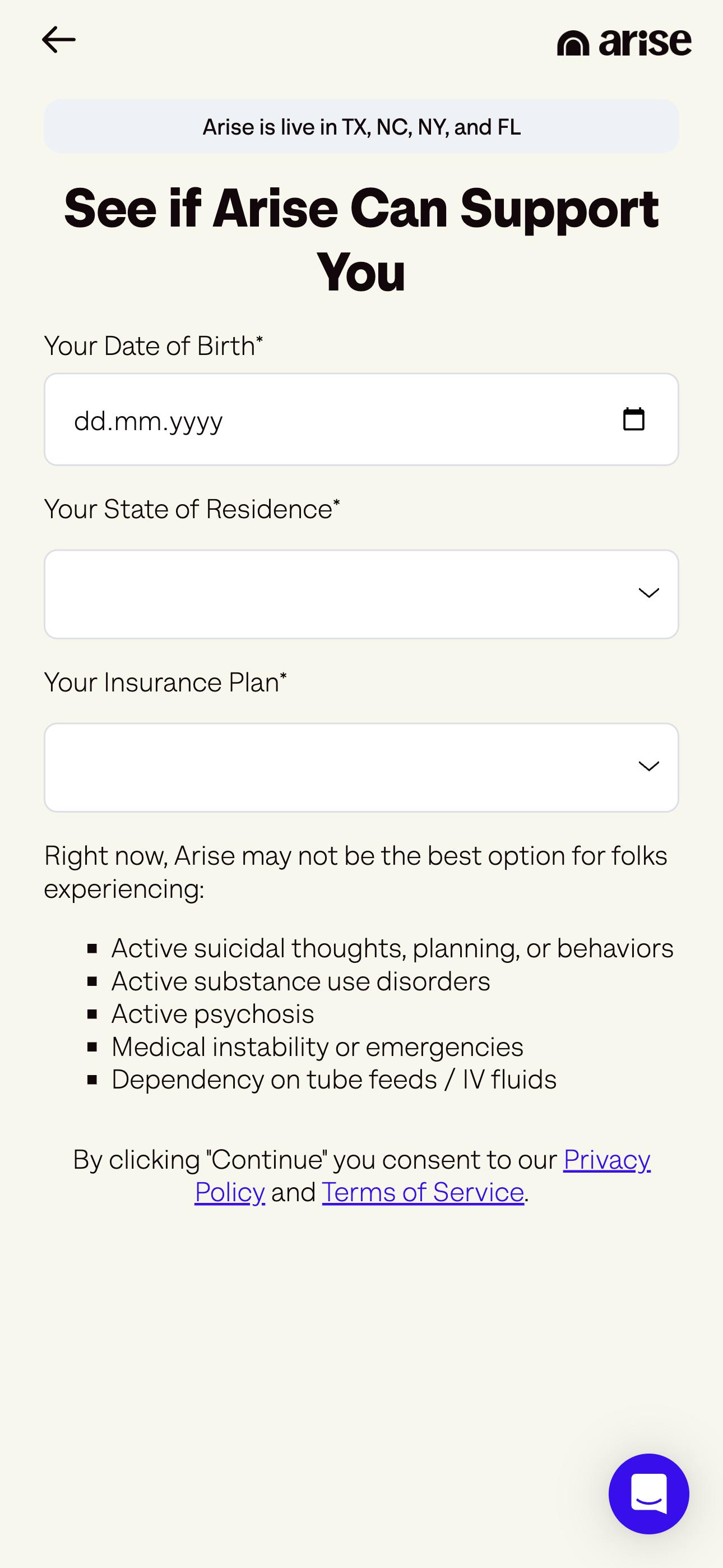
Arise, an eating disorder treatment provider, uses the placeholder feature to display the expected format for dates, making it easier for users to input their date of birth in the correct format.
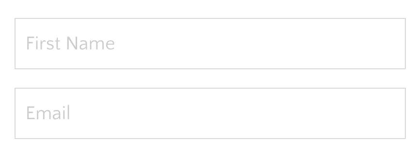
Avoid using placeholder text as a replacement for the actual question or prompt as in the example below. Placeholder text can be hard to read due to its lighter appearance, and it disappears as soon as users start typing, which may cause confusion.
First person wording
Leverage first-person language in calls to action (CTA) and submission buttons to create a more personalized experience. Instead of generic terms like "Submit," use language that makes users feel more involved, such as “Start my free trial” or “Get my results.” This subtle shift in tone empowers users, putting them in control of the action.
The onboarding form at Future, a fitness coaching platform, uses first-person wording like “Reveal My Matches,” which feels personalized and action-oriented. By tailoring the CTA in this way, the form fosters a more engaging and interactive experience, encouraging users to follow through and complete their submission.
Experiment to optimize
Test any new design feature you introduce to check it’s enhancing your users’ experience and improving your form completion rates. One effective way to do this is through A/B variant testing, like the tool offered by Formsort, which allows you to compare different versions of your form and identify which one performs better. Analyze user interactions to determine the best design choices for your forms.
The most common metrics used to evaluate form performance are:
Completion rates: The number of users that complete the form as a percentage of the number of users who start the form.
Drop-offs: Essentially the opposite of completion rate, drop-offs measures the number of users who abandon the form. By identifying specific points in the form where users are most likely to drop, you can pinpoint areas of friction or confusion, allowing you to optimize the form for a smoother user experience and increase the overall completion rate.
Error rates: Monitor how frequently users encounter validation errors or provide incorrect inputs. This will help you identify whether any changes in instructions, field layout, or interaction design are confusing users and need further adjustment.
By monitoring these metrics and optimizing based on data-driven insights, you can refine your forms to boost usability, improve user satisfaction, and increase overall conversion rates.
How Formsort can help optimize your form design
Formsort is a low-code form builder that incorporates the latest design best practices, ensuring your forms are both functional and engaging. This lets you focus on optimizing the user experience with intuitive design, smooth user flow, and personalized interactions–without getting bogged down in technical details. One of the key advantages of Formsort for UX designers is the ability to quickly iterate on forms without relying on developer support.
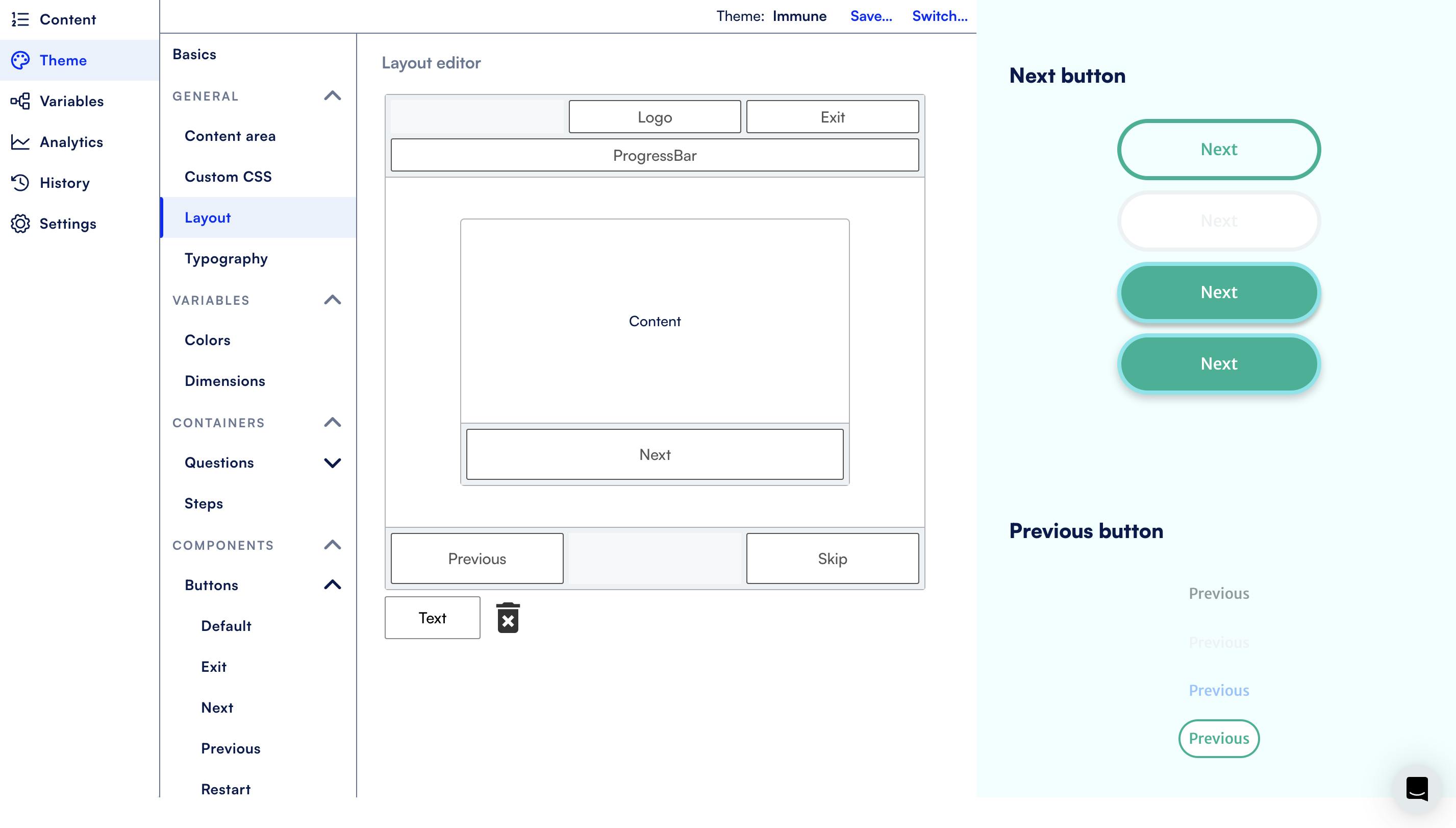
Formsort also provides a variety of built-in tools, including single-column layouts, mobile responsiveness, question grouping, A/B testing, conditional logic, and data validation. Plus, the theme editor offers extensive customization, including custom CSS features, to align your forms with your brand’s aesthetics.
Design your next form with Formsort
Elegant, intuitive forms enhance the user experience and improve completion rates. Stay ahead of the curve by designing sleek, modern forms that adhere to the best design practices. Discover how you can use Formsort to build and launch forms to collect the data you need effortlessly. Get started here.