10 common form building mistakes and how to avoid them

Boost your form completion rates with these essential tips
Ever met a form that felt clever but wasn’t easy to fill out?
Something went wrong in the planning, design, or building process. The result was a form that didn’t feel intuitive or efficient. As the primary interaction point for purchases, sign-ups, feedback and data gathering on websites, forms are crucial for user engagement and conversion rates. All too often, common form-building mistakes can lead to user frustration, form abandonment, and ultimately, a negative impact on your business.
In this article, we’ll identify 10 common form-building mistakes and provide tips for optimizing your forms. We’ll also highlight some real form examples of each strategy to illustrate how to implement them effectively. For more detailed form-building insights, you can read how to optimize your onboarding form or refer to our comprehensive form design guide.
Form building mistakes
Mistake 1: Asking for too much information
Asking for excessive information can overwhelm users, creating friction in the user experience. Users are often deterred by lengthy forms for reasons including:
- Privacy - It can feel like an invasion of privacy, especially if the requested information seems unrelated to the purpose of the form. Users may feel reluctant to provide extensive personal details.
- Time - A long list of required fields can be daunting and time-consuming to fill out, especially on mobile devices where typing can be more challenging.
- Relevance - Users may question the necessity of providing certain pieces of information, especially if they are not immediately relevant to the task at hand.
Try instead: Only ask for essential information
Start by identifying the core information necessary to achieve the form's objective and eliminate any unnecessary fields. Use clear and concise language to communicate the purpose of each field and provide guidance where needed.
Also, consider implementing smart form logic to tailor the form dynamically based on user inputs, reducing unnecessary clutter and improving usability. By focusing on essential information, you can create more user-friendly forms that enhance engagement and satisfaction.
Allara Health
Allara Health is an online PCOS center. Their onboarding form gets right to the point and efficiently collects only necessary details. To determine eligibility based on location, they simply ask for the responder’s zip code. No need to obtain the patient’s full address just yet.

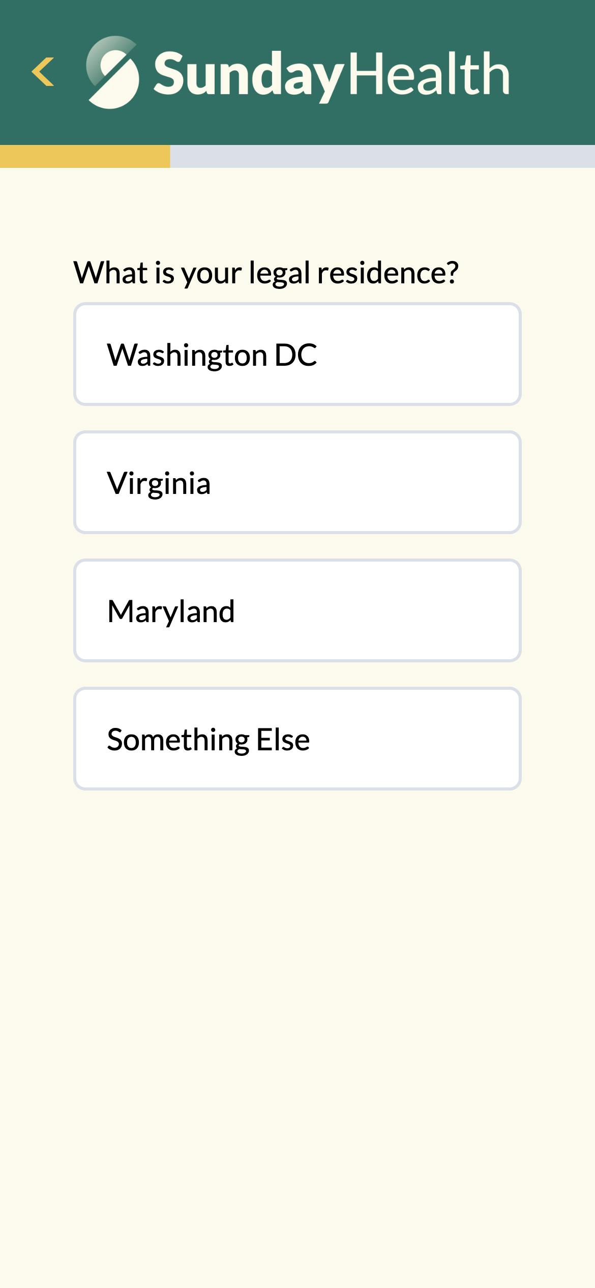
Sunday Health
Sunday Health uses a quick qualification form that asks only the most essential questions to check for eligibility. As with most healthcare providers, they are licensed in specific locations, so they list these areas upfront and ask responders to identify if they live in one of the qualifying regions. By allowing users to quickly select from four options instead of sifting through a lengthy dropdown list, the form simplifies the process and makes it easy for responders to see which locations qualify. This approach enhances user experience through clarity and transparency.
Mistake 2: Providing too little information
Not including enough information about your company and your offerings can leave users confused or uncertain about what they are signing up for or what the purpose of the form is. Forms are often a place to educate potential customers about specialized products and services. Niche offerings require detailed explanations to explain their unique features, qualifiers, usage guidelines, potential impact and any associated side effects.
Use clear, concise details about your products, services, or form purpose to build trust and credibility with your users. Comprehensive information helps make informed decisions and increases form completion rates. Striking the right balance is crucial for optimizing form effectiveness and fostering positive user experiences.
Try instead: Include brand language and information about your offering
Start by aligning the tone and messaging of your forms with your brand identity to ensure consistency across all touch points. Use language that resonates with your target audience and reflects your brand's values and personality.
Ensure that you clearly communicate the unique selling points and benefits of your offerings to capture users' attention and motivate them to act. Incorporating compelling visuals, concise descriptions, and persuasive calls-to-action can further enhance the impact of your forms and drive user engagement and conversion.
Origin
Origin Physical Therapy has a fairly involved pelvic health intake form. This specialized form educates as it collects information. They ensure patients understand why specific questions are asked by providing helpful medical data. Statistics and detailed explanations included in the form demonstrate the company's expertise in its area of specialization, helping patients feel confident in their care.


Mistake 3: Poor mobile optimization
Building a form that isn’t mobile-friendly is a critical misstep. With the majority of internet users accessing content through mobile devices, neglecting to optimize forms for mobile can lead to frustration, high bounce rates, and missed opportunities for engagement. Responsive forms adapt seamlessly to various screen sizes and touch interfaces, providing users with a smooth and intuitive form-filling experience on any device. By prioritizing mobile responsiveness, you can reach a wider audience and improve overall user satisfaction with your website or application.
Try instead: Optimize your forms for mobile devices
Simplicity and efficiency are key for mobile responsive design. Start by designing forms with a mobile-first approach, focusing on minimalistic layouts, large touch-friendly buttons, and streamlined input fields. Ensure that form elements are adequately spaced to prevent misclicks or accidental submissions. Form questions that require precision are best avoided on mobile screens, such as grid questions or sliders. Use features such as autofill and date pickers to enhance usability and reduce user effort. Make sure to test your forms across various mobile devices and screen sizes to identify and address potential issues like below-the-fold buttons, cutoff text, inconsistent formatting, touch target size, and input field alignment.
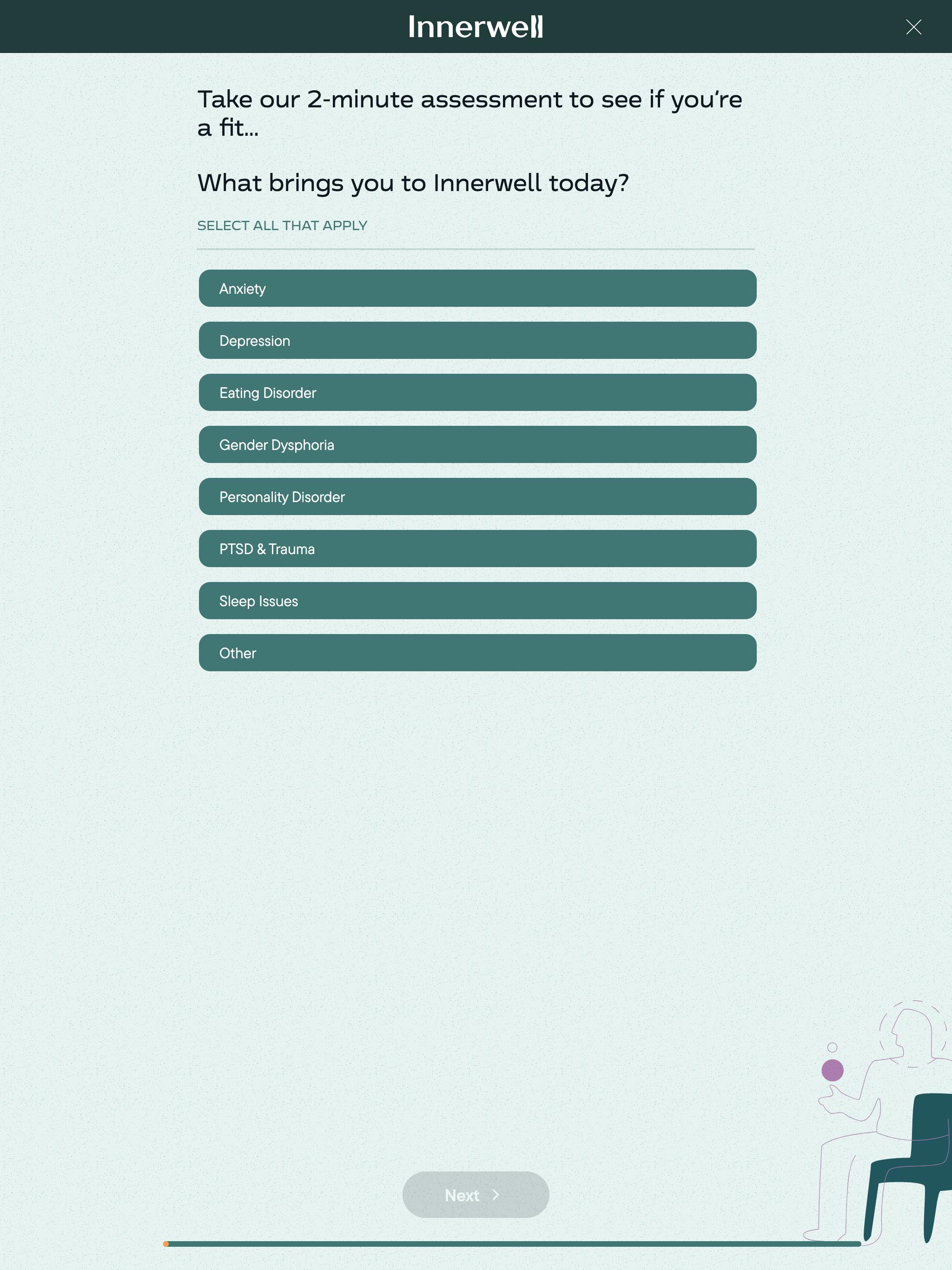
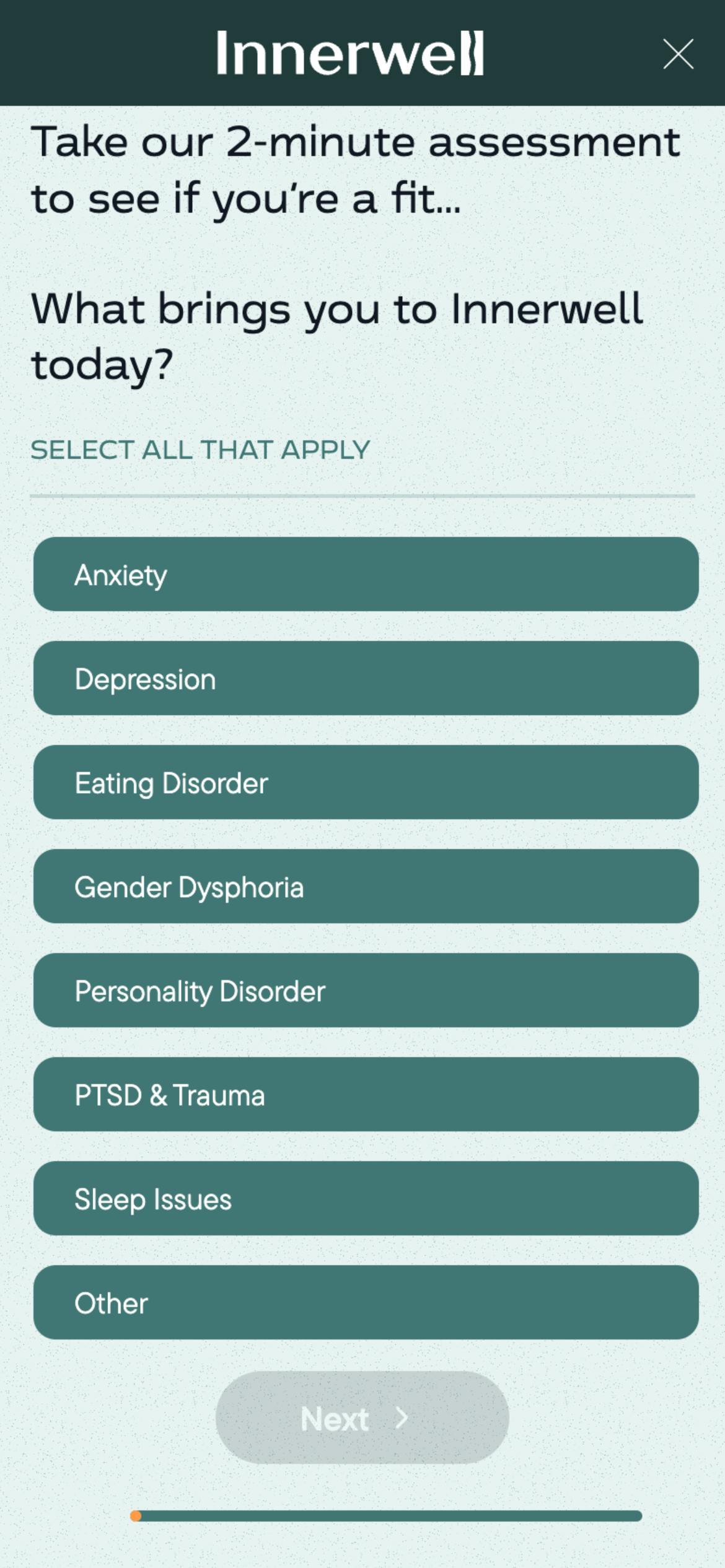
Innerwell
Innerwell’s mobile-optimized form page design emphasizes simplicity and efficiency. It has a minimalist layout, large touch-friendly buttons, and streamlined input fields. Complementary visuals that can be found on larger screens are eliminated on the mobile view to highlight essential form elements. Features like autofill and drop down lists enhance usability and reduce user effort.
Mistake 4: Lack of clear instructions
If your instructions are unclear, too long, complicated, or if you don’t provide instructions, you’ll likely confuse users, increase the likelihood of errors, and risk higher form abandonment rates. Clear instructions and labels are essential for guiding users through the form-filling process, reduce confusion, and ensure that responders provide accurate information. By providing clear guidance, you can streamline the form-filling experience, improve user satisfaction, and increase the likelihood of form completion.
Try instead: Write effective form instructions
When writing form instructions, simplicity and clarity are essential. Follow these tips to develop instructions that are concise, accurate, and user-friendly:
- Use straightforward language that is easy to understand and free from jargon or technical terms where possible. Clearly state what information is required in each field and provide examples or hints where appropriate to help users understand what is expected.
- Break down complex tasks into manageable steps and use bullet points or numbered lists to organize instructions effectively.
- Consider using visual cues such as icons or color highlights to draw attention to important information.
Koalafi
Koalafi, a financial services company, provides clear instructions in their B2B qualification form to ensure applicants can accurately answer potentially confusing questions. For example, when requesting an Employer Identification Number (EIN), Koalafi includes a helpful tooltip explaining what an EIN is and why it's needed. Additionally, they provide a placeholder in the input field to guide users on the expected format. This attention to detail reduces errors and streamlines the application process, enhancing the overall user experience.

Mistake 5: Ignoring accessibility
Imagine you provide heart health services and your target population is older adults. Your form has great questions, clear instructions, and an attractive design. However, the font in your form is standard size, which is too small for many of your users to read with ease. A 70-year-old potential patient tries to fill out the form to sign up for a consultation. He struggles to read the small text, squinting and leaning closer to the screen. He misses important information and makes errors in his responses. Frustrated, he abandons the form halfway through, deciding it’s not worth the hassle. You’ve lost a potential client, who now feels that your services may not be user-friendly for someone of his age group. By ignoring accessibility and not considering the needs of your older audience, your form becomes a barrier rather than a helpful tool, negatively impacting user experience and potentially reducing your client base.
Accessibility in form design ensures that all users, including those with disabilities or impairments, can easily access and interact with digital content. It is a crucial aspect of creating an inclusive user experience, enabling everyone to participate fully and independently. Accessibility is not just about legal compliance; it’s about recognizing and addressing the diverse needs of your audience so they can engage with your form and interact with your services effectively.
Try instead: Make forms accessible to all users
To make forms accessible to all users, follow best practices outlined in guidelines like the one provided by W3C. Some things you should do are:
- provide alternative text for images
- use semantic HTML elements,
- include proper keyboard navigation
- implement ARIA (Accessible Rich Internet Applications) attributes where necessary
- provide sufficient color contrast
- use fonts that are legible and large enough
- regularly test your forms with assistive technologies such as screen readers to identify and address accessibility barriers
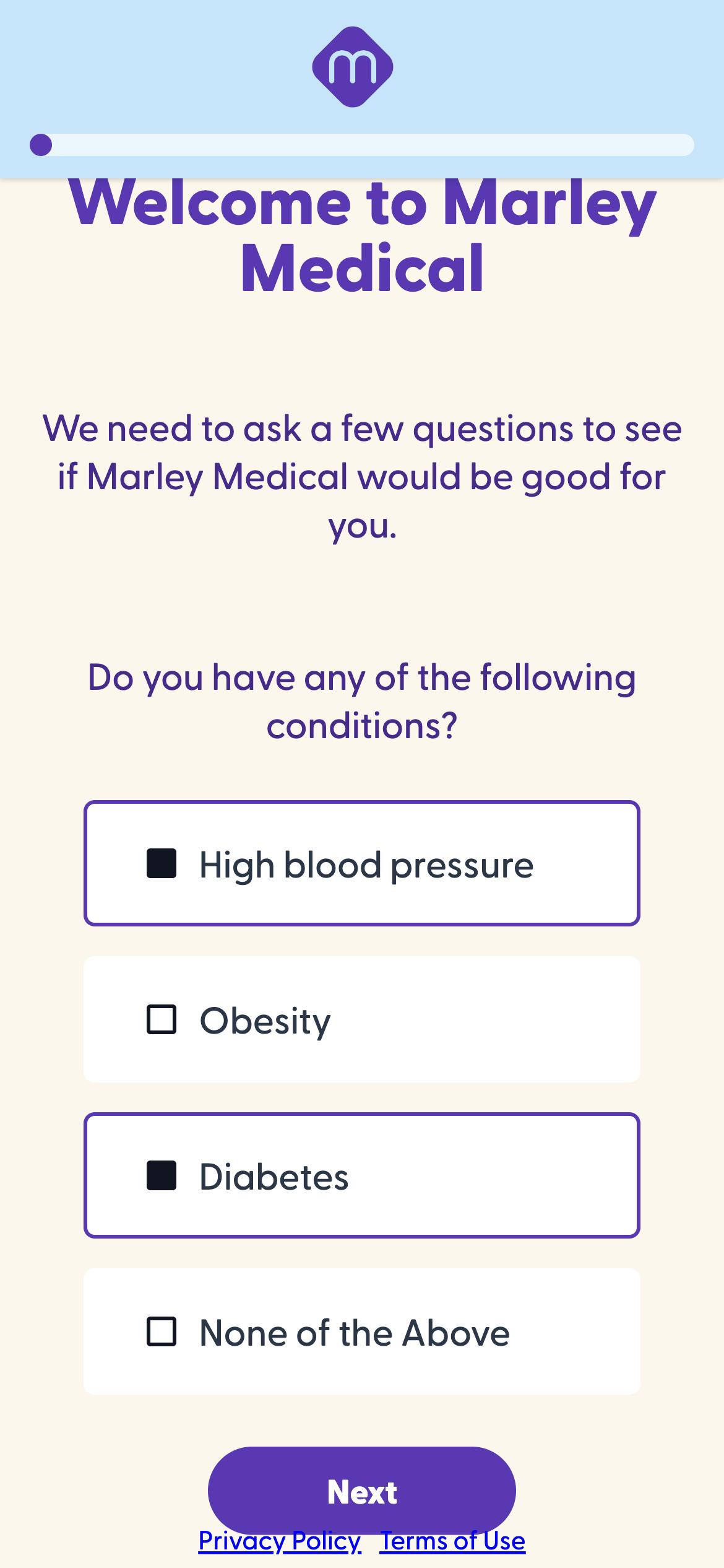
Marley Medical
Marley Medical's heart health qualification form, thoughtfully designed for accessibility, caters to an older patient population who may experience visual issues or difficulty navigating online. With a clean layout, high-contrast text, and intuitive navigation, the page ensures ease of use for all users, including those with disabilities. The cream background can enhance accessibility by reducing eye strain and improving readability. Clear labels and concise instructions accompany each field, further enhancing usability for individuals with varying levels of digital proficiency.
Mistake 6: Using unintuitive layouts
When it comes to forms, familiarity is key. There are few rules in but many conventions that make it easy for users to interact with sites across the web. Deviating from conventions—like not having active/inactive states for buttons—can frustrate users. Similarly, a container that looks clickable but is only active within a small section can confuse users, potentially deterring them from completing orders on your e-commerce site.
You might want to add some cool animation, infuse an avantgarde brand aesthetic, or experiment with new ideas. When trying anything new, it’s important to ask if these features will engage and ease the form filling experience or confuse and frustrate users. Then test and monitor to see if these are having the desired impact or hurting your form submission rates.
Try instead: Use features that optimize intuitive layout
Most form builders are designed to help you create intuitive forms. So if you use the available features on a platform like Formsort, you’ll automatically be following conventions even while adding the unique features that set your form apart. If you dive deep into customization, you’ll want to be mindful of intuitive layout decisions like:
- Single column layout: Use a single column layout to maintain a natural reading flow and reduce cognitive load. This is especially helpful in mobile devices.
- Logical field grouping: Group related fields together to help users understand the structure and purpose of the form.
- Consistent alignment: Align text and fields consistently to create a clean and organized look. For example, headings and questions might be centered or left-aligned. Next buttons are usually below the text on a page and either centered or right-aligned.
- Actionable buttons: Ensure buttons are clearly labeled and distinguishable between active (e.g., "Submit") and inactive states (e.g., "Disabled"), either by using different colors or shadows.
- Progress indicators: Use progress bars or steps to show users how far they are in multi-page forms.
- Placeholder text: Use placeholder text to offer examples or hints, but don’t rely on it as a replacement for labels. You can add tooltips to explain why you’re asking for certain data or what data type you’re seeking.
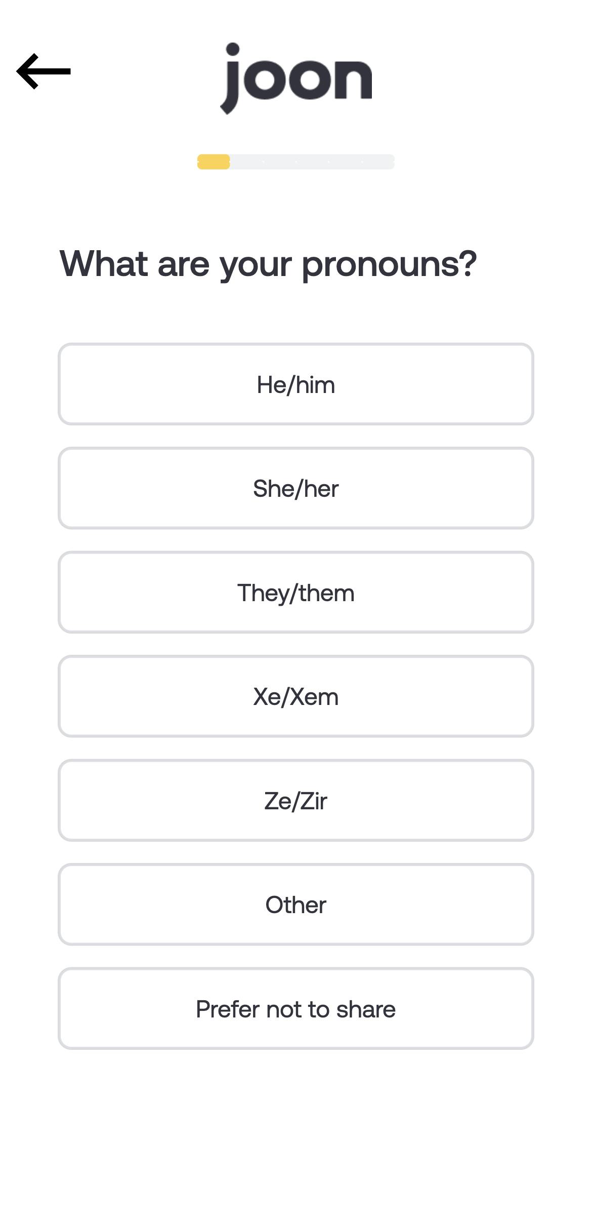
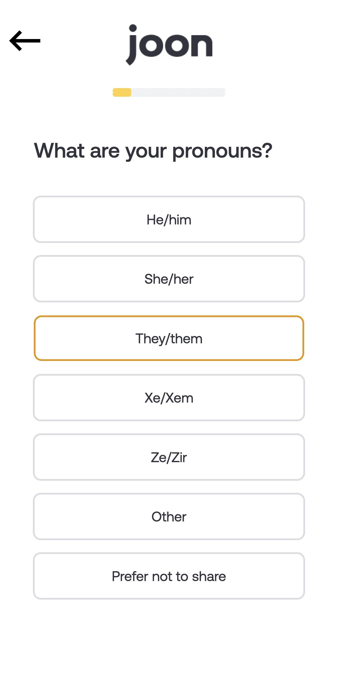
Joon
Joon’s mental health intake form features a clean, youthful design, perfect for their teen and young adult patient population. The form has a single column layout, consistent center-alignment, and a nifty progress bar up top. Displaying one question per page with large, actionable select buttons makes this form easy to navigate. With a rounded, easy-to-read font and a yellow-on-white color scheme, the form ensures excellent readability and user experience. Generous spacing further enhances usability, making it a great solution for all devices and screen sizes.
Mistake 7: Not using field validation
What happens when a lead goes all the way through your SaaS sales funnel and finally signs up, only to never find out why she wasn’t onboarded? You have all the information you need to qualify her for your product, but without a valid email address, you can’t contact her. She takes her business to another provider.
Neglecting field validation is a significant mistake, as it can lead to incomplete or incorrect data submissions, frustrating users and complicating data processing. Implementing real-time field validation is crucial for enhancing user experience and form accuracy. When you provide immediate automatic feedback, users can correct errors as they fill out the form, reducing the likelihood of submitting incorrect information.
Try instead: Leverage field validation for valid data
Provide real-time feedback to users, clearly indicating errors next to the relevant fields. Use simple and concise error messages that explain the issue and how to correct it. Highlight erroneous fields with noticeable colors, such as red, and ensure validation criteria are consistent and intuitive. Incorporate inline validation to guide users as they type, and test the form thoroughly to ensure all validation rules work correctly across different devices and browsers. Formsort offers built-in validators to streamline this process, while also allowing the addition of custom validators to handle more specific validation needs.
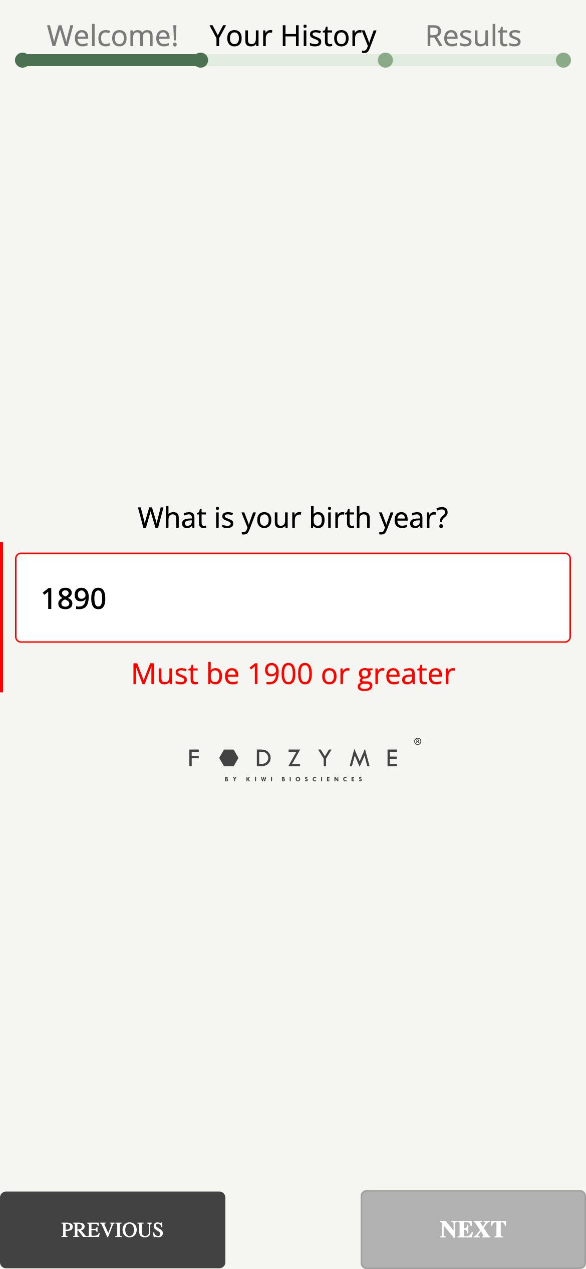
Fodzyme
Fodzyme's form uses field validation to ensure users provide accurate information. Their real-time notification includes highlighting the input field in read, a red sidebar, and an instructive feedback message that helps users quickly correct their mistakes without progressing to the next step. Users don’t mistakenly submit forms with invalid data or have to get to the end of the form to find out they’ve made mistakes in previous pages.
Mistake 8: Failing to provide feedback after submission
When you don’t confirm that a form has been submitted, it leaves responders uncertain about whether their submission was successful or if they need to take further action. This lack of clarity can lead to frustration and loss of confidence. Providing immediate, clear feedback after submission is essential. A confirmation message reassures users that their input was received and informs them of the next steps, if any. It enhances user satisfaction by closing the loop, ensuring they feel acknowledged and confident that their efforts were successful.
Try instead: Display effective confirmation messages
Immediately display a confirmation message upon form submission, clearly stating that the submission was successful. Use a friendly, professional tone and consider adding a thank you note to express appreciation. Include any relevant details, such as what will happen next or when the user can expect a response. Provide links to any follow-up resources or forms. If applicable, provide a summary of the submitted information or a reference number. Ensure the message is visually distinct and easy to read, reinforcing the successful completion of the task.
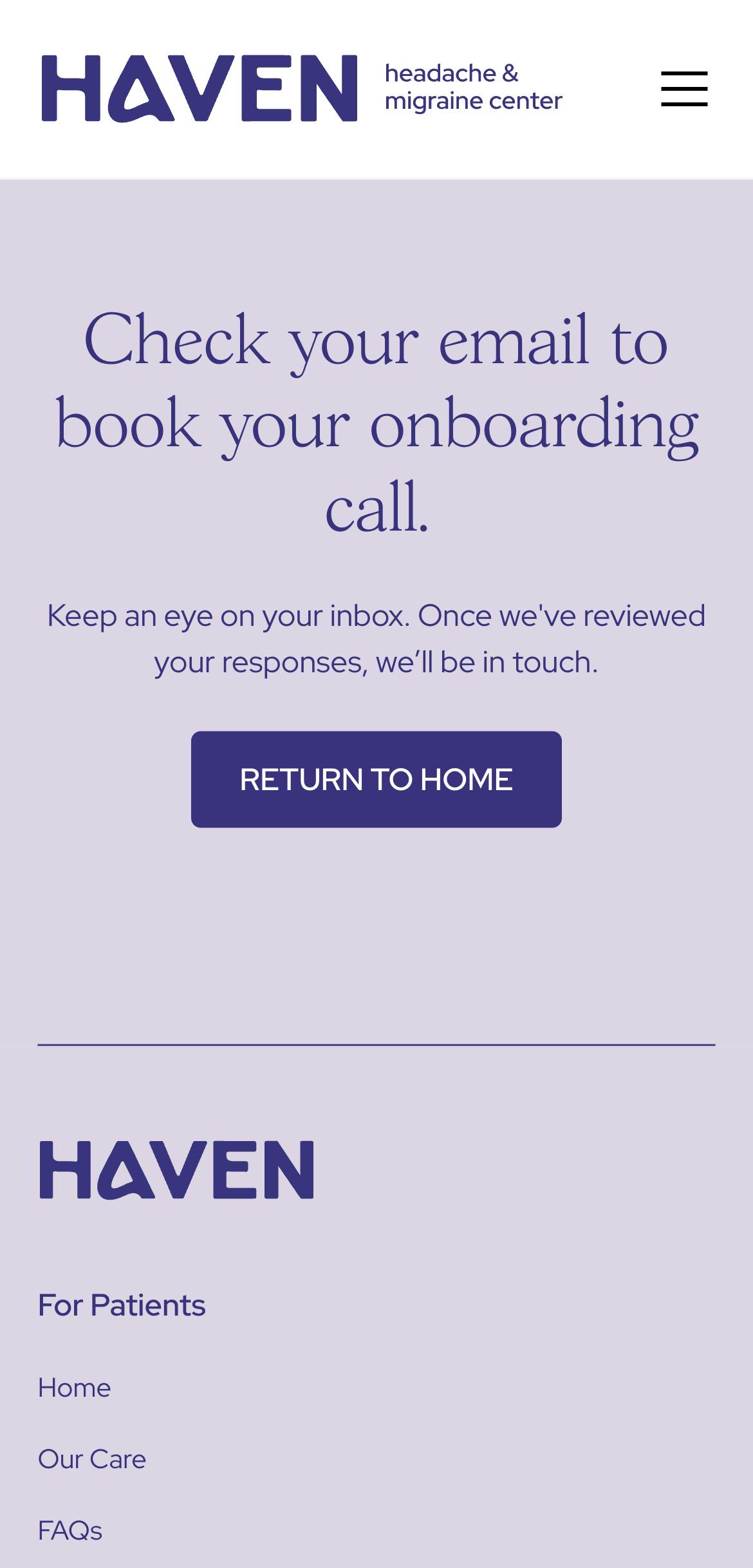
Haven Health
Haven Health’s submission and confirmation pages are designed with user clarity and ease of use in mind. The submission page features a straightforward message with a prominent and easily clickable Submit button. The design is clean, with ample white space and a clear call-to-action, ensuring users understand the final step. The confirmation page assures users their form was received and provides a clear next step in the onboarding process.

Mistake 9: Not testing forms
Not testing forms is bad practice because it can lead to usability issues, data inaccuracies, and user frustration. Without thorough testing, forms may contain errors, compatibility issues, or poor design choices that hinder user interaction and data submission. Testing forms on different devices and browsers is essential to ensure they function correctly across various platforms. This process identifies and resolves issues related to different screen sizes, operating systems, and browser behaviors, ensuring a consistent and reliable user experience for all users, regardless of how they access the form.
Try instead: Conduct thorough form testing
Conducting thorough form testing involves several key steps. Test the form on multiple devices and browsers to ensure compatibility and responsiveness. Check for usability issues by having real users complete the form, observing their interactions and gathering feedback. Verify that all validation rules work correctly and that error messages are clear and helpful. Ensure all form elements, such as buttons and fields, function as intended and that submission processes correctly store and handle data.
Examples of common issues found during testing
Common issues discovered during testing include:
- Validation errors: Incorrect or missing validation rules that either allow invalid data to be submitted or prevent valid data from being accepted.
- Compatibility issues: Forms that do not display or function correctly on certain devices or browsers, leading to a poor user experience.
- Usability problems: Confusing layouts, unclear instructions, or difficult-to-use input fields that frustrate users and lead to incomplete submissions.
- Submission failures: Forms that do not submit properly, either due to server errors, incorrect form configurations, or broken submission buttons.
- Performance issues: Slow loading times or unresponsive forms, especially under high traffic conditions, which can lead to user abandonment.
Mistake 10: Not saving abandoned form information
Imagine a user getting half-way through a form when his phone dies or the browser suddenly closes. If his form information isn’t saved, he’ll restart the form from scratch, leading to frustration and potential abandonment. By saving partial form data, you let your users resume their progress seamlessly, enhancing their experience and increasing the likelihood of form completion.
Saving partial responses offers other benefits for your business. It provides valuable insights into user behavior and preferences by revealing where users drop off in the form completion process. This data can be analyzed to identify pain points and optimize the form layout, content, and usability to improve conversion rates. Additionally, saved partial responses allow for personalized follow-up communication with users, such as targeted email campaigns or tailored offers based on the information provided. By understanding user intent and engagement levels through saved partial responses, you can make more informed decisions and better serve their customers' needs.
Try instead: Capture and use abandoned form data
Capturing and using abandoned form information involves implementing auto-save functionality to store user inputs in real-time. Use cookies or local storage to save data on the user's device, ensuring privacy and security. Provide users with the option to resume their form where they left off upon returning. Analyze abandoned form data to identify common drop-off points and address potential usability issues. You might also consider sending gentle reminders or follow-up emails to users who partially completed forms, encouraging them to return and finish the process. With Formsort, you can implement these strategies effectively, with built-in features for auto-saving data and tools to analyze form abandonment.
Examples of how to learn from and act on incomplete submissions
By learning from incomplete submissions and implementing targeted improvements, you can significantly enhance form completion rates and user satisfaction. Some effective steps you can take include:
Analyze drop-off points
- Identify trends: Use analytics tools to pinpoint where users abandon the form. Look for patterns indicating specific questions or sections causing drop-offs.
- Action: Simplify or rephrase confusing questions, reduce the number of required fields, or break long forms into multiple shorter pages.
Collect partial data
- Save progress: Implement auto-save functionality so that users’ progress is stored even if they leave before completing the form.
- Action: Follow up with users via email to encourage them to return and complete their submission. Personalize the message based on the information already provided.
User feedback
- Request feedback: Prompt users who abandon forms to provide feedback on why they didn’t complete it through a short, optional survey.
- Action: Use this feedback to make targeted improvements to the form’s design and usability.
A/B testing
- Test variations: Conduct A/B tests with different form designs, field arrangements, and question wording to determine which versions have higher completion rates.
- Action: Implement the most effective design based on the test results to reduce abandonment rates.
Address technical issues
- Error tracking: Monitor for technical issues like slow loading times, broken fields, or compatibility problems that might cause users to abandon the form.
- Action: Fix identified technical issues promptly to improve the overall user experience.
Personalize the follow-up
- Use partial data: Utilize the partial data collected to personalize follow-up communications.
- Action: Reach out to users with specific reminders or assistance offers tailored to the information they’ve already provided, making it easier for them to resume and complete their submission.
Avoid common pitfalls and build intuitive forms with Formsort
Form design plays a critical role in shaping user experience, directly influencing engagement and completion rates. A well-designed form minimizes user frustration, enhances clarity and streamlines the data collection process, reflecting positively on your brand's professionalism and attention to detail.
Formsort offers a comprehensive suite of tools tailored to create elegant forms that adhere to industry best practices. By leveraging features like responsive design, error prevention, and feedback mechanisms, you can ensure your forms are accessible and user-friendly. Start building intuitive forms that enhance user experience and drive conversions by signing up for Formsort's low-code form builder today.