Best practices for getting user consent in SaaS, healthcare, and fintech
How to display user agreements to ensure transparency and trust
With increasing government oversight, companies must be transparent about their terms and conditions (TOC) and data privacy policies. They surface these agreements directly in their sign-up flows, enabling customers to read and understand the service they are signing up for as well as the ways in which their personal information might be used.
When designing terms and conditions and privacy policies, you should take into account usability, friction, and industry-specific legal requirements. In this article, we will outline some trends in designing customer consent in sign-up flows across SaaS, fintech and healthcare pertaining to:
- Types of legal agreements used in these industries
- Levels of consent
- Where agreements can be placed in the flow
- Ways to display agreements
Disclaimer: We’ve developed these insights from a user experience and design perspective. This is not intended to be legal advice, and shouldn’t be taken as such. We recommend you work closely with your legal team when incorporating these agreements into your sign-up experience.
What types of user agreements do companies display?
Your company’s geography and industry will inform the types of legal agreements you use. In the U.S., companies typically display their Terms of Service and Privacy Policy in their sign-up flow. In Europe, companies may surface additional legal agreements in compliance with GDPR policies. Companies that offer services in more than one country have separate sections based on the legal requirements of each geographical area they operate in.
The three industries we will analyze are software as a service (SaaS), financial service (fintech), and healthcare. Typically, SaaS companies have relatively lenient legal requirements for attaining customer consent. Fintech and healthcare companies must comply with much more stringent regulations due to the nature of their services and the types of personal information they handle.
Common agreements by industry:
SaaS
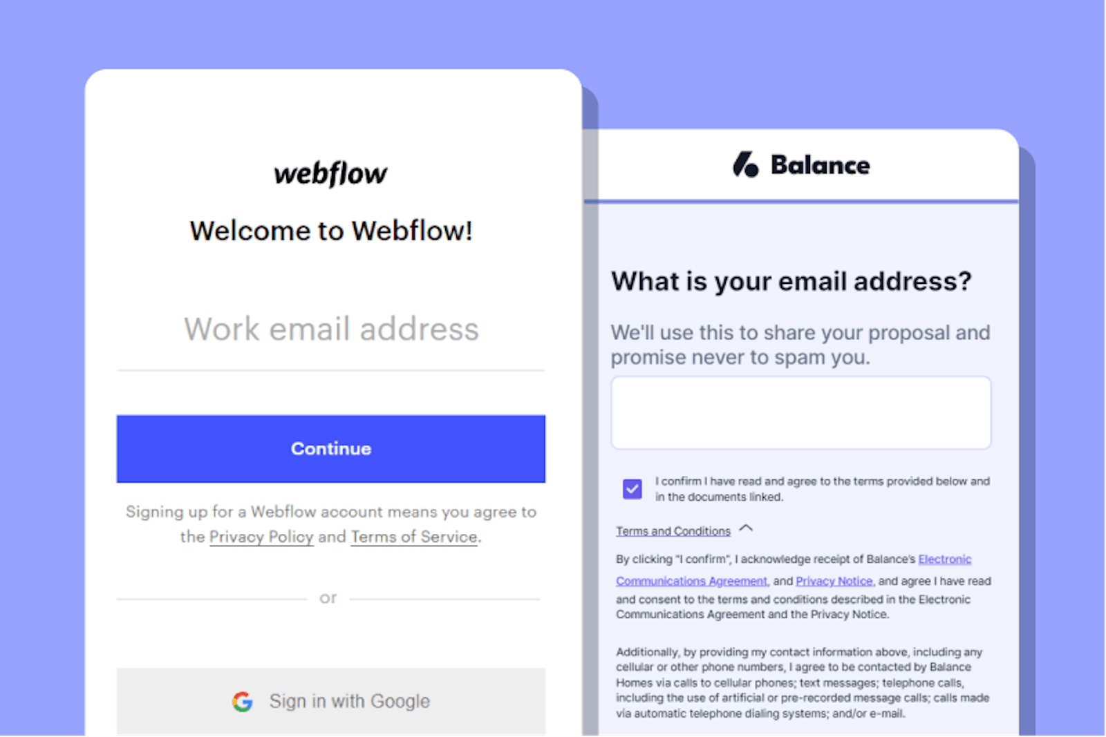
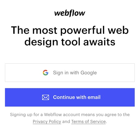
SaaS companies like Webflow typically show their Terms of Service and Privacy Policy on the first page of their sign-up flow, using a sign-in wrap agreement. They display a message stating that by continuing with account creation, the user implicitly agrees to the Privacy Policy and Terms of Service and provide links to these agreements on this page. This type of agreement works for SaaS companies, whose services are relatively low-risk and require minimal customer information. SaaS companies generally opt for this low-friction option in their sign-up flows.
Financial services
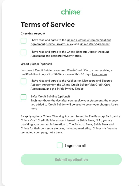
In contrast, financial services is a heavily regulated industry, and each finance vertical has its own set of data privacy policies and customer consent procedures. As a result, most financial services companies show agreements beyond the Terms of Service and Privacy Policy, such as the Electronic Communications Agreement and the Account Agreement for that product.
A fintech company partnering with another company to offer their product will also feature their partners’ legal agreements where relevant. For example, Chime offers their spending account product via a bank partner. Before a new customer signs up, they must consent to the Chime’s Terms of Service, as well as its partner bank.
Healthcare
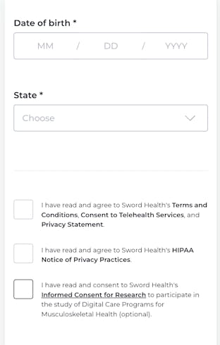
Like finance, healthcare is a heavily regulated industry where each vertical has its own unique customer consent procedures beyond the Terms of Service and Privacy Policy. Some common legal agreements surfaced in digital healthcare sign-up flows include the Telehealth consent agreement, HIPAA privacy notice and optional forms like the Informed Consent for Research. For example, Sword Health and Curology include all of these agreements. Notably, their agreements have an added layer of friction because quite often the regulations require active consent. Therefore, users must click to confirm that they’ve read each of these agreements (whether they actually have or not).
- Telehealth consent agreement: This contract is unique to the telehealth industry, which refers to the electronic delivery of healthcare services. Most states include some sort of telehealth-specific informed consent requirement in their statute, administrative code and/or Medicaid policies.
- HIPAA Privacy Notice: Several companies have separate privacy notices regarding their treatment of protected health information (PHI) as part of their HIPAA policy. This is on top of the company’s general privacy policy regarding data. Any partners healthcare companies work with must also be HIPAA-compliant. For instance, Formsort is a HIPAA-compliant form builder and doesn’t store customer data for the long term. Read more about Formsort's HIPAA-compliance form builder here.
- Miscellaneous, optional forms like Informed Consent for Research: Optional forms can be featured along with the required agreements, as seen below on the Sword Health sign-up flow. Notice that it is best practice to make optional contracts clickwrap.
What are the levels of consent?
Whether your agreements are designed to be implicitly or explicitly accepted depends on your industry and the kind of data you’re handling. From no-friction, implicit consent to explicit consent required scrolling, here are the most common levels of consent:
Browse wrap agreements
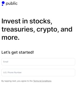
Sufficient for most companies in the SaaS industry, the sign-in wrap agreement is a no-friction statement indicating that by completing account creation the user accepts the company’s terms of service and privacy policy. In such cases, companies must ensure the statement is legible, using an easy-to-read, appropriately-sized font. The background-font color contrast should facilitate reading the statement. The documents should also be linked so that users can read them if they choose. On the backend, the storage system needs to record the unique user account data as well as the timestamp of account creation as proof of customer consent.
Click wrap agreements
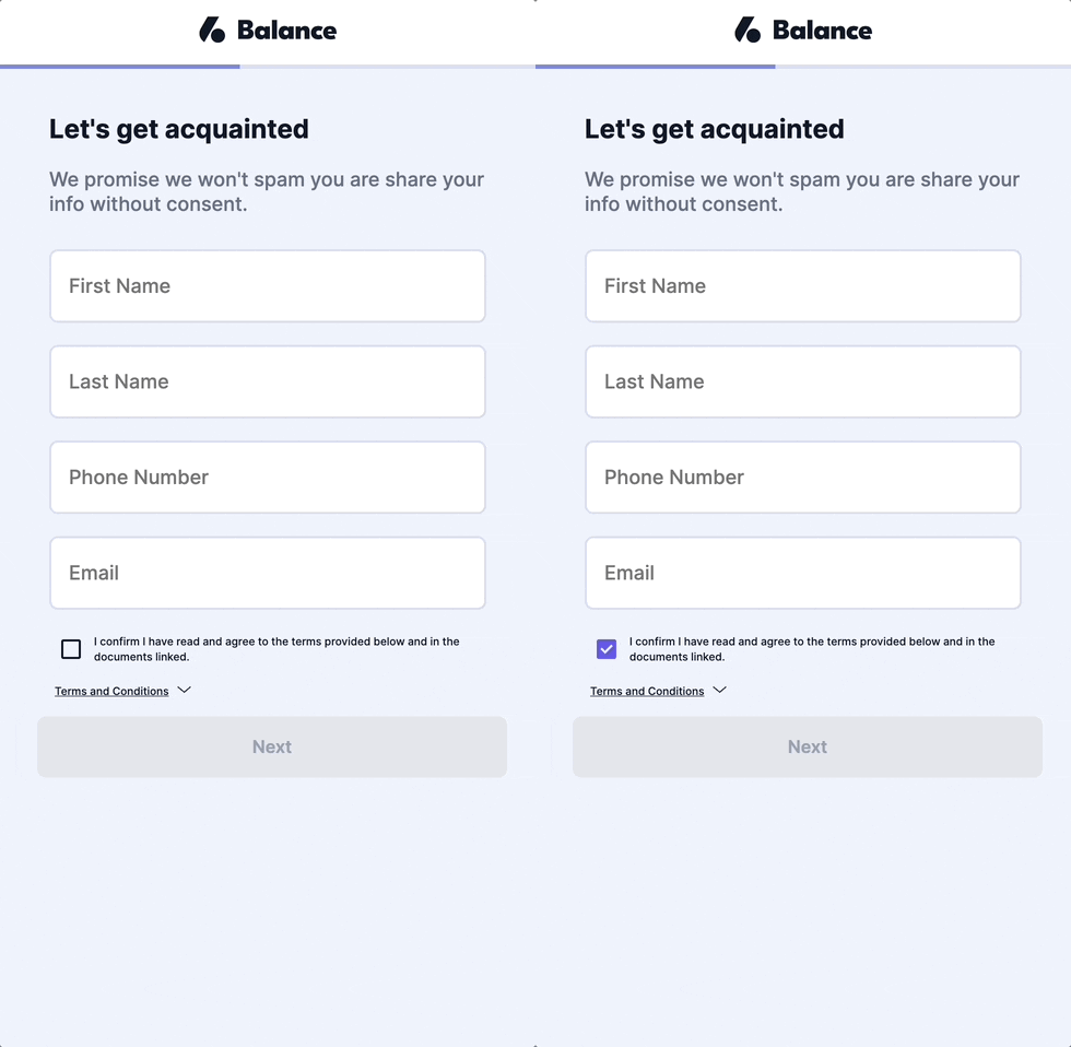
Clickwrap agreements add an extra layer of legal protection to both companies and users. Requiring users to click on a checkbox proves that the user actively intended to consent and alerts users that they are strongly encouraged to read the linked agreements in order to understand the legalities surrounding the services they are receiving.
Scroll wrap agreements
Depending on your industry, it might make sense for you to display your agreements and require users to scroll through them before clicking the checkbox. This requires the most explicit level of consent. Further still, you can require users to click checkboxes embedded within the agreements to ensure they are reading the most significant parts. These levels of friction risk user drop-off but can be essential to protect both parties once a user is signed up.
Where can agreements appear in the sign-up flow?
Typically companies show agreements right when a customer creates an account. The account creation step and the legal agreements can come at the beginning, middle or end of the flow.
Beginning
Many companies feature account creation on the first page of their sign-up flow in order to reduce user friction and get new leads into the product as quickly as possible. They feature their legal agreements on the first page as well.
Middle
Some companies feature account creation halfway through the sign-up flow, after they’ve collected some user data. This information can be used to verify users’ identity if that’s an important part of providing services, as it is in the case of fintech company Chime.
End
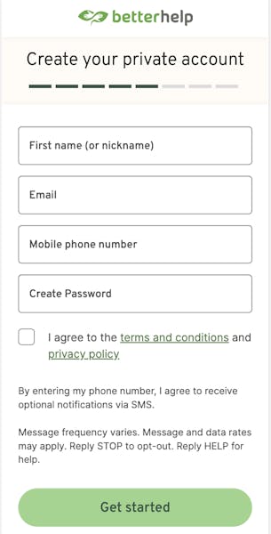
Companies like Better Help put account creation as the last step in their flow, after collecting some more information on user demographics and mental health concerns. This helps ensure sign-ups come from high intent users.
How are agreements displayed in sign-up flows?
Upon click, agreements can be displayed as redirects, in-app pop-up modal, or in-app screen. Let’s take a look at how each one works.
Redirects
Companies like Public, Notion, Figma, Webflow, Sword Health and Chime redirect users to a new page when they click on the Terms & Conditions or Privacy Policy links. Users are redirected to the webpage with the full legal agreement. Notion’s agreements do not open in new tabs but rather on the actual in sign-up page. While displaying the agreement on the sign-up page might be sometimes necessary for legal reasons, it most certainly creates additional user friction by requiring the user to navigate back and forth between pages to create their account.. All the other flows open new tabs to display their agreements.
In-app pop-up modal
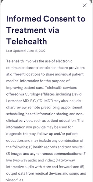
Curology and some other companies balance out the added friction of their clickwrap agreements by displaying a pop-up modal. When a user clicks on one of the agreements, a pop-up appears displaying the contract, with the flow receding into gray in the background but still there. It can be closed by clicking the X and the main flow screen reappears.
In-app screen
This is when users have to scroll through the entire Terms & Conditions language via in-app screen. The T&C may link to many other agreements (risk disclosures, partner agreements). This is the most explicit way to get customer consent, because you are forcing the users to interact with the full agreement. However all of that scrolling likely leads to lower conversion rates.
Design consent agreements seamlessly into your flows with Formsort
Formsort’s sign-up flow builder has a built-in consent module that is suitable for all use cases. You can choose how you will display your consent agreements and fully customize the design of your module to match the specific needs of your organization.
Start building your flows with Formsort, a HIPAA compliant form builder. Check out some of the web’s best sign-up flows in our design gallery Fineflows.