Introducing Formsort’s UI Library

Optimizing your form building experience with our new UI library
Announcing Formsort’s new user interface (UI) library
A seamless user experience is just as essential for our customers (you) as it is for your end users. That’s why we’ve redesigned our set of existing UI components to make your form building process as intuitive as possible.
Why we needed a UI library
Up until this point, our team at Formsort has been utilizing the rich collection of Material UI components with some level of customization. As a primer, Material UI components are React-based design components in the Material library that are specifically created for web developers to use when designing their websites. They form the foundation of a website’s design – from colors and fonts to icons and shapes – and reduce the need for everyone having to create them from scratch.
As we've grown as a business, our studio has created UI interactions that are so specialized that relying on off-the-shelf components could result in a suboptimal user experience. As a result, we've spent the last few months redesigning our UI library, building on top of the existing Material UI components and creating new ones.
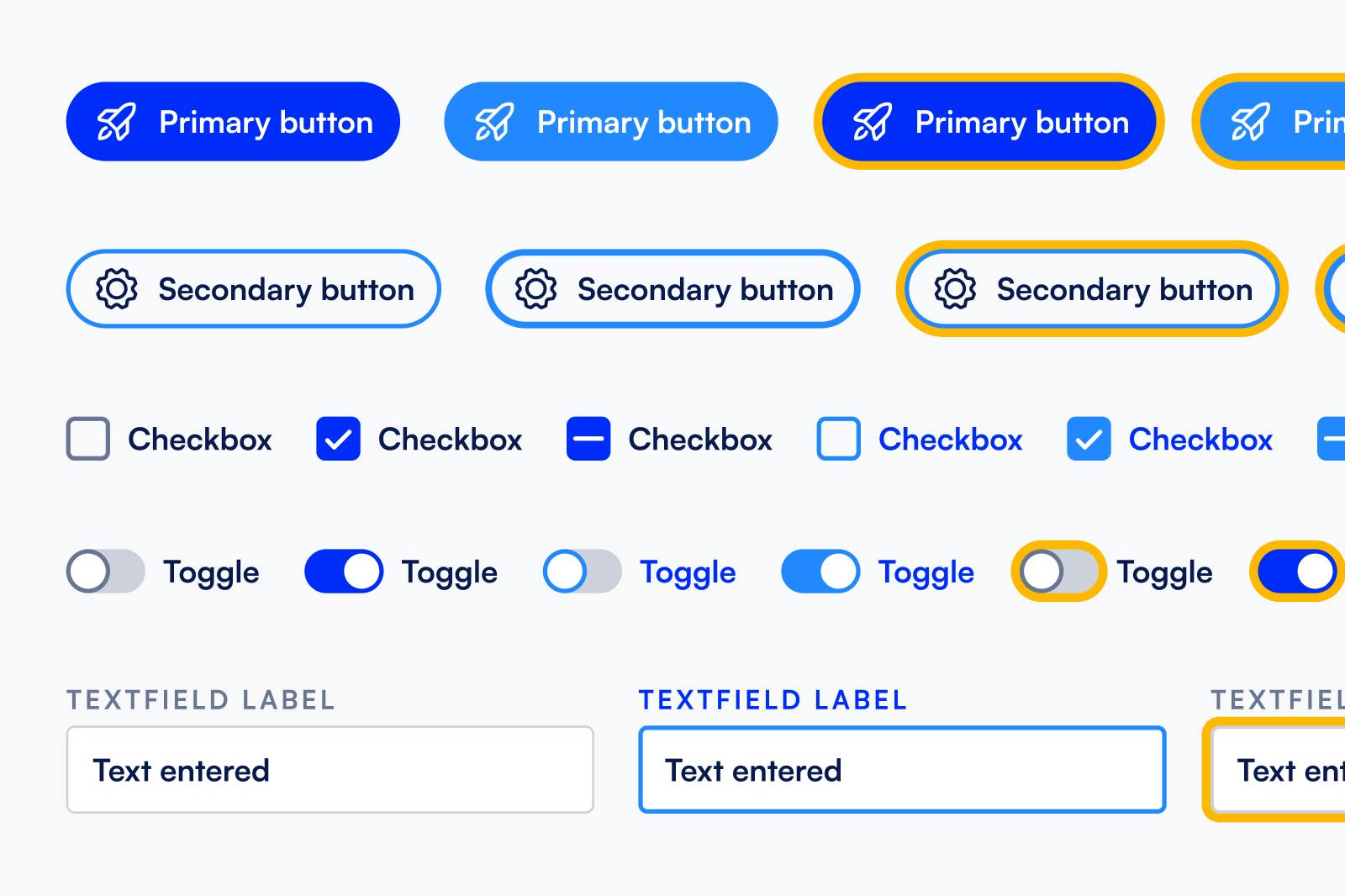
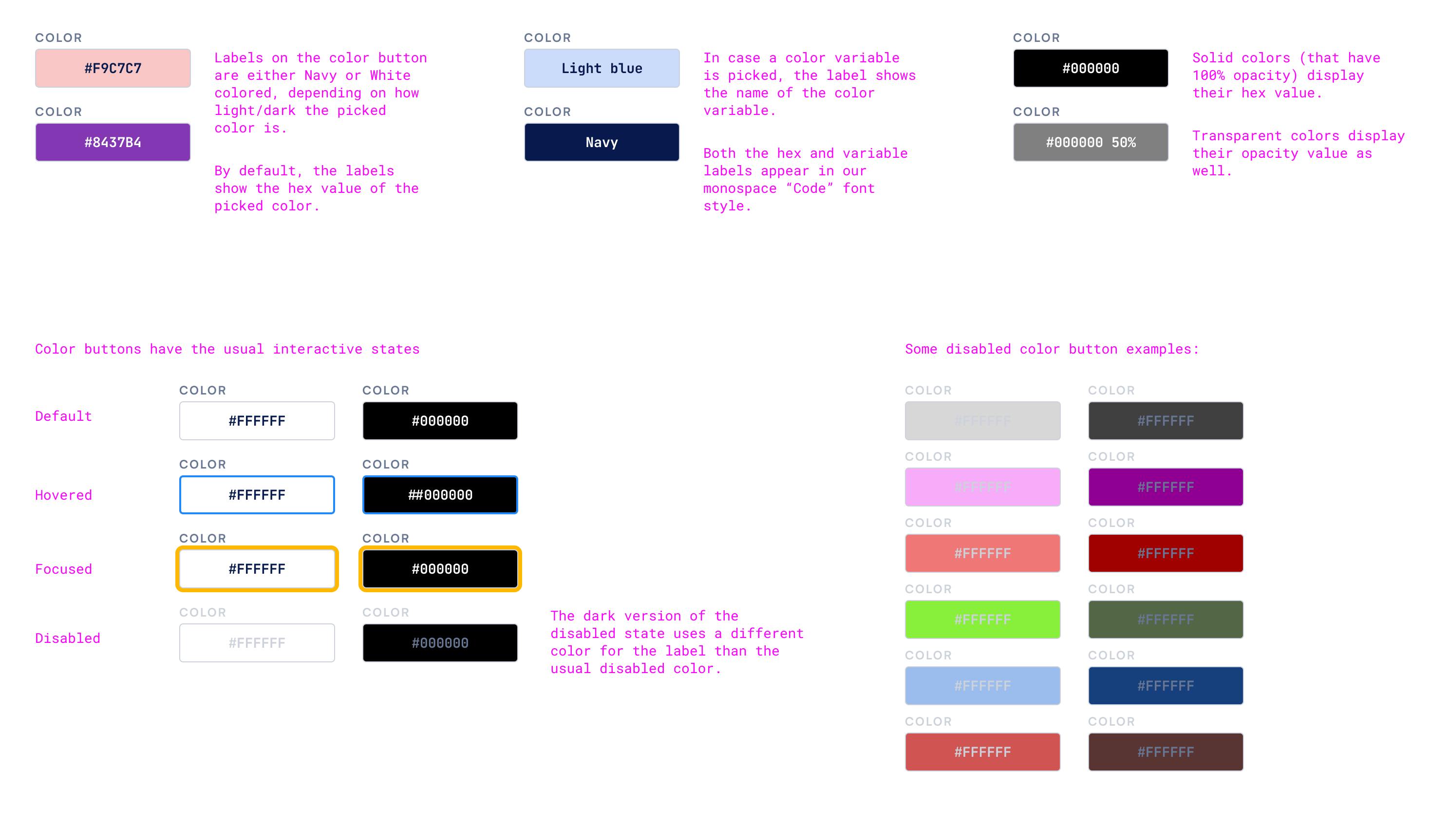
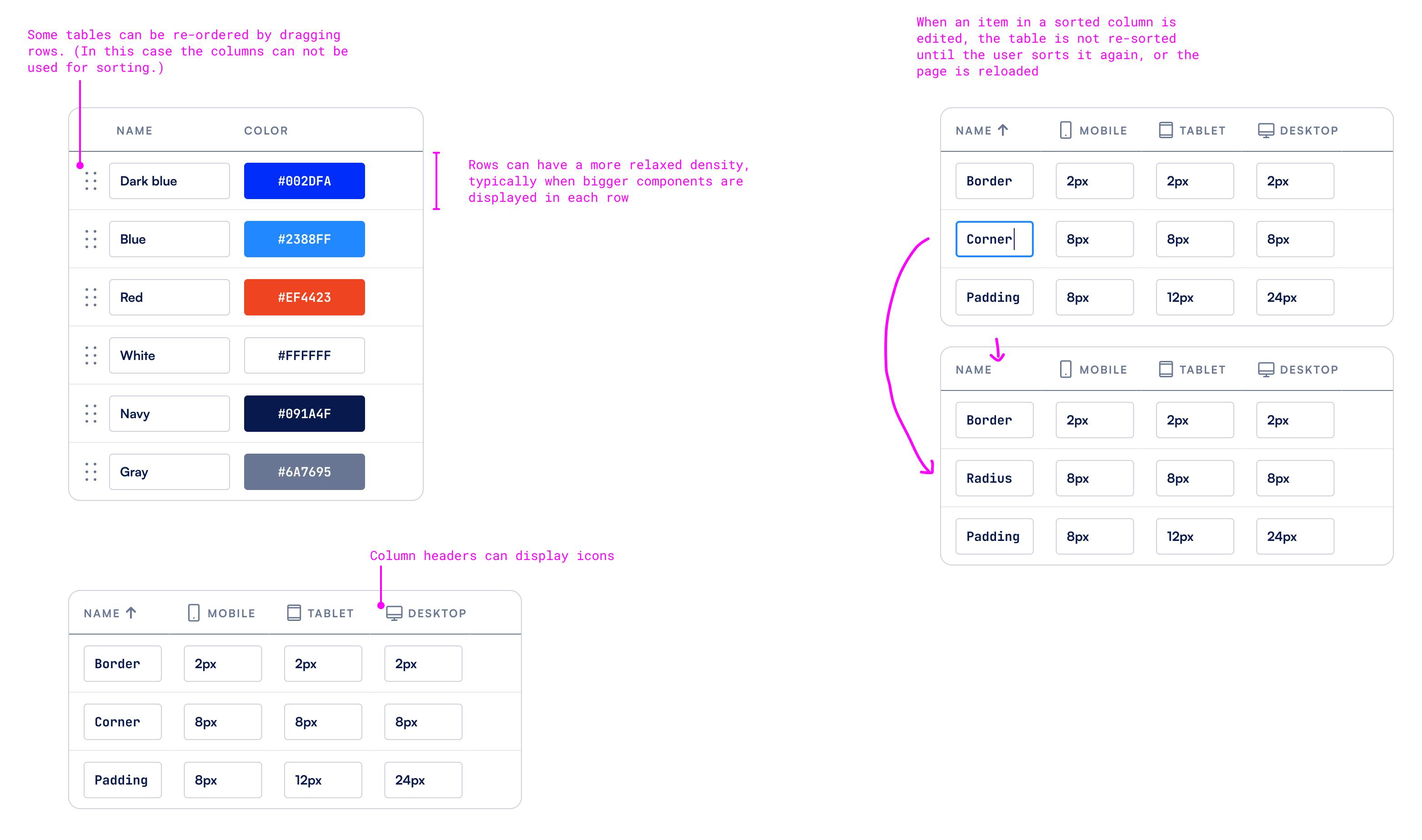
Getting these interactions right and having them as reusable components ensures that our customers have a pleasant and consistent experience when building flows. It also speeds up your design and implementation process. For example, now when you choose a background color, you will see the color hex code and a bigger color swatch.
Big picture and first steps
Our goal is to develop a robust design system to optimize your flow building experience. We’ve started with the most urgent UX areas identified internally and by our customers, including interactions related to:
- Improving our color picker tool. Inconsistent colors can leave a poor first impression with customers. We’ve updated our color picker tool's interface to make it easier to choose and display your color of choice.
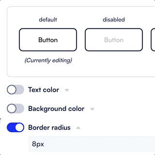
- Standardizing the display of optional properties. Editing the content and style of forms can get quite complex. To make this a less overwhelming experience, we are only showing options and properties when relevant. For example, we’ve standardized how we display and group optional properties using a component we call the Toggle accordion. Now, you will always see which option will trigger and enable more options. You will also find it easier to understand the relationship between them.
Our design principles and process
Since we already had a working version of our UI library, our redesign process started with looking at what we have today and creating a series of components to improve the flow building UX. We followed the atomic design approach: first we defined our most basic building blocks (e.g. colors, fonts, shapes are atoms) molecules (e.g. dropdown lists) and finally organisms (e.g. dialogs). Building up from a repertoire of high-quality standalone, portable, reusable building blocks ensures that end customers’ flow building experience is consistent and intuitive.
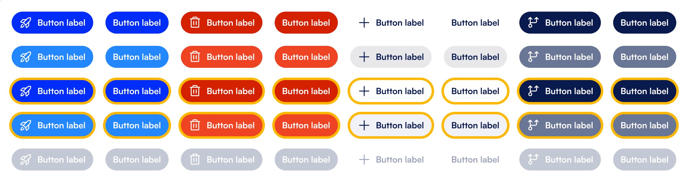
Even small details like alignment, wording, fonts, and scale can have a large impact on the flow building experience. Our UI library components are created with accessibility in mind e.g. taking into account color contrast, text legibility and non-mouse interactions (like keyboard interactions).
We aim to keep our library minimal and responsive to user needs. We are not creating components just for the sake of having them. We are optimizing our resource allocation by only developing the highest-impact components.
Exploring and creating the components proved to be a great opportunity to review how Formsort works on the interaction level. When doing the exploration work on a new or existing component, we meticulously look at all the places in Formsort Studio where such an interaction takes place. We discuss all the use-cases and edge-cases, making sure we create solutions that cover everything and are future-proof. We aim to create components that can potentially combine existing, similar patterns: when similar functionality is presented with different interactions across the UI, it's a good chance for us to come up with a single solution. The resulting consistency makes the lives of our users easier and saves future implementation and design resources for us.
How we’re implementing the library
Our engineering and design teams work closely to make sure we get everything right e.g. from the technical and accessibility perspectives. We continue to use Material UI as a base for our components with a rich customization. As new components become available in the UI library, we phase out and replace all the old instances across the Formsort Studio interface. We use Figma for exploration and design, Storybook to showcase and document the components that are ready, and Chromatic to detect visual regression.
Next steps
At this point, around 80% of everything you see in the Studio has been updated with new UI library components. Changes range from the most basic building blocks like buttons and checkboxes to more specific interactive elements like a color picker or an image uploader.
We’re still in the beginning phases of our UI library. Its expansion and maintenance will be an ongoing journey. Eventually, it will evolve into a well-rounded design system that covers a lot more than the atoms, molecules and organisms we have today. As we continue building the UI library, look out for more updates!
Want to learn more?
Learn more about our ongoing improvements and how Formsort can help you build better forms.