Best practices for designing a client intake form

Intake forms are your first touchpoint with prospective patients - it's important to get them right.
Form design tradeoffs
We’ve all been there: sitting beneath harsh fluorescents in a waiting room, filling out page after page of new patient forms just to meet with a care provider. Wouldn’t it be better for everyone if the new patient intake experience was warmer and more inviting? Consumer healthcare companies have the chance to make that change.
Intake forms are often a prospective client’s first interaction with a provider, and every single form design choice impacts a patient's perception of your company. You can curate a digital experience that’s much more personal and comfortable than the traditional waiting room.
Of course, there’s no “one-size-fits-all” form builder solution — your design decisions depend on your brand, your patients, and your goals. Following are some options to consider when building a client intake form for modern patients.
How to collect email addresses
These days, patients guard their email addresses almost as closely as their Social Security numbers, so how and when you ask for emails in a digital form matters!
Asking too quickly could cause a responder to exit a form without completing it, but not asking soon enough could mean you lose their data forever. When walking this tightrope, it’s important to think about your company’s value proposition and how you can incorporate that into your email address request.
Here are a few ways to collect client emails:
Ask at the beginning
Asking for email addresses at the beginning of an intake form offers transparency: the responder understands that they need to provide their email to access the company’s insights or offerings.
For example, Apostrophe asks for the client’s email address immediately, and the email request screen offers clear information on what the user will have access to after providing their contact info.
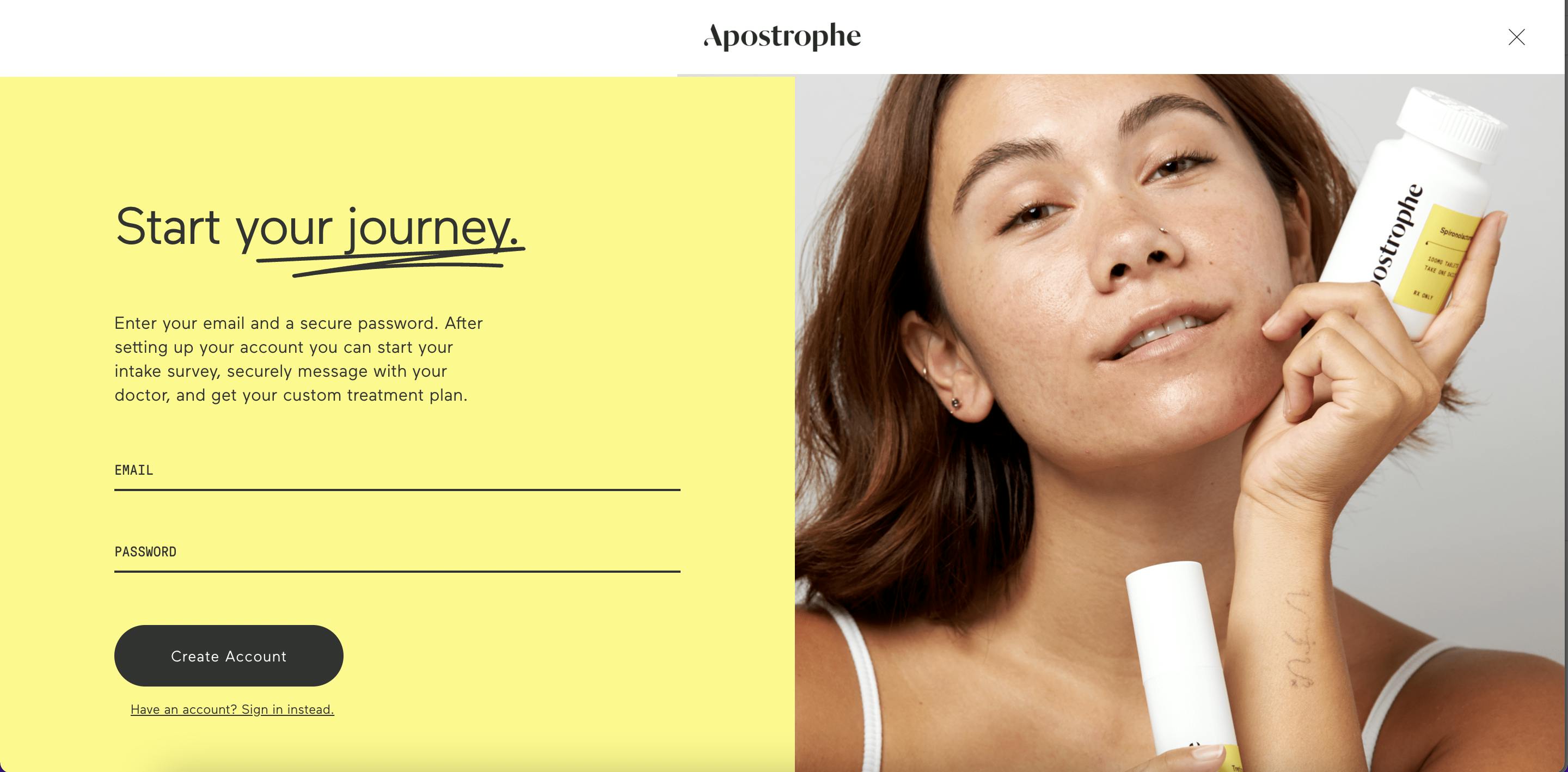
However, if you are going to ask for contact information off the bat before building a connection with the client, be sure to clearly establish expectations so they understand what they’re agreeing to.
Ask at a transition point in the intake form
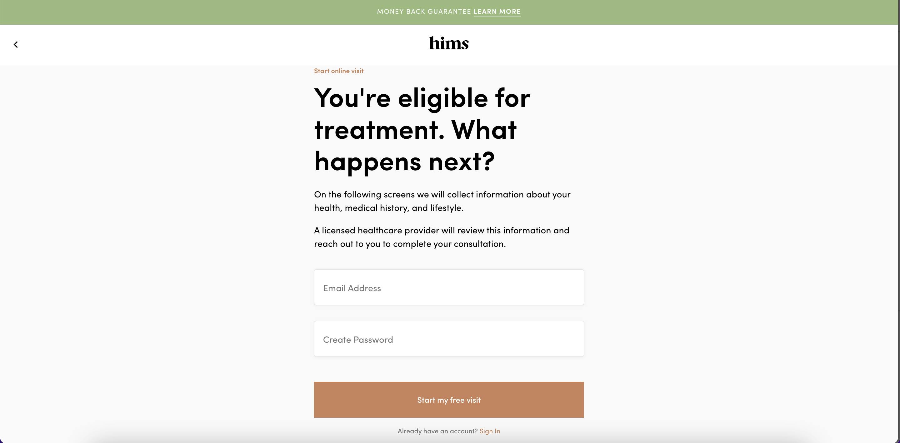
Gathering patient email addresses mid-way through an intake form gives you a chance to build trust and offers a natural transition into a different section of the form. This might signal a visual or thematic transition, letting responders know that they are now entering a secure or personal part of the form.
A good example: Hims collects client emails after asking questions about the responder’s relevant health concerns but before diving into more personal questions on medical history and background.
Ask before presenting results
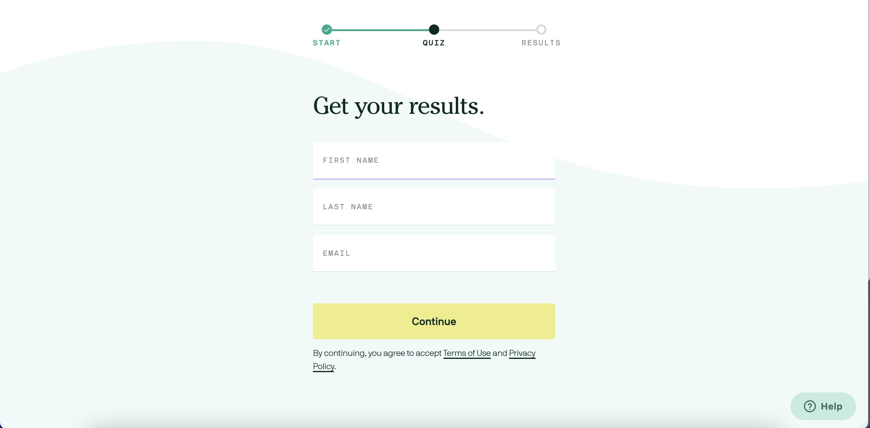
You can ask for a patient’s email after they’ve completed the intake form but before you deliver their results. This way, they’ve already invested time into the completion of the form, and entering their email is the final step that grants access to the insights or recommendations your company offers.
Cove uses this method, incentivizing patients to provide their email address by asking for it before delivering quiz results.
How to add informational text to a form
Informational text that educates about a health concern or contextualizes the intake questions can build trust with patients as they move through the form. Since there’s no face-to-face interaction, informative text can help responders feel both supported and empowered.
That said, you don’t want to overdo it! Information overload can overwhelm consumers and lower conversion rates, whereas insufficient information can leave clients unconvinced of your brand’s value proposition.
The key here is to think about what type of information will best equip new patients to use your product or service.
Educational information
Incorporating educational information into a patient intake form, either about a general health topic or about your company specifically, can help establish you as a subject-area expert. We all want the people giving us healthcare advice to know what they’re talking about!
For example, Hims does a good job using informational slides between questions to educate, normalize the patient’s experience, and reduce shame around sensitive topics.

You should also consider how you’ll incorporate educational information into your form. Hims formats informational slides as a loading screen between questions, which automatically disappear after a second or two.
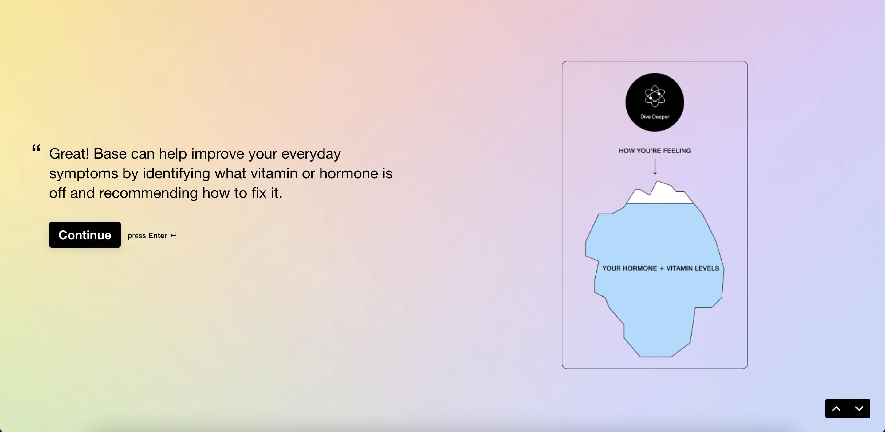
However, users have to click through Base’s educational slides to arrive at the next question. This can be engaging and give the responder more autonomy over the form experience, but it also means they have to click through more slides, which could potentially deter some responders from completing the form.
Information to guide users through the form
Supporting text can also help guide the user experience in a form, breaking up longer sections or sharing how certain questions and answers inform the overall process.
Here’s an example: Base incorporates informational slides after each answer submitted by the patient, simulating the back-and-forth of a conversation and giving the form a personalized feel for the responder.
Similarly, Care/of breaks up sections with informational slides that let the responder know what’s to come in the following section and how the information will be used.

How to use visuals
Visuals are a powerful element in consumer decision-making, which is why adding images and graphics to web forms can help keep responders engaged. Images also allow you to communicate effectively and precisely so that patients don’t feel confused. There’s nothing worse than feeling uncertain when you’re seeking healthcare expertise.
There are many ways to include visuals when building forms, and how and where you use them depends on your goals, brand, and prospective patients. Here are some common types of visuals in new patient forms:
Images of other patients
Photos of other patients, like the below example from Noom, can lend legitimacy to your brand and build trust during the new patient intake process.

Images to portray concepts
Sometimes, images are a more effective way to communicate a concept.
In this first question on Candid’s intake form, the included graphics quickly and directly communicate the concept, which shortens and simplifies the form while also offering the patient a reflection of their own experience.
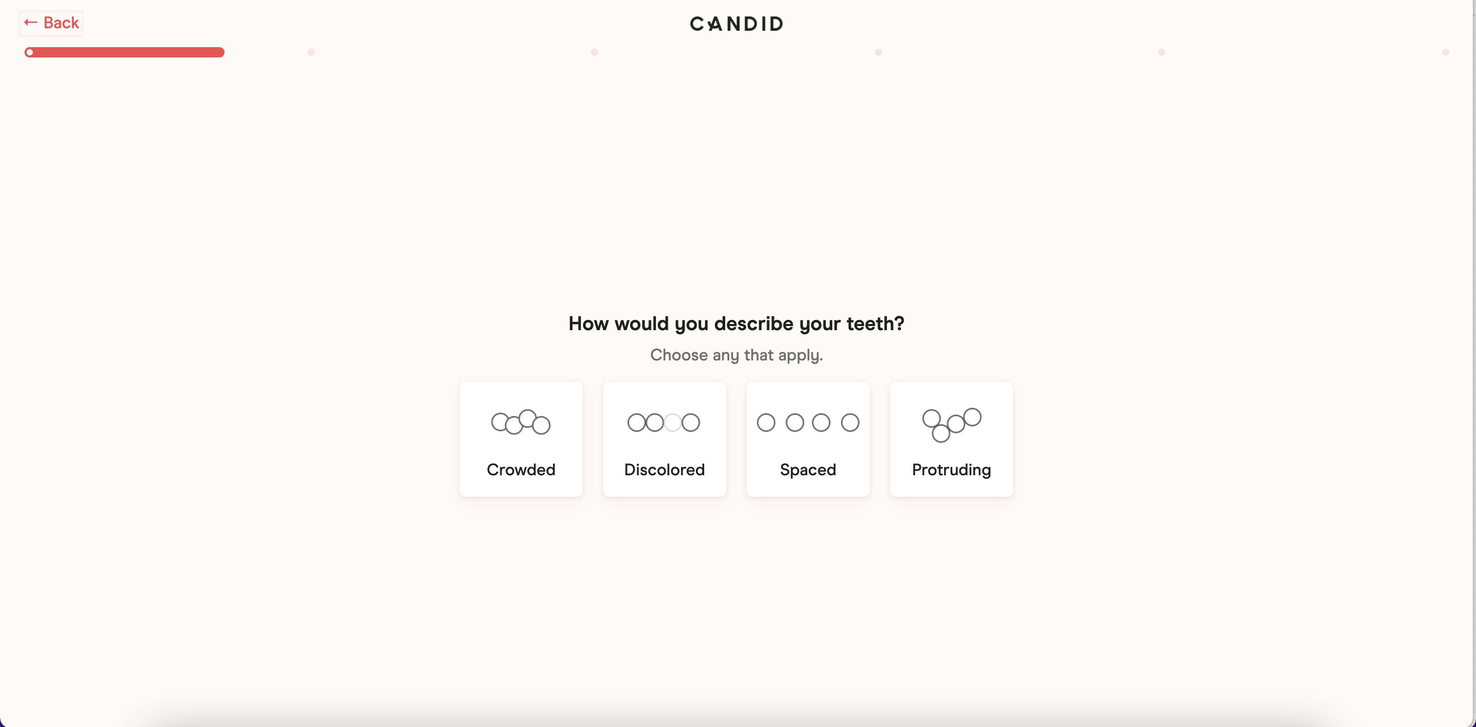
Plus, Candid offers a great example of a company that increased its sales by optimizing its patient intake form. Teledentistry is a new service, so the company needed to build trust and educate customers on the benefits of using clear aligners to straighten teeth. The incorporation of on-brand visual elements was fundamental to this particular form design.
Images to support branding
Incorporating visuals throughout a form is a solid way to establish branding consistency and keep responders engaged.
Patients completing intake forms are about to give you sensitive healthcare information, so you want the form to look professional and put together. Fortunately, you can go above and beyond the dingy waiting rooms of the past to build trust with modern clients!
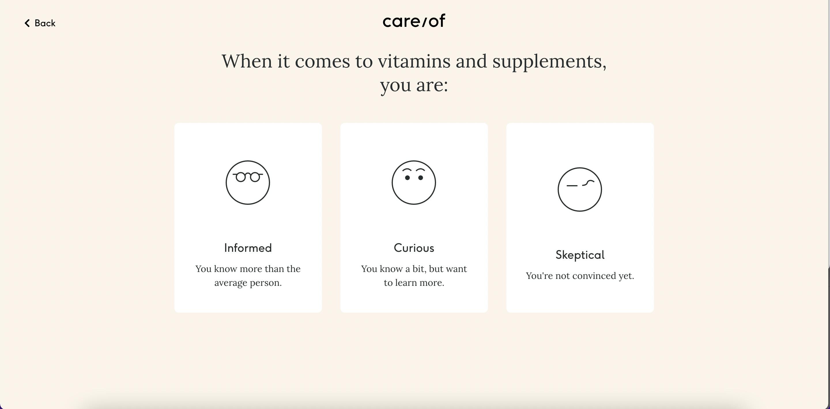
For example, Care/of uses graphics that match the brand’s approachable, hip design, which creates a cohesive user experience from start to finish and clearly demonstrates the careful consideration they put into building the form.
Key takeaways
The sky’s the limit when it comes to patient intake form design. There’s no conclusive best practice for implementing any of the above concepts, and the best way to figure out what works for your brand is to test and iterate over time.
That’s where a form builder like Formsort can help. We empower consumer healthcare companies to create highly customizable forms that integrate with your tech stack and evolve with your business.
And the best part? You won’t be limited by your engineering team’s bandwidth. Your PMs, marketers and designers can test multiple flows to curate the best possible patient experience. Formsort helps you upgrade from the traditional waiting room experience and build digital onboarding that’s as modern and dynamic as your company.
Sign up to learn more about Formsort and start building with us!